Data Journalism Top 10: Where Raindrops Go, Spiral Chart Debate, Prenatal Tests, Death Threat Dataviz

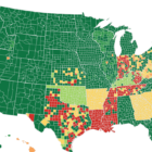
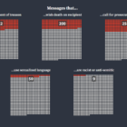
We have rolled into the third calendar year of the pandemic, but the debate about how journalists present data on the coronavirus continues to rage. Just six days into 2022, a spiral chart divided the data journalism community into two camps. Our weekly NodeXL analysis and curation of the most popular data journalism stories on Twitter also features an investigation into the prenatal testing industry, a visualization of death threats received by election staff, and an interactive map of Russian military bases near the Ukraine border.

Fast Tools for the Election, from #gijnElectionWatchdog

For the past seven weeks, a special GIJN project, #gijnElectionWatchdog, has provided US reporters with tools to tackle the toughest election stories in daily tweets and weekly roundups. Here, with just a few days remaining til a hugely consequential election, we share quick-reference tools that matter in this period for time-pressed journalists.

Tools for Spotting Bots, Working Tough Sources, and Combatting Fresh Disinformation from #gijnElectionWatchdog

In week five of GIJN’s project to arm US reporters with tools for the toughest election stories, #gijnElectionWatchdog shared a tool to spot Twitter bots, a live dashboard to combat the hottest election disinformation efforts as they arise, a free cybersecurity toolkit for reporters, and tips for finding hard-to-access election sources.