GIJN’s Data Journalism Top 10: Luanda Leaks, A Disappeared Lake, Animated Graphics, Data Mapping, NICAR

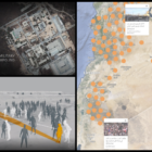
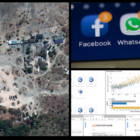
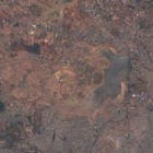
What’s the global data journalism community tweeting about this week? Our NodeXL #ddj mapping from January 13 to 19 finds the International Consortium of Investigative Journalists exposing how Africa’s richest woman really made her fortune, The Washington Post using satellite imagery to show the disappearance of an entire lake in the Philippines, El País sharing the behind-the-scenes process of their work, and Mike Reilley curating a mega list of useful data journalism tools.

My Favorite Tools: Malachy Browne

For our series about journalists’ favorite tools, we spoke with The New York Times’ Malachy Browne, a pioneer in the field of visual investigations. He told GIJN’s Gaelle Faure about the tools that help him recreate crime scenes, including satellite imagery, EXIF data viewers, 3D modeling, and more.

Most Popular Resources on GIJN in 2018

GIJN is constantly on the lookout for the best tipsheets, reporting gudies, how-to stories, and videos, then collating and integrating it into ever-growing Resource Center. Following is a curated list of the top 10 most popular resources accessed by journalists on our site in 2018.

GIJN’s Data Journalism Top 10: Faking Climate Change Data and in WEB Du Bois’ Black Americ

What’s the global data journalism community tweeting about this week? Our NodeXL #ddj mapping from Aug 6 to 12 finds @sciam profiling a new color scale for the color blind, @EDudinskij’s fun dissertation on dataviz in science fiction movies, @morgenpost using satellite imagery to show the consequences of droughts, and @gregladen and Grant Foster calling bull on a climate change denier’s flawed graphs.

GIJN’s Data Journalism Top 10: Stories with Maps, Tools with Charts, Casting for Shakespeare

What’s the global data journalism community tweeting about this week? Our NodeXL #ddj mapping from October 15 to 21 finds @Esri’s @AllenCarroll talking the power of maps in storytelling, @visualizingdata’s catalogue of charts and corresponding tools to help information designers, and @ericwilliamlin’s deep dive into the data of casting decisions in Shakespearean plays since the 1900s.

Top Ten #ddj: The Week’s Most Popular Data Journalism Links

Here are the top data journalism tweets for March 20-26, per our NodeXL mapping: record low Arctic ice (@NASA); Europe’s STEM gender issue (@MSFTnews); satellite imagery search (@ddjournalism); Western Europe terrorism (@TheEconomist); storm #dataviz (@sciam); data resources (@jschwabish); & more.

This Week’s Top 10 in Data Journalism

What’s the global data journalism community tweeting about this week? Our NodeXL #ddj mapping from December 4 to 10 has @Reuters documenting the deplorable living conditions at refugee camps in Bangladesh, Financial Times’ @theboysmithy transforming bad charts into useful ones and the impressive work of the 2017 @infobeautyaward winners.

My Favorite Tools: Joel Konopo

For our series about journalists’ favorite tools, we spoke with Joel Konopo of Botswana’s INK Centre for Investigative Journalism. He told GIJN’s Olivier Holmey all about how he uses satellite images to expose corruption, Cryptomator to encrypt sensitive files, and lots more.

How to Build a GIF of Satellite Imagery in R

Sometimes, the best way to tell a story is to take a bird’s eye view. Here’s how Storybench editor Aleszu Bajak did this by recreating a GIF of Chennai’s disappearing Lake Puzhal reservoir. Check out his process and code, which could be used for countless other animations — to show, say, dam collapses, deforestation, forest fires, and more.

Tracking a Mysterious Missile Launcher Inside an Information War

Egyptian traffic cops found a mobile launcher lying in a piece of pile near the airport of Cairo. The story was quickly dismissed by Egyptian media. But others believed it. In this detective & research adventure recorded by web research specialist Henk van Ess, you’ll learn how to find the truth midst of an information war.