Data Journalism Top 10: Wordle Wins, Djokovic Drama, and UK’s Partygate Scandal

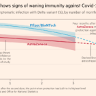
If you’re a word puzzle addict and active on Twitter, you’ll have come across the latest craze — Wordle. Al Jazeera Labs analyzed the puzzle’s word bank to give tips on how to tackle the game strategically. Our weekly NodeXL curation of the most popular data journalism stories on Twitter also features an analysis of shopping habits during the pandemic, an examination of vaccination rates among elite athletes, details on the scandal shaking UK politics, and an interactive mini-golf game illustrating how gerrymandering — the manipulation of electoral boundaries — plays out in various US states.

Pandora Papers image 2

Data Journalism Top 10: Pandora Papers, Data Podcasts, and COVID-19 in Scottish Care Homes

Tracking the most popular data journalism stories on Twitter from September 27 to October 3, we found a series of articles based on discoveries from the Pandora Papers offshore leak. In this edition, we also feature reporting on the damage caused by the eruption of the volcano on La Palma, data journalism podcasts, and a roundup of the German election results.

Data Journalism Top 10: Fading Immunity, Women Losing Work, Myanmar Murders, Teen Pregnancy, Britain’s Wealth Gap

Tracking some of the most popular data journalism stories on Twitter from August 23 to 29, we found a thread by Financial Times journalist John Burn-Murdoch exploring what we know so far about the long-term effects of immunizations, a look into the pandemic’s impact on the global female workforce by The Washington Post, and an investigation into teen pregnancies in Peru by OjoPúblico.

How We Built the Data Visualization That Brought Brazil’s COVID Deaths Close to Home

When the COVID-19 pandemic first hit Brazil, a team of data journalists set out to illustrate what the death toll looked like by creating a data visualization that presented something beyond the numbers. The team considered various ways of displaying the story. Here’s a behind-the-scenes look at how they created At the Epicenter.

Forbidden Stories' Pegasus Project exposé

Data Journalism Top 10: Pegasus, Silencing Reporters, Europe Flooding, Diversity Mapping, K-pop

Our NodeXL mapping from July 12 to 18, which tracks the most popular data journalism stories on Twitter each week, found a series of articles resulting from the collaborative project that analyzed an unprecedented leak of more than 50,000 phone numbers selected for surveillance. In this edition, we also feature an insight into Facebook’s data wars by The New York Times, an interactive piece by Al Jazeera on how the holy city of Mecca has expanded, and a colorful project by the Washington Post on the rise of K-pop.

Data Journalism Top 10: Pandemic Cocktails, Pricey Food, Zoonotic Diseases, the World’s Top Songs

If you have tried to mix cocktails at home lately, you’re not alone. Tired of waiting for bars and restaurants to reopen, more consumers have started buying premium alcohol, according to data published by the Financial Times. Our NodeXL #ddj mapping from March 1 to 7, which tracks the most popular data journalism stories on Twitter, also found an analysis by Bloomberg showing that global food prices have hit their highest level in six years, an explainer of the connection between bats and virus outbreaks by Reuters, an interactive piece on Atlantic currents by The New York Times, and a musical map by The Pudding.

Data Journalism Top 10: Chinese Propaganda, Social Media Abuse, Herd Immunity, Florida Condo Collapse, Pandemic Plastic

With less than a month until the start of the Olympic Games, host country Japan’s slow vaccination campaign is causing concern. Our NodeXL mapping from June 21 to 27 found a piece by The New York Times looking at Japan’s efforts to combat the pandemic in the run-up to a global sporting event. In this edition, we also feature a joint investigation by ProPublica and The New York Times into Chinese propaganda on the internet, a herd immunity calculator by German newspaper Zeit, and revelations from the Guardian about abusive posts on social media targeting English soccer players.

Data Journalism Top 10: Deadly Russian Births, Pacific Mining Plunder, Toxic Dams, Cool Rocks, Extreme Rainfall, Analyzing Chess

Our NodeXL #ddj mapping from May 31 to June 6, which tracks the most popular data journalism stories on Twitter each week, found a project by the Guardian explaining who profits from the mass extraction of the region’s natural resources. In this edition, we also feature an investigation by IStories into maternal and infant mortality in Russia, a look into the toxic threat caused by aging dams in the US by Undark Magazine, and an analysis of wildlife trade in Southeast Asia by GIJN member Oxpeckers.