FOIA This!
FOIA This! The Depressing State of Open Data
|
In our latest look at FOIA around the world, we examine the state of open data sets. According to the new report by the World Wide Web Foundation, the news is not good.
Global Investigative Journalism Network (https://archive.gijn.org/tag/open-data/page/3/)
In our latest look at FOIA around the world, we examine the state of open data sets. According to the new report by the World Wide Web Foundation, the news is not good.

In Malaysia, the Sinar Project has taken up the challenge of collating patchy government statistics to provide the public, and journalists, with useable data.
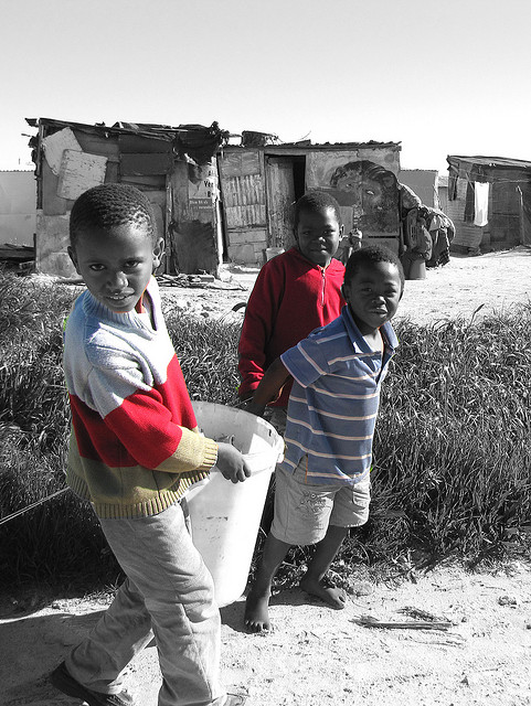
Governments may have begun Open Data, but the next wave is People Data. Any group in any part of the world can self-organize to collect data about their community and publish it on the cloud to effect change. This is an incredibly powerful development.
What’s the global data journalism community tweeting about this week? Our NodeXL #ddj mapping from April 16 to 22 finds @camellia_will debating the future of data portals, @DLeonhardt using hard data to show whether Democratic or Republican presidents have been more fiscally responsible and @morgenpost mapping bicycle thefts hotspots in Berlin.

What’s the global data journalism community tweeting about this week? Our NodeXL #ddj mapping from July 9 to 15 finds @morgenpost’s interactive slider showing how fast a German national footballer earns your monthly salary, tons of interesting Google search data in its @GoogleTrends data store, @durand101 and @puddingvizgender exposing bias in the UK House of Commons and @EdjNet offering a search engine for 800,000 EU datasets.

What’s the global data journalism community tweeting about this week? Our NodeXL #ddj mapping from Aug 6 to 12 finds @sciam profiling a new color scale for the color blind, @EDudinskij’s fun dissertation on dataviz in science fiction movies, @morgenpost using satellite imagery to show the consequences of droughts, and @gregladen and Grant Foster calling bull on a climate change denier’s flawed graphs.

What’s the global data journalism community tweeting about this week? Our NodeXL #ddj mapping from Aug 13 to 19 finds @puddingviz proving that women’s pockets are inferior to men’s once and for all, @vizzuality pondering the impact cartographers have on our understanding of the world by presenting nocturnal activity in daytime maps, @InfoTimes_ discovering the bots behind the political debate in Egypt and @hnrklndbrg’s visualizations on everything from loner jobs to knife emergency room visits.
What’s the global data journalism community tweeting about this week? Our NodeXL #ddj mapping from October 22 to 28 finds @NateSilver538 talking about election forecasting, @BBCNews highlighting the prevalence of fast food outlets in the UK, @washingtonpost comparing how tough it is for Americans to vote by state, and @business and @HowWeGetToNext on battling for fresh air in India and Europe.

What’s the global data journalism community tweeting about this week? Our NodeXL #ddj mapping from Oct 8 to 14 finds 25 inspirational data visualizations collated by @VismeApp, a @nytimes op-ed by climate scientists warning of the future dangers of heat and humidity combined, @FT maps of New York’s glut of luxury residences and @ejcnet with veteran data journalists on web scraping.
What’s the global data journalism community tweeting about this week? Our NodeXL #ddj mapping from December 3 to 9 finds @BuzzFeedNews mapping wildfire prone areas across America, @dwnews dissecting the value of insurance against climate change, the release of @infobeautyaward winners, and @jschwabish teaching fourth grade kids the wonders of data visualization in fun and inventive ways.