What’s the global data journalism community tweeting about this week? Our NodeXL #ddj mapping from March 11 to March 17 finds @davduf’s award-winning exposé of Yellow Vest injuries in France, @theboysmithy making music out of the yield curve, and @alisonkilling on mapping two fictional migrants’ journeys to Europe.
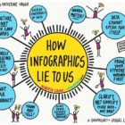
What’s the global data journalism community tweeting about this week? Our NodeXL #ddj mapping from March 25 to 31 finds @ajlabs visualizing air raids through sound, @infobae exposing secret dictatorship decrees in Argentina, @albertocairo presenting on how charts can be misleading and how to fix them, and @TheEconomist laying bare the “crimes” against data visualization they have committed.
What’s the global data journalism community tweeting about this week? Our NodeXL #ddj mapping from July 22 to 28 finds The New York Times analyzing the catalyst behind Hong Kong’s recent protests, National Geographic visualizing human migration in the past 50 years, Ellery Studio’s fun and informative renewable energy coloring book, and The Economist’s findings that Hillary Clinton could have won the 2016 US election if all Americans had turned up to vote.
What’s the global data journalism community tweeting about this week? Our NodeXL #ddj mapping from September 30 to Oct 6 finds Al Jazeera Labs analyzing the key issues debated and voted at the United Nations General Assembly since 1946, Datajournalism.com gathering expert advice on doing data journalism during natural disasters, Knight Center offering a free data visualization course in three languages, and El Confidencial visualizing the internal migration patterns in Spain’s provinces.
Two new resources for accessing open data begin this Research Desk update. We’ve also included data-rich resources on migration and a special section on terrorism.
What’s the global #ddj community tweeting about? Our NodeXL analysis from July 17 to 23 has @ajc intern @stephanierlamm mapping closed data, @zeitonline mapping the path of voluntary rescue boats in the Mediterranean Sea and @PPLAFF on the corruption scandal around Democratic Republic of the Congo President Joseph Kabila.
The last time GIJN Spanish Editor Catalina Lobo-Guerrero was in El Salvador, she was so shaken up by stories of violence and sexism towards women there that she ended up writing an Op-Ed for The New York Times with the following opening line: “I don’t want to go back to El Salvador.” But last month she returned to the country to attend the ForoCAP, the Central American Journalism Forum.
Full Migration Guide here. There’s a growing number of international and national journalism contests on migration, including a new US one with a whopping $100,000 prize.
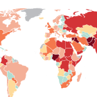
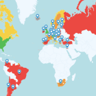
With an estimated 257 million migrants in the world, migration has emerged as one of the most contentious national and international issues. GIJN has gathered resources on this topic, including:
Useful sources of factual information
Reporting guidelines and media criticism
Information on journalism prizes (and the winners) concerning migration
Examples of recent and varied stories
See also GIJN’s resource page on human trafficking.
Time for a new collection of tools and reports. This week we’ve got a human rights database, file conversion for 208 formats, and nine new reports from research organizations, ranging from terrorism and corruption to European migration. Got a suggestion for The Research Desk? Write me at gprice@mediasourceinc.com.