How They Did It: Building a Visual Story with a Non-Visual Piece

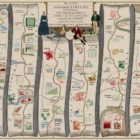
Australian journalist Rick Feneley wrote a powerful investigative piece about a string of gay hate crimes that plagued Australia’s eastern border. But before “The Gay Hate Decades” was published, Feneley was left with one last hurdle: Creating a digital element to accompany his work. And that’s where SBS web developer Ken Macleod came in.

Eight Interactive Investigative Stories To Check Out

Need some inspiration on making your next immersive investigative piece pop? This seriously impressive selection from Latin America includes stories about forced sterilization in Peru, the controversial Belo Monte hydroelectric dam in the Amazon and Big Pharma’s stranglehold in the region.

How They Did It: Inside a Mega-Collaboration on the US-Mexico Wall

More than 30 journalists set out to film and observe every foot of the border with Mexico, from Texas to California. The result was a fully interactive map with about 20 hours of aerial footage of the border, a seven-chapter story about the journey, 14 additional stories about the consequences of the wall, 14 mini-documentaries and an explanation of the history of the border itself. Here’s how they did it.

Top Ten #ddj: The Week’s Most Popular Data Journalism Links

Here are top data journalism tweets for May 8-14, per our NodeXL mapping: race against fastest marathoner (@alastairotter); mapping the ransomware attacks (@nytimes); French election data dive (@DataspotTLG and @ftdata); Alberto Cairo interview (@chytomo); and more.

Top Ten #ddj: This Week’s Top Data Journalism

What’s the global #ddj community tweeting about? Our NodeXL mapping from June 26 to July 2 includes a new data journalism handbook by @smfrogers, timeless hits and blocked tweets from @SPIEGELONLINE and data visualization pitfalls to avoid by @tamaramunzner.

This Week’s Top 10 in Data Journalism

What’s the global data journalism community tweeting about this week? Our NodeXL #ddj mapping from February 5 to 11 finds @flowingdata’s tips to visualizing missing or incomplete data, statistics of women’s challenges in journalism by @abraji and @generonumero and a cool income inequality interactive by @EconomicPolicy.

This Week’s Top 10 in Data Journalism

What’s the global data journalism community tweeting about this week? Our NodeXL #ddj mapping from February 19 to 25 finds economist @SethS_D analyzing Spotify data to find the correlation between our birth year and our music influences, @infowetrust illustrates three centuries of iconic infographics in a beautiful 17th century-styled dataviz and @EdjNet’s Stats Monitor gives you #ddj news leads on European data.