Data Journalism
Tips for Investigating Hate Crimes and Violence When Government Data Sources Fail
|
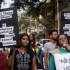
Journalist Rachel Chitra used news reports to build a database on hate crimes and violence in India. Here she gives tips for reporters facing a data gap, and offers lessons learned from her research about how journalists can reliably step in to gather, clean, and publish data when the government fails to keep track of important information.