data journalism AR-15 history visualization wound

Data Journalism Top 10: AR-15 Gun Violence, US Mortality, Water Scarcity, Russian Atrocities

In this week’s Data Journalism Top 10, The Washington Post did a 10-story deep dive on issues related to gun violence and the deadly AR-15 weapon after yet another school shooting. Our weekly roundup also features a look at global water scarcity hotspots, Russian war atrocities, and the enduring appeal of British television shows.

Uber Files secret access

Data Journalism Top 10: Uber Files, A New Notre-Dame, Saudi Sportswashing, Boris Johnson’s Legacy

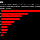
The Uber Files leak contains reams of data and documents that detail the inner workings of the ride-hailing company, and has led to a global investigation into the firm’s practices. Also in this week’s edition of the top 10 stories in data journalism, we look at the dubious legacy of the UK’s scandal-hit leader Boris Johnson, the reconstruction of Notre-Dame cathedral, and the widespread epidemic of US gun violence.

Data Journalism Top 10: China’s Gene Data, Norway’s Terror, India’s Sugar, Space Tourism

Ten years ago, terror attacks in Norway claimed the lives of 77 people and seriously injured at least 40. Our NodeXL mapping from July 5 to 11 found an interactive timeline piece by Norwegian newspaper Verdens Gang telling the story of a tragic event that impacted an entire nation. In this edition, we also feature an investigation by Reuters into a Chinese company harvesting genetic data from pregnant women, a series on gun violence in Chicago by The Trace, and a look at “silent” Russian politicians by IStories.

GIJN’s Data Journalism Top 10: School Shootings, Trains vs Planes, Ukraine-Russia Trade, UK Airport Crimes

What’s the global data journalism community tweeting about this week? Our NodeXL #ddj mapping from Aug 27 to Sept 2 finds @nytclimate personalizing climate change, @npr fact-checking the US Education Department’s school shooting data, @dwnews calculating the cost of travel to the environment, and @junkcharts dissecting the strengths of Thailand cave rescue data visualizations.

GIJN’s Data Journalism Top 10: The NYT’s Data Curriculum, Space Junk, Parents vs. Non-Parents

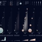
What’s the global data journalism community tweeting about this week? Our NodeXL #ddj mapping from June 17 to 23 finds Federica Fragapane visualizing space debris and their distance from earth, The New York Times open-sourcing its in-house data curriculum, Nathan Yau visualizing what time is lost for people once they have children, and Guns & America quantifying gunshot incidents within 300 meters of Washington, DC schools.