Document of the Day: Visual Vocabulary

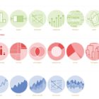
Inspired by the Graphic Continuum by Jon Schwabish and Severino Ribeca, the Financial Times graphic team came up with their own neat chart of visualizations. The Visual Vocabulary is a guide to help journalists pick the right type of visualization for their story.
GIJN’s Data Journalism Top 10: Lying Charts, Flu Tracker, Soaring Alcohol Costs, Taxing Football

What’s the global data journalism community tweeting about this week? Our NodeXL #ddj mapping from February 25 to March 3 finds a @nytimes profile of its much admired data editor @amandacox; a flu tracker by @morgenpost; and a double dose of skepticism in @amandabee’s roundup of bad data interpretations and @albertocairo’s “How Charts Lie” book.

GIJN’s Data Journalism Top 10: Populism Quiz, EU Fact-Checking, Twitter Data, GitHub 101

What’s the global data journalism community tweeting about this week? Our NodeXL #ddj mapping from March 18 to 24 finds a collection of beautiful news graphics by Megan Jaegerman curated by statistician @EdwardTufte, @tagesanzeiger’s quiz testing readers’ level of populist leanings, a new collaborative fact-checking effort by the name of @FactcheckEU, and @briromer’s interesting piece on maps that break strict geography rules.

Data Journalism’s Top Ten

What’s the global data journalism community tweeting about this week? Our NodeXL #ddj mapping from Sept 11 to 17 has @puntofisso using machine learning to map the average face of British politicians, @AftertheFloodco creating a font that turns numbers into sparklines, and @datassist listing seven deadly sins in statistical analysis.

This Week’s Top Ten in Data Journalism

What’s the global data journalism community tweeting about this week? Our NodeXL #ddj mapping from October 16 to 22 has @Sage_News analyzing data journalism practices over the past four years, data expert @albertocairo weighing in on uncertainty in interpreting graphics, @tristanf listing 12 new digital story formats for news and @R_Graph_Gallery’s inspiring Python Graph Gallery.

This Week’s Top 10 in Data Journalism

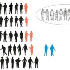
What’s the global data journalism community tweeting about this week? Our NodeXL #ddj mapping from January 29 to February 4 finds an @UpshotNYT analysis of the influence of Trump’s tweeting on Republicans’ attitudes towards the NFL, a new font typeface made out of human silhouettes created by @albertocairo and a fun Graphic Continuum card set by @jschwabish and @dataviz_catalog to use in the classroom.