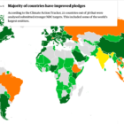
The Guardian analyzes countries' climate change pledges

Data Journalism Top 10: Toxic Air, Hidden Emissions, Twitter’s Algorithm, Can Data Die?

Our weekly analysis of the most popular data journalism stories on Twitter highlights a story by the Financial Times into how Europe gets its natural gas and the geopolitics of this industry. In this edition, we also feature major investigations into poisonous air and underreported methane emissions by ProPublica and The Washington Post as well as eight must-read newsletters curated by DataJournalism.com.

Data Journalism Top 10: China’s Gene Data, Norway’s Terror, India’s Sugar, Space Tourism

Ten years ago, terror attacks in Norway claimed the lives of 77 people and seriously injured at least 40. Our NodeXL mapping from July 5 to 11 found an interactive timeline piece by Norwegian newspaper Verdens Gang telling the story of a tragic event that impacted an entire nation. In this edition, we also feature an investigation by Reuters into a Chinese company harvesting genetic data from pregnant women, a series on gun violence in Chicago by The Trace, and a look at “silent” Russian politicians by IStories.

Data Journalism Top 10: A Stunning COVID Data Blunder, Beautiful News, Arctic Fires, Eviction Abuses, Isolating Students

The advancement of technology and availability of complex data tools has been a real boon to society, but utilizing the wrong tools for the job can have dire consequences. Our NodeXL #ddj mapping from October 5 to 11 finds British media organizations the BBC and the Guardian reporting on a blunder by the English national health authority: it used the wrong Excel file format to store data, resulting in the loss of thousands of COVID-19 test data results. Meanwhile, German television news program ZDF heute highlighted how the Arctic has reached record high temperatures this year, DCist and Spotlight DC examined problems in the process of evictions, and we find Information is Beautiful offering a daily feed of uplifting news among the gloom of 2020’s news cycle.

Top Ten Developments in Data Visualization This Year

Data visualization specialist Andy Kirk took a look at the most significant developments in the field so far this year and found the rise of the datagif, impressive work at the Hindustan Times and some beauties over at Periscopic. Here’s his top ten list in data visualization from January to June 2017.