GIJN’s Data Journalism Top 10: Lying Maps, Foul Mouthed Moms and Geek Sauce

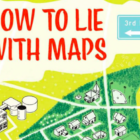
What’s the global data journalism community tweeting about this week? Our NodeXL #ddj mapping from April 30 to May 6 finds @theboysmithy talking to @MarkMonmonier about the influence a cartographer can exert over a naive map reader, @OCCRP’s data visualization platform to map complex crime networks and @PostGraphics’ mapping of diversity in America’s neighborhoods.
GIJN’s Data Journalism Top 10: History of Infographics, Colorism in Fashion, Weather Trends

What’s the global data journalism community tweeting about this week? Our NodeXL #ddj mapping from April 22 to 28 finds an interesting breakdown of colorism in fashion by @puddingviz, a series of gorgeous maps on natural disasters and extreme weather trends in the United States by @PostGraphics, a preview of a book on the history of infographics by @srendgen, and @UpshotNYT’s recap of its best articles from the past five years.