This Week’s Top 10 in Data Journalism

What’s the global data journalism community tweeting about this week? Our NodeXL #ddj mapping from March 19 to 25 finds a sobering study on income inequality between black and white males visualized by @nytimes, a cool time-lapse graphic of snow fall in the United States by @PostGraphics and peak baby-making seasons by country by @VismeApp and @ddjournalism.

This Week’s Top Ten in Data Journalism

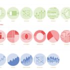
What’s the global data journalism community tweeting about this week? Our NodeXL #ddj mapping from October 16 to 22 has @Sage_News analyzing data journalism practices over the past four years, data expert @albertocairo weighing in on uncertainty in interpreting graphics, @tristanf listing 12 new digital story formats for news and @R_Graph_Gallery’s inspiring Python Graph Gallery.

This Week’s Top Ten in Data Journalism

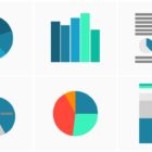
What’s the global data journalism community tweeting about this week? Our NodeXL #ddj mapping from November 27 to December 3 has @journocode’s festive data-driven advent calendar with tutorials and interviews, @FT mapping cities at risk of natural disasters affecting property prices, and a #VisualizationUniverse by Google News Lab and Adioma.

This Week’s Top 10 in Data Journalism

What’s the global data journalism community tweeting about this week? Our NodeXL #ddj mapping from January 1 to 7 has data journalism and data visualization roundups by @ddjournalism and @flowingdata, podcasts by @datastories and @fabrider, as well as an analysis on prices corresponding with ski resort altitudes by @duc_qn.