Biz Tools - Chapter 9 image

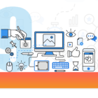
Инструменты для дизайна и визуализации данных

Бесплатные и условно бесплатные платформы и приложения, которые позволяют создавать простые и сложные дизайны на все случаи жизни, а также предоставляют коллекции стоковых изображений.

GIJC21, inequality, South Africa

Tips for Reporters Seeking to Reveal the Scale of Inequality

Data on the gap between rich and poor, privileged and marginalized, tends to be nuanced or hard to find. But amid warnings that the COVID-19 pandemic will accelerate the gap between rich and poor, investigative reporters need new tools to show the scale and implications of these gaps. From audiographs to drone imagery, and featuring tips from South Africa and Brazil, we share some of these methods here.

Mis herramientas favoritas: Gustavo Faleiros

Para nuestra serie Mis herramientas favoritas hablamos con el periodista brasileño Gustavo Faleiros, editor de investigaciones ambientales del Rainforest Investigations Network (RIN) del Pulitzer Center, la iniciativa que busca abordar historias en la intersección de cambio climático, la corrupción y la gobierno en las tres principales regiones de bosques tropicales del mundo: Amazonas, Cuenca del Congo y Sudeste de Asia.

GIJC21, inequality, South Africa

Dicas para repórteres investigando desigualdade

Os dados sobre as diferenças entre ricos e pobres, privilegiados e marginalizados tendem a ser difíceis de encontrar. Mas em meio a avisos de que a pandemia COVID-19 vai aumentar ainda mais essa desigualdade, repórteres investigativos precisam de novas ferramentas para mostrar a escala e as implicações dessas diferenças.

My Favorite Tools: Geo-Journalist Gustavo Faleiros

For our “My Favorite Tools” series, we spoke with Brazilian journalist Gustavo Faleiros, editor of environmental investigations at the Pulitzer Center where he leads the Rainforest Investigations Network (RIN), about mapping deforestation and using data to chart what is happening in global forests.

My Favorite Tools: Alberto Cairo on Data Visualization

For our series on journalists’ favorite tools, we spoke to Alberto Cairo, head of visualization at the University of Miami’s Institute for Data Science and Computing. Cairo shared several user-friendly tools and core principles to help investigative reporters shape their data visually to create new insights for audiences.

Top Ten #ddj: The Week’s Most Popular Data Journalism Links

What’s the data-driven journalism crowd tweeting? Here are the top links for May 3-12: #ddj awards (@GENinnovate); China’s EU stereotypes (@foreignpolicy); Atlantic slave trade (@slate); French employment (@Data_Match); Germany’s green cities (@morgenpost); bubble maps (@datawrapper); & more.