Since the start of the pandemic, GIJN has produced more than 40 free webinars in 7 languages designed for journalists covering the COVID-19 crisis. Come September, GIJN will expand its online offerings on a range of new topics, with continued coverage of the pandemic.
One of the biggest issues that comes with visualizing election forecasts is how to incorporate uncertainty in a way that is understandable to readers. Our NodeXL #ddj mapping from August 10 to 16 finds FiveThirtyEight explaining their election forecast design process and considerations. Elsewhere, The New York Times Magazine has been digging into the collapse of the fashion industry, and the Hong Kong Free Press is teaming up with the Journalism and Media Studies Centre of The University of Hong Kong to expand its protest research archive.
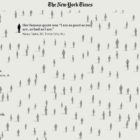
The coronavirus pandemic has upended the lives of people around the world, but some communities are especially hard hit. Our NodeXL #ddj mapping from July 6 to 12 finds The New York Times analyzing data that reveals Black and Latino people have been disproportionately affected by COVID-19, The Washington Post highlighting that business relief funds for the pandemic have gone to the rich and well-connected, and Bloomberg looking at more than 120 US businesses that say the coronavirus helped force them into bankruptcy.
How widespread is mask use in your country? Our NodeXL #ddj mapping from July 13 to 19 finds The New York Times mapping the odds of people encountering other mask wearers in the United States, two university professors quantifying the number of interruptions a parent suffers on average every hour while working from home, the Committee to Protect Journalists talking to data journalists about the struggles of reporting on COVID-19, and openDemocracy documenting cases of mistreatment of women in labor around the world since the pandemic started.
Which communities are most economically affected by the coronavirus pandemic? Our NodeXL #ddj mapping from May 25 to 31 finds the Toronto Star looking at the effects of Canada’s lockdown on different communities in the country, ProPublica sharing a tool that lets you explore United States federal government contracts related to the coronavirus, the Financial Times analyzing excess mortality in 19 countries, and the Knight Center for the Journalism in the Americas offering a free online course on ethics in data journalism.
The devastating consequences of the coronavirus pandemic can get lost in the mass of numbers presented. Journalists are working hard to humanize the data. Our NodeXL #ddj mapping from May 18 to 24 finds The New York Times with a moving tribute to lives lost to COVID-19; Schema Design, the Google News Initiative, and Axios visualizing coronavirus-related Google searches; and The Atlantic revealing the US CDC conflated results of two types of coronavirus tests.
Throughout the coronavirus pandemic, we’ve seen heated debate on whether to best solve the health crisis through “herd immunity” — the indirect protection that occurs when much of a population becomes immune to infection. Our NodeXL #ddj mapping from May 11 to 17 finds FiveThirtyEight creating a simulation calculator which shows that getting to herd immunity without a vaccine isn’t quite that simple; The Marshall Project tracking COVID-19 cases and deaths in prisons across America; the BBC’s Media Show highlighting data journalists as the media’s latest rock stars; and Istories and MediaZona examining elder abuse in Russia, which experts fear may worsen during the pandemic with so many people staying home.
Economies around the world have taken a big hit as countries implement lockdown measures to curb the spread of the coronavirus. Our NodeXL #ddj mapping from May 4 to 10 finds The New York Times looking into businesses that could be potential infection super-spreaders, and the alarmingly high unemployment rate, while German news media NDR and ZDF heute have examined lost life expectancy due to COVID-19 and the importance of intensive care beds. While Reuters published an important analysis into the use of little-known law that is increasingly being used to grant immunity to police who have used excessive force.
What will life be like after the coronavirus lockdown measures are relaxed? Our NodeXL #ddj mapping from April 27 to May 3 finds German news outlets ZDF heute and RBB24 looking into pedestrian traffic in Germany post-quarantine, the Financial Times and The New York Times highlighting the complexities of getting an accurate COVID-19 death toll and the problem of undercounting fatalities, and the Africa Centres for Disease Control and Prevention setting up a dashboard to track statistics related to the coronavirus across the region.
From “flattening the curve” to “social distancing,” and now “breaking the wave,” the global data journalism community is using new terminology in its attempts to explain the intricacies of COVID-19 to the masses. Our NodeXL #ddj mapping from April 6 to 12 finds Reuters Graphics explaining their “breaking the wave” chart, The Washington Post helping readers figure out the best material to use to make their own masks, the Financial Times comparing the response of China and the United States in handling the pandemic, and Press Gazette highlighting the huge appetite for data-driven visual journalism about COVID-19.