Data journalism is becoming increasingly important to newsrooms of all sizes. But how can a small newsroom begin to tackle it? Here are 10 steps your newsroom can take to improve data journalism efforts, while taking care of your limited budget.
Hawaii’s scenery can be breathtaking, with cliff-rimmed white-sand beaches and surf-worthy waves. But our NodeXL #ddj mapping (Dec. 28-Jan. 3) found ProPublica highlighting dramatic erosion of the island state’s beaches over the past century. Also in this edition, we feature an interactive graphic to calculate the time to achieve COVID-19 herd immunity based on the US vaccination rate, a global vaccine distribution tracker, Federica Fragapane’s visualization of stolen paintings, and a compilation of 2020’s best data visualization lists.
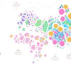
For those unfamiliar with GIJN’s Top 10 Data Journalism roundup, each week we select the most popular data journalism items on Twitter. We do this by using NodeXL to map use of the terms #ddj and data journalism, and then add a bit of old-fashioned human curation to highlight the most compelling items. At the end of the year, we survey the entire period and pick the best from hundreds of tweets. This year — the year of the pandemic — in which the coronavirus dominated public conversation and news headlines, our mapping reflects that reality.
Are scented candles a casualty of the coronavirus crisis? Our NodeXL #ddj mapping from November 23 to 29 found researcher Kate Petrova’s data analysis revealing that scented candles have suffered a blow in online reviews and a decrease in ratings, possibly linked to the coronavirus’ ability to affect people’s sense of smell. Elsewhere, Germany’s Zeit Online created a COVID-19 infection risk calculator, the COVID Tracking Project explained how holidays and weekends disrupt the recording and publishing of virus data, and Reuters analyzed the shortcomings of the coronavirus contact tracing system in England. Meanwhile, the Sigma Awards, which celebrate the world’s best data journalism, have opened for entries.
Have you ever noticed how your Google search results now appear with boxes of information extracted from the websites by the search engine? Our NodeXL #ddj mapping from November 9 to 15 found The Markup’s new “Simple Search” browser extension, which allows you to view the best results in the “traditional” Google search format. We also discovered a visualization of the connection between members of the ruling British Conservative Party and COVID-19 contracts, InfoAmazonia’s investigation into mining requests in protected Indigenous land in the Amazon, and German daily Der Tagesspiegel showing that the American private equity group Blackstone is a major private property owner in the German capital, Berlin.
The US presidential election dominated the Twitter chat waves last week. Our NodeXL #ddj mapping from November 2 to 8 found data journalists sharing live election results trackers by Bloomberg, The Washington Post, and The New York Times, while The Atlantic and Slate weighed in on the problems of polling. Elsewhere open source platform Mapbox is organizing an election mapping contest, and Lazer Lab created a dashboard to explore 29 million tweets related to COVID-19 shared by over half a million Americans.
Personal data is big business, and not only for private firms. Our NodeXL #ddj mapping from September 21 to 27 finds a number of troubling investigations: Channel 4 News revealed that Donald Trump’s 2016 presidential campaign used personal data from Facebook and Cambridge Analytica to deter Black voters from casting their ballot; Consumer Reports found that companies were making it difficult for people to opt out of having their data sold despite a landmark California law that protects individual data rights; and Noteworthy and The Business Post highlighted a concerning lack of clear regulation surrounding access to, and use of, genetic and patient data by private firms.
“Death is the great equalizer,” or so the saying goes. But our NodeXL #ddj mapping from September 21 to 27 finds an investigation by The Boston Globe Spotlight team that proves otherwise: race and income influences how and when people die. In this Top 10 #ddj edition, we also found The Markup launching its new privacy tool, the Financial Times examining how Finland, and the cities of Madrid and New York City handled the pandemic, as well as a great guide by Datawrapper’s Lisa Charlotte Rost to choosing better colors for your charts.
For our series about journalists’ favorite tools, we spoke with Barbara Maseda, the founder and editor of Proyecto Inventario, an open data platform for journalists reporting on her native Cuba. She told GIJN about the investigative tools she uses to overcome the difficulties of data reporting in and about Cuba.
Following the 2011 Tunisian revolution, the loosening of free speech created a vibrant marketplace of ideas but investigative reporting still lagged. A group of Tunisian journalists set out to change this by founding independent media outlet Inkyfada, which has experimented with data and audio storytelling and worked hard to diversify its revenue in order to guard its independence. Layli Foroudi profiled Inkyfada for GIJN.