This week’s Top 10 in Data Journalism looks at the impact of the Ukraine war on the food prices around the world, inequality in radiotherapy access in Spain, the cost of breastfeeding for women, how going viral on TikTok can bring career success, and the places Germans can go for €9.
The Uber Files leak contains reams of data and documents that detail the inner workings of the ride-hailing company, and has led to a global investigation into the firm’s practices. Also in this week’s edition of the top 10 stories in data journalism, we look at the dubious legacy of the UK’s scandal-hit leader Boris Johnson, the reconstruction of Notre-Dame cathedral, and the widespread epidemic of US gun violence.
The dramatic effects of sea level rise can be visualized in a variety of ways. For emotional appeal, digitally modified photos can show how rising water levels might affect treasured monuments and buildings.
This week, GIJN’s roundup of the best in data journalism features an analysis of the impact of Russia’s Black Sea blockade on the global food chain, a deep dive into the US military’s role in aiding Saudi-led airstrikes in Yemen, and a look at how different forms of inequality affect the lives of residents in Brussels, Belgium.
In a lightning round session at #GIJC21, a panel of leading reporters and editors needed just five minutes each to outline new tools and databases that any reporter can use to gather hard-to-find facts.
This week’s Top 10 in Data Journalism column looks at schools shootings in the US, the faces from China’s Uyghur detention camps, heat records in the US, migrants at the Polish-Belarus border, the parcels sent by the Russian troops back home or the suicide toll in European jails.
From Wikileaks to the FinCEN files, huge stories have made use of data visualizations to engage their readers and simplify complicated topics. But while data journalism is a powerful tool for investigative journalists, the vast possibilities of this world are wasted if reporters cannot effectively communicate the data they have found to the reader. To test your knowledge, GIJN has created an annotated quiz so readers can assess their current knowledge and understand the mistakes we all make while creating data visualizations.
This week’s Top 10 in Data Journalism column looks at a historical investigation into Haiti’s lost billions, visualizing COVID’s US death toll, and Asia’s growing wealth inequality.
In this week’s Top 10 in Data Journalism, we look at pro-Russian propaganda’s popularity in Africa and South Asia, the rising costs of goods in the US and India, inequitable disaster funding, and the power of animating data visualization.
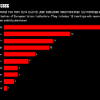
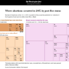
This week’s Top 10 in Data Journalism features an analysis of Russian military casualties, the heat wave scorching India, myths about the link between dog breeds and behavior, and the potential impact of overturning a key judicial ruling on abortion in the US.