This Week’s Top Ten in Data Journalism

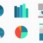
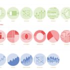
What’s the global data journalism community tweeting about this week? Our NodeXL #ddj mapping from October 16 to 22 has @Sage_News analyzing data journalism practices over the past four years, data expert @albertocairo weighing in on uncertainty in interpreting graphics, @tristanf listing 12 new digital story formats for news and @R_Graph_Gallery’s inspiring Python Graph Gallery.
This Week’s Top Ten in Data Journalism

What’s the global data journalism community tweeting about this week? Our NodeXL #ddj mapping from October 23 to 29 has @fedfragapane and @piaaaac visualizing six asylum seekers’ routes, @Recode breaking down the Gates Foundation’s philanthropic contributions by category and @lisacrost offering tips on how to choose a color palette for choropleth maps.

This Week’s Top Ten in Data Journalism

What’s the global data journalism community tweeting about this week? Our NodeXL #ddj mapping from November 27 to December 3 has @journocode’s festive data-driven advent calendar with tutorials and interviews, @FT mapping cities at risk of natural disasters affecting property prices, and a #VisualizationUniverse by Google News Lab and Adioma.

This Week’s Top 10 in Data Journalism

What’s the global data journalism community tweeting about this week? Our NodeXL #ddj mapping from December 4 to 10 has @Reuters documenting the deplorable living conditions at refugee camps in Bangladesh, Financial Times’ @theboysmithy transforming bad charts into useful ones and the impressive work of the 2017 @infobeautyaward winners.

This Week’s Top 10 in Data Journalism

What’s the global data journalism community tweeting about this week? Our NodeXL #ddj mapping from January 1 to 7 has data journalism and data visualization roundups by @ddjournalism and @flowingdata, podcasts by @datastories and @fabrider, as well as an analysis on prices corresponding with ski resort altitudes by @duc_qn.

How They Did It: Developing a Data-Driven Navigator on Gun Laws

Last August, Everytown for Gun Safety, a non-profit research and advocacy group for gun control, launched the Gun Law Navigator, an exploratory data visualization tool explaining how states in America regulate guns. The project, developed by the Boston-based creative digital studio Upstatement, received lots of attention not only for examining such a sensitive topic, but also for successfully telling a visual, data-driven story about a complex subject: legislation.

This Week’s Top 10 in Data Journalism

What’s the global data journalism community tweeting about this week? Our NodeXL #ddj mapping from January 15 to 21 finds an interactive @voxdotcom piece on American districts which are reducing or perpetuating racial segregation in schools, several data-related good book recommendations by @stephencredmond and @Gapminder and a podcast discussion of memorable visualizations between @michelle_borkin and @datastories.

This Week’s Top 10 in Data Journalism

What’s the global data journalism community tweeting about this week? Our NodeXL #ddj mapping from January 22 to 28 finds a gorgeous data visualisation of German streets by @zeitonline, a detailed data analysis of Roger Federer’s tennis career by @srfdata and a look at eight alternatives in redistricting US voting boundaries by @FiveThirtyEight.

This Week’s Top 10 in Data Journalism

What’s the global data journalism community tweeting about this week? Our NodeXL #ddj mapping from February 5 to 11 finds @flowingdata’s tips to visualizing missing or incomplete data, statistics of women’s challenges in journalism by @abraji and @generonumero and a cool income inequality interactive by @EconomicPolicy.