Top Ten #ddj: This Week’s Top Data Journalism

What’s the global #ddj community tweeting about? Our NodeXL mapping from June 26 to July 2 includes a new data journalism handbook by @smfrogers, timeless hits and blocked tweets from @SPIEGELONLINE and data visualization pitfalls to avoid by @tamaramunzner.
Top Ten #DDJ: This Week’s Top Data Journalism

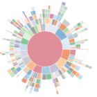
What’s the global #ddj community tweeting about? Our NodeXL mapping from July 10 to 16 has Dwarshuis on the Airbnb takeover of Amsterdam, @blprnt on taking a systems approach to data and @SPIEGELONLINE and @Correctiv_org on Big Pharma’s payments to doctors.

Top Ten #DDJ: This Week’s Top Data Journalism

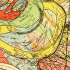
What’s the global #ddj community tweeting about? Our NodeXL analysis from July 17 to 23 has @ajc intern @stephanierlamm mapping closed data, @zeitonline mapping the path of voluntary rescue boats in the Mediterranean Sea and @PPLAFF on the corruption scandal around Democratic Republic of the Congo President Joseph Kabila.

Data Journalism’s Top Ten

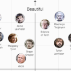
What’s the global data journalism community tweeting about this week? Our NodeXL #ddj mapping from August 7 to 13 has @UpshotNYT plotting Game of Thrones characters in two dimensions, @paulbradshaw offering 10 principles for data journalism and data journalists at a @dagstuhl workshop with narrative patterns for data-driven storytelling.

Data Journalism’s Top Ten

What’s the global data journalism community tweeting about this week? Our NodeXL #ddj mapping from August 14 to 20 has @Forbes mapping six years of American television news, the looming Kantar @infobeautyaward’s submission deadline and @sarahslo’s list of women in the field of data visualization.

Top Ten Developments in Data Visualization This Year

Data visualization specialist Andy Kirk took a look at the most significant developments in the field so far this year and found the rise of the datagif, impressive work at the Hindustan Times and some beauties over at Periscopic. Here’s his top ten list in data visualization from January to June 2017.

Data Journalism’s Top Ten

What’s the global data journalism community tweeting about this week? Our NodeXL #ddj mapping from August 21 to 27 has useful digital forensics tools from @bellingcat, mathematician Cathy O’Neil warning us about blind faith in big data and an analysis of Delhi’s insane dowry demands by @htTweets.

Data Journalism’s Top Ten

What’s the global data journalism community tweeting about this week? Our NodeXL #ddj mapping from August 28 to Sept 3 has the most amusing memes you’ll read all day from  @xocasgv, a trip with @stuartathompson to the New York Times’ morgue to discover fascinating graphics from the 50s and 60s and crowdsourcing flooded roads by @HoustonChron.

Data Journalism’s Top Ten

What’s the global data journalism community tweeting about this week? Our NodeXL #ddj mapping from Sept 4 to 10 has @FastCoDesign bringing the #EndtheRainbow argument to the fore, @puddingviz analyzing driving times to abortion clinics in the US and @nsuwatch dissecting a trial involving a German terrorist organization by the numbers.

Data Journalism’s Top Ten

What’s the global data journalism community tweeting about this week? Our NodeXL #ddj mapping from Sept 11 to 17 has @puntofisso using machine learning to map the average face of British politicians, @AftertheFloodco creating a font that turns numbers into sparklines, and @datassist listing seven deadly sins in statistical analysis.