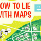
GIJN’s Data Journalism Top 10: Innovative Visualization, Data Fellowships and the Dark Side

What’s the global data journalism community tweeting about this week? Our NodeXL #ddj mapping from April 23 to 29 finds @thetimes’ interactive which will determine whether you will join the dark side, @albertocairo discussing precedents to innovative visualizations and @srendgen talking about the technological revolution encouraging data journalism.

GIJN’s Data Journalism Top 10: Lying Maps, Foul Mouthed Moms and Geek Sauce

What’s the global data journalism community tweeting about this week? Our NodeXL #ddj mapping from April 30 to May 6 finds @theboysmithy talking to @MarkMonmonier about the influence a cartographer can exert over a naive map reader, @OCCRP’s data visualization platform to map complex crime networks and @PostGraphics’ mapping of diversity in America’s neighborhoods.

GIJN’s Data Journalism Top 10: Trump Country, Conga Lines and the Nerds in the Corner

What’s the global data journalism community tweeting about this week? Our NodeXL #ddj mapping from May 7 to 13 finds @adamrpearce brilliantly illustrating the problem and causes of backed up trains along the New York subway, @Textyorgua_Eng highlights the destruction of Ukraine’s landscape due to illegal amber mining and @duc_qn analyzes which university gives you the best bang for your buck.

GIJN’s Data Journalism Top 10: Sex in Parliament, Peace and Press Freedom and Vanishing Global Water

What’s the global data journalism community tweeting about this week? Our NodeXL #ddj mapping from May 14 to 20 finds @FinancialTimes highlighting @NASA data on high risk drought areas across the globe, @infogram juxtaposing press freedom with global peace rankings and @BBCNews showing how smuggling mobile phones is a rampant problem in English and Welsh prisons.

GIJN’s Data Journalism Top 10: Racing Snails, Presidential Gifts and Berlin’s Building Blocks

What’s the global data journalism community tweeting about this week? Our NodeXL #ddj mapping from May 21 to 27 finds @nigelblue’s wildly humorous infographic book about crazy competitions across the globe, @Data_Match breaks down the list of gifts given to the president of the United States by foreign leaders and @FinancialTimes looks into the pressures Antarctica faces.

GIJN’s Data Journalism Top 10: School Murders, Visualizing Uncertainty and Brazil’s Deadly Week

What’s the global data journalism community tweeting about this week? Our NodeXL #ddj mapping from May 28 to June 3 finds @washingtonpost’s alarming data on gun violence in American schools, @vlandham’s experiments with visualizing uncertainty and @GENinnovate with the latest data journalism trends displayed in the 2018 Data Journalism Awards entries.

GIJN’s Data Journalism Top 10: Simon Says, AI’s Breakthrough Year and Global Migration’s Portal

What’s the global data journalism community tweeting about this week? Our NodeXL #ddj mapping from June 4 to 10 finds an awesome curated list of resources for visualizing music by @Willian_justen, a deep dive into unsolved murders across America by @washingtonpost and @CarbonBrief mapping of the past, present and future of global coal power plants.

GIJN’s Data Journalism Top 10: World Cup, South Africa’s Pit Toilets and France’s Deadly Police Interventions

What’s the global data journalism community tweeting about this week? Our NodeXL #ddj mapping from June 11 to 17 finds three data stories about the World Cup, from @BBCSport, @FT and @TspLeute, @guardian looked at at how urban cycling can change the world and @Bastamag explores 40 years of deaths from police interventions in France.