Журналистика данных

Топ-10 DDJ: ошибка в данных о COVID, клан в Кыргызстане и арктические пожары в России
|
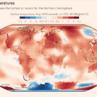
Как неправильный формат файла Excel приводит к распространению COVID-19, высокие температуры в Арктической зоне России вызывают пожары, а предвыборные прогнозы – сбивают с толку избирателей.