Журналистика данных
В Топ 10 DDJ: Маски работают. Реально. И мы покажем, как
|
Сопоставление количества коек в больницах и пациентов с COVID по регионам, коронавирусные пробки на дорогах и несколько статей о президентских выборах в США.
Global Investigative Journalism Network (https://archive.gijn.org/tag/covid-19/page/19/)
Сопоставление количества коек в больницах и пациентов с COVID по регионам, коронавирусные пробки на дорогах и несколько статей о президентских выборах в США.

For our series about journalists’ favorite tools, we spoke with Katherine Eban, who has won awards for her work on gun trafficking, pharmaceutical counterfeits, and CIA interrogations. She described some of the low-tech tools and old-school strategies that have helped her break major stories on the COVID-19 pandemic.
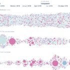
Research shows that masks are an essential defense against the coronavirus. Our NodeXL #ddj mapping from October 26 to November 1 finds The New York Times using animation and augmented reality to show just how masks work to filter and trap air particles that may carry the virus. This edition also includes several pieces on the United States presidential election: FiveThirtyEight founder Nate Silver talks to Vox about polling errors and uncertainties, freelance journalist Betsy Mason explains common shortcomings of US election maps, and NYT analyzed more than 25 million donations to Trump and Biden’s presidential campaigns.

Gearing up for Halloween? You’ll want to refer to our NodeXL #ddj mapping from October 19 to 25. We found FiveThirtyEight’s ultimate Halloween candy ranking from the archives to please the palates of finicky trick-or-treaters. This edition also includes The Economist’s mathematical model to determine whether Formula 1 racing success depends on its driver or the car engineer; The Globe and Mail examines bias in Canada’s prison system; and El Pais looks into how to reduce the probability of COVID-19 transmissions indoors.
FiveThirtyEight составляет рейтинг сладостей на Хэллоуин, The Economist определяет, от кого зависит успех в гонках Формулы-1; Globe and Mail исследует предвзятость тюремной системы Канады; а El Pais изучает, как сократить риск передачи COVID-19 в помещениях.

Lo que determina si tu redacción sigue siendo viable en un contexto de pandemia, es cómo administras tu efectivo y a tu equipo, tanto de planta como freelance.

Geospatial technologies and data can be used to contain and respond to the spread of a disease, but can also help in pre-empting and preventing them. Looking at outbreaks of malaria, SARS, H1N1 and Zika, among other viruses, Avneep Dhingra explores how maps and geospatial technology have helped during different outbreaks.

ProPublica изучает, как глобальное потепление усугубляет лесные пожары; дизайнер Уилл Чейз визуализирует разрушительные ураганы в виде интерактивного колеса. Financial Times обобщает данные о пандемии, а Markup ищут дата-журналиста в новый проект, посвященный алгоритмам соцсетей.
How does climate change increase the likelihood of weather extremes? Our NodeXL #ddj mapping from October 12 to 18 finds ProPublica examining how the warming global climate exacerbates wildfire activity, and designer Will Chase visualizing some of the most destructive hurricanes with an interactive wheel graphic. The Financial Times is summarizing key trends of the pandemic using charts, maps, and graphics, while The Markup announced its latest project looking into the black box algorithms of social media platforms.

The advancement of technology and availability of complex data tools has been a real boon to society, but utilizing the wrong tools for the job can have dire consequences. Our NodeXL #ddj mapping from October 5 to 11 finds British media organizations the BBC and the Guardian reporting on a blunder by the English national health authority: it used the wrong Excel file format to store data, resulting in the loss of thousands of COVID-19 test data results. Meanwhile, German television news program ZDF heute highlighted how the Arctic has reached record high temperatures this year, DCist and Spotlight DC examined problems in the process of evictions, and we find Information is Beautiful offering a daily feed of uplifting news among the gloom of 2020’s news cycle.