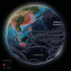
What’s the global data journalism community tweeting about this week? Our NodeXL #ddj mapping from November 25 to December 1 finds The New York Times profiling Bellingcat and its use of OSINT techniques; the International Consortium of Investigative Journalists and Stanford University collaborating to employ artificial intelligence to solve a journalistic problem; and the Science Communication Lab creating a beautiful interactive scientific poster to explore the world’s oceans.
What’s the global data journalism community tweeting about this week? Our NodeXL #ddj mapping from Aug 6 to 12 finds @sciam profiling a new color scale for the color blind, @EDudinskij’s fun dissertation on dataviz in science fiction movies, @morgenpost using satellite imagery to show the consequences of droughts, and @gregladen and Grant Foster calling bull on a climate change denier’s flawed graphs.
What’s the global data journalism community tweeting about this week? Our NodeXL #ddj mapping from Oct 8 to 14 finds 25 inspirational data visualizations collated by @VismeApp, a @nytimes op-ed by climate scientists warning of the future dangers of heat and humidity combined, @FT maps of New York’s glut of luxury residences and @ejcnet with veteran data journalists on web scraping.
What’s the global data journalism community tweeting about this week? Our NodeXL #ddj mapping from July 29 to August 4 finds a number of articles related to the climate crisis, including the BBC’s piece on tree planting and its interactive tool on temperatures across the world, as well as Alberto Cairo’s blog post on misleading charts created by climate deniers. We also found useful tips and tools: a data GIF maker by Google News Initiative, Datajournalism.com’s strategies for teaching data journalism, and Paul Bradshaw’s tutorial on how to extract numeric data from phrases.
What’s the global data journalism community tweeting about this week? Our NodeXL #ddj mapping from October 7 to 13 finds The New York Times tackling the topic of auto emissions as a significant climate problem, The Washington Post mapping the colors of America’s fall foliage across the nation, St. Louis Post-Dispatch sharing its newsroom process in data transparency, and Nicholas Strayer offering a tutorial to build your own cool resume using R.
What’s the global data journalism community tweeting about this week? Our NodeXL #ddj mapping from July 31 to August 6 has @nytimes charting increasingly hot summers, @qz on Wannacry ransomware hackers cashing out their ill-gotten gains and @tagesanzeiger mapping lightning prone areas in Switzerland.
What’s the global data journalism community tweeting about this week? Our NodeXL #ddj mapping from Sept 4 to 10 has @FastCoDesign bringing the #EndtheRainbow argument to the fore, @puddingviz analyzing driving times to abortion clinics in the US and @nsuwatch dissecting a trial involving a German terrorist organization by the numbers.
What’s the global data journalism community tweeting about this week? Our NodeXL #ddj mapping from August 28 to Sept 3 has the most amusing memes you’ll read all day from @xocasgv, a trip with @stuartathompson to the New York Times’ morgue to discover fascinating graphics from the 50s and 60s and crowdsourcing flooded roads by @HoustonChron.
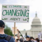
From the tropics to the Arctic, Indigenous peoples are on the front lines of the climate crisis. Investigative reporting is critical to tell their stories, delve into the causes and effects of global warming, and examine mitigation strategies.
What’s the investigative journalism twist on covering the climate crisis? Much of the biggest news understandably comes from scientists, but there’s lots of potential for imaginative reporting, as discussed in a new GIJN resource guide on climate.