GIJN’s Data Journalism Top 10: Copycat Laws, Melting Ice, Rwanda’s Genocide Trials, Data Do’s and Don’ts

What’s the global data journalism community tweeting about this week? Our NodeXL #ddj mapping from April 1 to 7 finds @JuliaAngwin sharing do’s and don’ts of data journalism projects at @journalismfest, @elconfidencial highlighting the negative effects on Spain’s economy if women stopped working for a day, @azcentral and @USATODAY revealing just how many bills in the United States are copied from model legislations, and @justiceinfonet visualizing data on trials for the Rwandan genocide.

GIJN’s Data Journalism Top 10: Avengers on the Move, Nonprofit Tax Filings, Visualizing Uncertainty

What’s the global data journalism community tweeting about this week? Our NodeXL #ddj mapping from June 3 to 9 finds @sto3psl mapping places the Avengers visited in Europe, @fedfragapane visualizing which elements in the periodic table are in danger of running out, @srfdata highlighting the top worries of the Swiss and @propublica doing researchers and journalists a huge public service by making 3 million US nonprofit records text-searchable.

GIJN’s Data Journalism Top 10: Hong Kong Protests, Migration Waves, Democratizing Dataviz

What’s the global data journalism community tweeting about this week? Our NodeXL #ddj mapping from July 22 to 28 finds The New York Times analyzing the catalyst behind Hong Kong’s recent protests, National Geographic visualizing human migration in the past 50 years, Ellery Studio’s fun and informative renewable energy coloring book, and The Economist’s findings that Hillary Clinton could have won the 2016 US election if all Americans had turned up to vote.

GIJN’s Data Journalism Top 10: Visualizing Climate Change, Numbers from Phrases, Democratic Donors, Moscow Money

What’s the global data journalism community tweeting about this week? Our NodeXL #ddj mapping from July 29 to August 4 finds a number of articles related to the climate crisis, including the BBC’s piece on tree planting and its interactive tool on temperatures across the world, as well as Alberto Cairo’s blog post on misleading charts created by climate deniers. We also found useful tips and tools: a data GIF maker by Google News Initiative, Datajournalism.com’s strategies for teaching data journalism, and Paul Bradshaw’s tutorial on how to extract numeric data from phrases.

GIJN’s Data Journalism Top 10: Burning Amazon, Mass Shootings, Hungarian Kings

What’s the global data journalism community tweeting about this week? Our NodeXL #ddj mapping from August 19 to 25 finds Bloomberg mapping the alarming degradation of the Amazon rainforest, Alyssa Fowers discussing variations in visualizing mass shootings and their corresponding impact on readers, Data Carpentry sharing tips for organizing data in spreadsheets, and Atlatszo visualizing the succession of Hungarian kings.

Top Ten #ddj: The Week’s Most Popular Data Journalism Links

What’s the data-driven journalism crowd tweeting? Here are top links for Aug 29-Sept 2: Earth warms at top rate in 1000 years (@NASAClimate); 2 million oil/gas docs (@Open_Oil); G20 CO2 emissions (@CarbonBrief); German dialects (@SPIEGELONLINE); Munich massacre on Twitter (@puls_br); ;and more.

Top Ten #ddj: The Week’s Most Popular Data Journalism Links

Here are the hottest data journalism tweets for Jan 30-Feb 5, per our NodeXL mapping: Visual Trumpery (@albertocairo); dataviz colour functions (@FastCoDesign); How to Lie with Statistics (@PenguinBooks); mapping 13m climate change tweets (@CarbonBrief); OpenStreetMap (@datenjournalist); & more.

Top Ten #ddj: The Week’s Most Popular Data Journalism Links

Here are the top data journalism tweets for March 6-12, per our NodeXL mapping: ski resorts & climate (@SPIEGELONLINE); science reporting grants (@ddjournalism); chart chooser (Andrei Pandre); #Tapestryconf recap (@catmule); scraping MP data (@marcelpauly); US middle class fail (@nytimes); & more.

Top Ten #ddj: The Week’s Most Popular Data Journalism Links

Here are the top data journalism tweets for Apr 3-9, per our NodeXL mapping: #fakenews guide (@PublicDataLab); election bots (@d1gi); data story rules (@surendranb); China climate risk (@nytimes); UK jobs (@sole24ore); #PerugiaPledge (@dw_innovation); & more.

Top Ten #ddj: The Week’s Most Popular Data Journalism Links

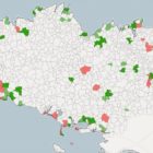
Here are top data journalism tweets for Apr 10-16, per our NodeXL mapping: Brittany’s posh hotels (@dataspotTLG); Flourish #dataviz tool (@FastCoDesign); US health insurance (@NPR); hexagonal Europe (@MusMekh); visual vocabulary (@ftdata); data internships (@ONS); China’s rising water (@kimmelman); & more.