“এবারের গ্রীষ্মে, বাংলাদেশের এক-চতুর্থাংশ পানিতে ডুবে ছিল। সপ্তাহব্যাপী বৃষ্টির কারণে উত্তর ও দক্ষিণ কোরিয়ার বড় একটি অংশে বন্যা হয়েছে। জলবায়ু পরিবর্তনের কারণে সৃষ্ট সম্পদের স্বল্পতার জন্য যুদ্ধ ও দ্বন্দ্বও ক্রমশ বাড়ছে। হত্যা বাড়ছে, মানুষ বাস্তুচ্যুত হচ্ছে। আগামী বছর এগুলো আরো তীব্র হবে।“
How does climate change increase the likelihood of weather extremes? Our NodeXL #ddj mapping from October 12 to 18 finds ProPublica examining how the warming global climate exacerbates wildfire activity, and designer Will Chase visualizing some of the most destructive hurricanes with an interactive wheel graphic. The Financial Times is summarizing key trends of the pandemic using charts, maps, and graphics, while The Markup announced its latest project looking into the black box algorithms of social media platforms.
How fast is the coronavirus spreading in countries around the world? Our NodeXL #ddj mapping from September 14 to 20 finds data visualization designer Jan Willem Tulp simulating the speed of COVID-19 infections and German television news program ZDF heute mapping how the pandemic traversed the globe. Meanwhile, Thibi Recipes explores tutoring data journalism as if you’re following a cooking recipe, the Financial Times reports on climate extremes, and ICIJ and Buzzfeed bare suspect financial data.
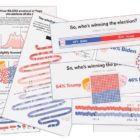
One of the biggest issues that comes with visualizing election forecasts is how to incorporate uncertainty in a way that is understandable to readers. Our NodeXL #ddj mapping from August 10 to 16 finds FiveThirtyEight explaining their election forecast design process and considerations. Elsewhere, The New York Times Magazine has been digging into the collapse of the fashion industry, and the Hong Kong Free Press is teaming up with the Journalism and Media Studies Centre of The University of Hong Kong to expand its protest research archive.
In the midst of the pandemic, some newsrooms haven’t forgotten about the issue of climate change. Our NodeXL #ddj mapping from July 20 to 26 found ProPublica partnering with The New York Times Magazine to examine climate migration and where climate refugees are moving to. On the COVID-19 front, FiveThirtyEight revealed the disparities in the availability of testing sites between Black and Hispanic neighborhoods and white areas, broadcaster RBB highlighted that the risk of coronavirus was more keenly felt by low-income earners, and the Google News Initiative and Agência Lupa communicated the impact of the coronavirus by visually putting readers at the epicenter of an outbreak.
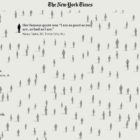
The devastating consequences of the coronavirus pandemic can get lost in the mass of numbers presented. Journalists are working hard to humanize the data. Our NodeXL #ddj mapping from May 18 to 24 finds The New York Times with a moving tribute to lives lost to COVID-19; Schema Design, the Google News Initiative, and Axios visualizing coronavirus-related Google searches; and The Atlantic revealing the US CDC conflated results of two types of coronavirus tests.
GIJN asked investigative journalists around the world to look ahead at what’s in store for 2020. Here are the trends, key forces, and challenges they expect will affect investigative and data journalism in the coming year, as well as the new skills and approaches we should be thinking about.
Throughout this year, we’ve brought you weekly “snapshots” of the Twitter conversation surrounding data journalism. But this week, we look at what the global data journalism community tweeted about the most during all of 2019. Below you’ll find links to stories from Brazil, Germany, Switzerland, the UK, the US, and elsewhere.
De Correspondent, a Dutch member-funded journalism platform, leverages on the shared knowledge and experience of their 55,000 paying members as much as possible in their reporting. Here’s their 3-step workflow incorporating reader engagement, which helped them land their scoop on Shell.
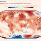
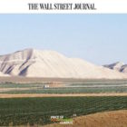
The Wall Street Journal’s graphic-heavy series “The Price of Climate” took an ambitious look at how financial and economic markers reflect present and future thinking about the climate. One of the editors that worked on it says it was a response to the fact “that a lot of climate change stories feel and look the same.” Here’s how they did it.