Top Ten #ddj: This Week’s Top Data Journalism

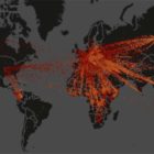
What’s the #ddj community tweeting about? Our NodeXL mapping from May 29 to June 4 includes research on social media’s fake propaganda from @ddjournalism, mapping global refugee flow from @FastCompany and the tax bracket racket from @voxdotcom.

Data Journalism’s Top Ten

What’s the global data journalism community tweeting about this week? Our NodeXL #ddj mapping from July 31 to August 6 has @nytimes charting increasingly hot summers, @qz on Wannacry ransomware hackers cashing out their ill-gotten gains and @tagesanzeiger mapping lightning prone areas in Switzerland.

This Week’s Top Ten in Data Journalism

What’s the global data journalism community tweeting about this week? Our NodeXL #ddj mapping from Sept. 18 to 24 features Wikipedia of Data Visualization, the State of Data Journalism, Dear Data Postcard Kit, and German election data.

Behind the First Arab Data Journalists’ Network

In 2012, Amr Eleraqi launched a data visualization website to introduce the concept of data visualization to the Arabic-speaking world. Earlier this year, Eleraqi and team of nine launched the first Arab Data Journalists’ Network. Here’s how the group plans on changing the data journalism scene in the region.

This Week’s Top 10 in Data Journalism

What’s the global data journalism community tweeting about this week? Our NodeXL #ddj mapping from December 4 to 10 has @Reuters documenting the deplorable living conditions at refugee camps in Bangladesh, Financial Times’ @theboysmithy transforming bad charts into useful ones and the impressive work of the 2017 @infobeautyaward winners.

This Week’s Top 10 in Data Journalism

What’s the global data journalism community tweeting about this week? Our NodeXL #ddj mapping from January 1 to 7 has data journalism and data visualization roundups by @ddjournalism and @flowingdata, podcasts by @datastories and @fabrider, as well as an analysis on prices corresponding with ski resort altitudes by @duc_qn.

This Week’s Top 10 in Data Journalism

What’s the global data journalism community tweeting about this week? Our NodeXL #ddj mapping from January 29 to February 4 finds an @UpshotNYT analysis of the influence of Trump’s tweeting on Republicans’ attitudes towards the NFL, a new font typeface made out of human silhouettes created by @albertocairo and a fun Graphic Continuum card set by @jschwabish and @dataviz_catalog to use in the classroom.

This Week’s Top 10 in Data Journalism

What’s the global data journalism community tweeting about this week? Our NodeXL #ddj mapping from February 12 to 18 finds @MattLWilliams discussing the ethics of publishing Twitter content, @MaryJoWebster explaining several common “dirty data” problems and @MediaShiftOrg showing examples of the powerful impact of small data teams in newsrooms.

GIJN’s Data Journalism Top 10: Aging Wimbledon, Must-Read DataViz, Bad Charts, German Opera

What’s the global data journalism community tweeting about this week? Our NodeXL #ddj mapping from July 15 to 21 finds Information Is Beautiful’s sharing its gallery of must-read data visualization books, Datajournalism.com highlighting pitfalls in creating charts, the FT analyzing the age of Wimbledon players, and WDR scrutinizing Germany’s opera repertoire.