Data Journalism

GIJN’s Data Journalism Top 10: Moscow Garbage, Mexican Homicide, EU Ideologies
|
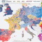
What’s the global data journalism community tweeting about this week? Our NodeXL #ddj mapping from May 13 to 19 finds a preview snippet on sensible charts from @albertocairo’s upcoming book “How Charts Lie,” @ladatamx’s report on homicides in Mexico, @RepublikMagazin’s analysis on the changing ideologies of political parties in the European Union, and a recap of the Data Journalism UK conference by @paulbradshaw.