Data Journalism Top 10: Lawmaker Insider Trading, Queen Elizabeth’s Money, Celebratory Gunfire, Russian Bomb Shelters

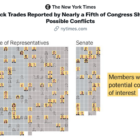
From stories examing potential conflicts of interest among lawmakers in Peru and the US, to a data story revealing the history of Queen Elizabeth II’s portrait on banknotes worldwide, our column features the best in data journalism. Also this week: the dangers of so-called celebratory gunfire, displacement in the Democratic Repubilc of Congo, and how the war in Ukraine has impacted children living in institutional care.

Data Journalism Top 10: Queen Elizabeth’s Reign, Arctic Fires, Taiwan Street Food, Brain Drain

Our weekly NodeXL and human curation of the most popular data journalism stories on Twitter features The Financial Times’ 10 charts visualizing developments in the United Kingdom during Elizabeth’s reign, The Marshall Project’s look at how government Covid-19 relief funds were used, and Taiwan Data Stories’ scrollytelling project about Taiwan’s iconic street food.

Data Journalism Top 10: Europe’s Drying Rivers, US Student Debt, Revisiting the Moon, Censoring Big Bang Theory

Our weekly analysis of the most popular data journalism stories on Twitter features the mapping of Europe’s drought-stricken rivers, NASA’s plans to return to the moon, how the war in Ukraine compares to other modern conflicts, tracking a stolen truck, and examining Chinese censorship of foreign content with edited episodes of The Big Bang Theory.

Data Journalism Top 10: Google and Abortion, Crisis in Emergency Care, Future Heatwaves, Marvel’s Cinematic Network

Our weekly analysis of the most popular data journalism stories on Twitter spotlights a Bloomberg investigation on Google search results for abortion, a story on the impact of state meddling in the finances of Canada’s Indigenous First Nations, data revealing a crisis in accident and emergency services in England, heat wave predictions for the year 2053 in the US, and for the film fans, a network visualization of the Marvel Cinematic Universe.

Data Journalism Top 10: Connecting China’s Power Players, Tracking Russian Voter Turnout, Drawing the India-Pakistan Border, and Serena Williams’ Trailblazing Career

The workings of the Chinese Communist Party are shrouded in secrecy, but ahead of the party congress later this year The South China Morning Post published a detailed guide on the key power players. Also this week, an investigation into the arbitrary nature of military justice in the United States, an analysis of Russia’s election voter turnout using artificial intelligence, and charts celebrating Serena Williams’ tennis career.

Scientific American - Florence Nightingale graphics

Data Journalism Top 10: Kids’ Fashion Stereotypes, Economic Sandwich Index, Immigration Profits, and Florence Nightingale’s Graphics

Children’s fashion is riddled with gender stereotypes, according to an analysis by German newspaper Süddeutsche Zeitung, which found that popular children’s clothing tended to be more revealing for girls, but comfortable and functional for boys. Also this week, analysis of the big earners in the healthcare industry, the tracking of post-pandemic recovery through sandwich sales, and Florence Nightingale’s contribution to graphic storytelling.

CBC heat islands graphed by economic diversity

Data Journalism Top 10: Sweltering Cities, Digital Inequity, Climate & Sleep, COVID & Schools

As parts of the world endure record-breaking temperatures, a highlight from the world of data journalism this week involves an analysis of how “heat islands” in Canadian cities vary based on economic strata. Our weekly Top Ten in Data Journalism also looks at the global spread of Pegasus spyware, digital inequity in the US, and how the COVID-19 pandemic affects school children in Latin America.