How They Did It: Developing a Data-Driven Navigator on Gun Laws

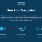
Last August, Everytown for Gun Safety, a non-profit research and advocacy group for gun control, launched the Gun Law Navigator, an exploratory data visualization tool explaining how states in America regulate guns. The project, developed by the Boston-based creative digital studio Upstatement, received lots of attention not only for examining such a sensitive topic, but also for successfully telling a visual, data-driven story about a complex subject: legislation.

How They Did It: The Azerbaijani Laundromat

In September, the Danish national newspaper Berlingske, in partnership with the OCCRP and other international media partners, exposed a complex money laundering scheme led by Azerbaijan’s elite. The stories revealed that, between 2012 and 2014, $2.9 billion connected to the country was siphoned through European companies and banks. Here’s how they got the story.

How They Did It: Building a Visual Story with a Non-Visual Piece

Australian journalist Rick Feneley wrote a powerful investigative piece about a string of gay hate crimes that plagued Australia’s eastern border. But before “The Gay Hate Decades” was published, Feneley was left with one last hurdle: Creating a digital element to accompany his work. And that’s where SBS web developer Ken Macleod came in.

How Univision Revealed Flaws in Costa Rica’s Judicial System

Four years of work and 8,000 judicial rulings later, the team at Univision Data shows how in Costa Rica, a person is more likely to be convicted of a crime if they are assigned a public defense attorney than if they have a private one. Their methodology included web scraping, R and logistic regression — a statistical method common in social sciences but practically unexplored in newsrooms.