GIJN’s Data Journalism Top 10: France’s Shocking Yellow Vest Injuries, Yield Curve Music, Migration Maps

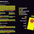
What’s the global data journalism community tweeting about this week? Our NodeXL #ddj mapping from March 11 to March 17 finds @davduf’s award-winning exposé of Yellow Vest injuries in France, @theboysmithy making music out of the yield curve, and @alisonkilling on mapping two fictional migrants’ journeys to Europe.
GIJN’s Data Journalism Top 10: Populism Quiz, EU Fact-Checking, Twitter Data, GitHub 101

What’s the global data journalism community tweeting about this week? Our NodeXL #ddj mapping from March 18 to 24 finds a collection of beautiful news graphics by Megan Jaegerman curated by statistician @EdwardTufte, @tagesanzeiger’s quiz testing readers’ level of populist leanings, a new collaborative fact-checking effort by the name of @FactcheckEU, and @briromer’s interesting piece on maps that break strict geography rules.

GIJN’s Data Journalism Top 10: Visualizing Air Raids, Dictator Decrees, Dataviz Crimes, Random Samples

What’s the global data journalism community tweeting about this week? Our NodeXL #ddj mapping from March 25 to 31 finds @ajlabs visualizing air raids through sound, @infobae exposing secret dictatorship decrees in Argentina, @albertocairo presenting on how charts can be misleading and how to fix them, and @TheEconomist laying bare the “crimes” against data visualization they have committed.

GIJN’s Data Journalism Top 10: Copycat Laws, Melting Ice, Rwanda’s Genocide Trials, Data Do’s and Don’ts

What’s the global data journalism community tweeting about this week? Our NodeXL #ddj mapping from April 1 to 7 finds @JuliaAngwin sharing do’s and don’ts of data journalism projects at @journalismfest, @elconfidencial highlighting the negative effects on Spain’s economy if women stopped working for a day, @azcentral and @USATODAY revealing just how many bills in the United States are copied from model legislations, and @justiceinfonet visualizing data on trials for the Rwandan genocide.

GIJN’s Data Journalism Top 10: AI-Powered Investigations, Why Companies Donate, Data From PDFs, UK Pay Gap

What’s the global data journalism community tweeting about this week? Our NodeXL #ddj mapping from April 8 to 14 finds a zine focused on machine learning-powered investigative journalism produced by @bxrobertz, a video explainer from @FT on whether big corporations are really generous or just avoiding taxes, @knowtheory and @amandabee reviewing seven optical character recognition tools and @workbenchdata offering a tutorial on visualizing @Twitter data.

GIJN’s Data Journalism Top 10: Data Feminism, Blockchain for Investigations, Train Speeds, EU DataViz Conference

What’s the global data journalism community tweeting about this week? Our NodeXL #ddj mapping from April 15 to 21 finds an informative interactive tool about the health of our generation by @srfdata, a piece by academic @wsaqaf explaining how journalism can utilize blockchain for investigations, data visualization teaching materials by @R_Graph_Gallery, and a book draft on data feminism by @kanarinka and @laurenfklein.

GIJN’s Data Journalism Top 10: History of Infographics, Colorism in Fashion, Weather Trends

What’s the global data journalism community tweeting about this week? Our NodeXL #ddj mapping from April 22 to 28 finds an interesting breakdown of colorism in fashion by @puddingviz, a series of gorgeous maps on natural disasters and extreme weather trends in the United States by @PostGraphics, a preview of a book on the history of infographics by @srendgen, and @UpshotNYT’s recap of its best articles from the past five years.

GIJN’s Data Journalism Top 10: Populism Popularity, DataViz Pedagogy, National vs. Local Media, German Migration

What’s the global data journalism community tweeting about this week? Our NodeXL #ddj mapping from April 29 to May 5 finds @zeitonline mapping German migration post-reunification, @FILWD pointing out the gaps in current data visualization teaching syllabi, @AlJazeera launching its data journalism introductory guide, and @WSJ highlighting the stark divide between national and local media in the United States.

GIJN’s Data Journalism Top 10: Weak Passwords, Wolf Drama, Chart Chooser, London vs. England

What’s the global data journalism community tweeting about this week? Our NodeXL #ddj mapping from May 6 to 12 finds @SteveFranconeri’s chart chooser based on data formats instead of visualization functions, @daswasfehlt’s examination of Austrian politicians’ weak email passwords in the wake of a major data leak, @NZZ’s look at whether wolves are really a nuisance in Switzerland and @wihbey’s research into the data competence and partisanship of journalists.

GIJN’s Data Journalism Top 10: Moscow Garbage, Mexican Homicide, EU Ideologies

What’s the global data journalism community tweeting about this week? Our NodeXL #ddj mapping from May 13 to 19 finds a preview snippet on sensible charts from @albertocairo’s upcoming book “How Charts Lie,” @ladatamx’s report on homicides in Mexico, @RepublikMagazin’s analysis on the changing ideologies of political parties in the European Union, and a recap of the Data Journalism UK conference by @paulbradshaw.

« Previous PageNext Page »