Data Journalism

GIJN’s Data Journalism Top 10: Early Voting Data, News Deserts, Next Gen Network Analysis
|
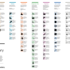
What’s the global data journalism community tweeting about this week? Our NodeXL #ddj mapping from October 29 to November 4 finds Google search voting predictions from @datavized, hurricane maps reimagined by @_KarenHao, and interactive commuter data from @WDR in Germany.