GIJN’s Data Journalism Top 10: School Murders, Visualizing Uncertainty and Brazil’s Deadly Week

What’s the global data journalism community tweeting about this week? Our NodeXL #ddj mapping from May 28 to June 3 finds @washingtonpost’s alarming data on gun violence in American schools, @vlandham’s experiments with visualizing uncertainty and @GENinnovate with the latest data journalism trends displayed in the 2018 Data Journalism Awards entries.
GIJN’s Data Journalism Top 10: Simon Says, AI’s Breakthrough Year and Global Migration’s Portal

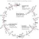
What’s the global data journalism community tweeting about this week? Our NodeXL #ddj mapping from June 4 to 10 finds an awesome curated list of resources for visualizing music by @Willian_justen, a deep dive into unsolved murders across America by @washingtonpost and @CarbonBrief mapping of the past, present and future of global coal power plants.

GIJN’s Data Journalism Top 10: World Cup, South Africa’s Pit Toilets and France’s Deadly Police Interventions

What’s the global data journalism community tweeting about this week? Our NodeXL #ddj mapping from June 11 to 17 finds three data stories about the World Cup, from @BBCSport, @FT and @TspLeute, @guardian looked at at how urban cycling can change the world and @Bastamag explores 40 years of deaths from police interventions in France.

GIJN’s Data Journalism Top 10: Footballers’ Salaries, Google Trends and Gender Bias with Pudding

What’s the global data journalism community tweeting about this week? Our NodeXL #ddj mapping from July 9 to 15 finds @morgenpost’s interactive slider showing how fast a German national footballer earns your monthly salary, tons of interesting Google search data in its @GoogleTrends data store, @durand101 and @puddingvizgender exposing bias in the UK House of Commons and @EdjNet offering a search engine for 800,000 EU datasets.

GIJN’s Data Journalism Top 10: Nike’s Vaporflys, Trump’s Trade War, FastCharts, Datapasta

What’s the global data journalism community tweeting about this week? Our NodeXL #ddj mapping from July 16 to 22 finds @UpshotNYT confirming Nike’s claim that their Vaporflys really do give runners an advantage, @FinancialTimes visualizes Trump’s escalating trade war, Britain’s digital divide and introduces their new charting tool and @MilesMcBain makes some data journalists very happy by creating Datapasta.

GIJN’s Data Journalism Top 10: Dam Disaster in Laos, Global Star Gazing, Why We Love Pie Charts

What’s the global data journalism community tweeting about this week? Our NodeXL #ddj mapping from July 23 to 29 finds @NadiehBremer visualizing beautiful constellations imagined by different cultures, @mslima diving deep into why we love pie charts, @leigh_tami18 explaining the various methods of joining datasets and the Reuters Graphic’s team visualization of the dam disaster in Laos.

America’s Cultural Landscape, Germany’s Record Summer, Spain’s Immigration Boom, Google’s Data Search

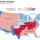
What’s the global data journalism community tweeting about this week? Our NodeXL #ddj mapping from July 30 to Aug 5 finds practical advice from @junkcharts for conference presenters to showcase their graphics, @Google making data in data journalism pieces more searchable, @funkeinteraktiv displaying the ways Germany is breaking records this summer, @eldiarioes examining Spain’s immigration boom and author Colin Woodard breaking down America’s regional cultures in The New York Times.

GIJN’s Data Journalism Top 10: Faking Climate Change Data and in WEB Du Bois’ Black Americ

What’s the global data journalism community tweeting about this week? Our NodeXL #ddj mapping from Aug 6 to 12 finds @sciam profiling a new color scale for the color blind, @EDudinskij’s fun dissertation on dataviz in science fiction movies, @morgenpost using satellite imagery to show the consequences of droughts, and @gregladen and Grant Foster calling bull on a climate change denier’s flawed graphs.

« Previous PageNext Page »