Data Journalism Top 10: Solar-Powered Batmobile, Hungarian Money Abroad, Migrants Dying in Qatar, Open Windows & COVID-19

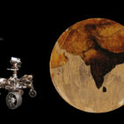
For decades, environmentalists have been dreaming about climate-friendly transportation. The arrival of hybrid and electric cars has brought us one step closer to travelling without damaging the planet. And this year, a California start-up promises to push the technology even further by rolling out the first mass-produced solar-powered car. Our NodeXL #ddj mapping from February 22 to 28 features this story alongside an investigation by the Guardian into deaths of migrant workers in Qatar, a cross-border project revealing Hungarian money flowing overseas, and a creative infographic about animals in space.

Data Journalism Top 10: Mission to Mars, Myanmar’s Protesters, Sand Mining, Journalism in Russia

After going through “seven minutes of terror,” NASA’s Perseverance rover managed to successfully touch down on Mars last week. Our NodeXL #ddj mapping from February 15 to 21 found reporting by The Wall Street Journal and Al Jazeera, which offers more insight into the rover’s journey to the red planet. In this edition, we also feature a story about the boom in independent journalism in Russia, an analysis of the future of South Africa’s coal mining industry, and a critique of data visualization’s ability to fully convey the realities of large-scale tragedies.

Data Journalism Top 10: From Newsroom to Netflix, Inside the Capitol Riot, Vaccine Data, Facebook for News

As governments around the world continue vaccination efforts and extend lockdowns, some experts argue that more data is needed to evaluate the effectiveness of immunization campaigns and mobility restrictions. Our NodeXL #ddj mapping from January 11 to 18 found outlets in Germany and the United Kingdom analyzing government measures to reduce the impact of the COVID-19 pandemic. In this edition, we also feature an insightful interview with former Washington Post journalist Aaron Williams, an interactive timeline of the US Capitol riot by ProPublica, and a refreshing data visualization project by The Pudding.

Data Journalism Top 10: Back to School, Australian Open Underdog, Amazon Oxygen Shortage, Big Tech & Green Energy

How can we get students and teachers safely back into classrooms? For many months, this has been a key question for public authorities, school leaders, and parents around the world. This topic and others topped the data journalism stories on Twitter from February 8 to 14. Check out #ddj stories from The New York Times, NPR, the Financial Times, FiveThirtyEight, and The Pudding.

Data Journalism Top 10: Biometric IDs, Data Spaghetti, Eviction Avalanche, Remote Working

With countries around the world considering the safest ways to ease lockdown measures, alongside the deployment of COVID-19 vaccines in many places, some are finding reasons to be optimistic about the end of the coronavirus crisis. But returning to once conventional daily activities, such as going to restaurants and sports stadiums, is still a distant prospect. Our NodeXL #ddj mapping from February 1 to 7 found Voxeurop covering the dangers of adopting biometric IDs and health passports, a look at Europe’s COVID-19 divide by Reuters, an analysis of leaked smartphone data by The New York Times, and a Twitter thread collection of archived data visualizations in various languages.

Data Journalism Top 10: Polarized America, Australia’s Pandemic, Poland’s Toxic Air, the Arab Spring, Life as Lego

Our NodeXL #ddj mapping from January 25 to 31 found interactive projects by the Australian Broadcasting Corporation and The Guardian analyzing these events. In this edition, we also feature environmental reporting by The New York Times and The Economist, a Wall Street Journal story on the GameStop Reddit mania that shook stock markets, and a visual representation of 2020 using Lego bricks.

« Previous PageNext Page »