How We Built the Data Visualization That Brought Brazil’s COVID Deaths Close to Home

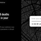
When the COVID-19 pandemic first hit Brazil, a team of data journalists set out to illustrate what the death toll looked like by creating a data visualization that presented something beyond the numbers. The team considered various ways of displaying the story. Here’s a behind-the-scenes look at how they created At the Epicenter.

Forbidden Stories' Pegasus Project exposé

Data Journalism Top 10: Pegasus, Silencing Reporters, Europe Flooding, Diversity Mapping, K-pop

Our NodeXL mapping from July 12 to 18, which tracks the most popular data journalism stories on Twitter each week, found a series of articles resulting from the collaborative project that analyzed an unprecedented leak of more than 50,000 phone numbers selected for surveillance. In this edition, we also feature an insight into Facebook’s data wars by The New York Times, an interactive piece by Al Jazeera on how the holy city of Mecca has expanded, and a colorful project by the Washington Post on the rise of K-pop.

Data Journalism Top 10: Pandemic Cocktails, Pricey Food, Zoonotic Diseases, the World’s Top Songs

If you have tried to mix cocktails at home lately, you’re not alone. Tired of waiting for bars and restaurants to reopen, more consumers have started buying premium alcohol, according to data published by the Financial Times. Our NodeXL #ddj mapping from March 1 to 7, which tracks the most popular data journalism stories on Twitter, also found an analysis by Bloomberg showing that global food prices have hit their highest level in six years, an explainer of the connection between bats and virus outbreaks by Reuters, an interactive piece on Atlantic currents by The New York Times, and a musical map by The Pudding.

Data Journalism Top 10: China’s Gene Data, Norway’s Terror, India’s Sugar, Space Tourism

Ten years ago, terror attacks in Norway claimed the lives of 77 people and seriously injured at least 40. Our NodeXL mapping from July 5 to 11 found an interactive timeline piece by Norwegian newspaper Verdens Gang telling the story of a tragic event that impacted an entire nation. In this edition, we also feature an investigation by Reuters into a Chinese company harvesting genetic data from pregnant women, a series on gun violence in Chicago by The Trace, and a look at “silent” Russian politicians by IStories.

Why Web Scraping Is Vital to Democracy

Journalists have used scrapers to collect data that rooted out extremist cops, tracked lobbyists, and uncovered an underground market for adopted children. The Markup recently made the case for web scraping in an amicus brief before the United States Supreme Court that threatens to make the practice illegal. Here’s why they did it.

Data Journalism Top 10: Atlas of Emotions, Carbon Recyclers, Football Long Shots, COVID-19 Endgame, Mister Rogers’ Cardigans

To fight climate change, we need to protect sea life. Whales, plankton, and seagrasses have a key impact on the Earth’s carbon cycle. Our NodeXL #ddj mapping from to April 5 to April 11, which tracks the most popular data journalism stories on Twitter each week, found a piece by Reuters Graphics explaining how these species interact underwater as well as capture and transform carbon. In this edition, we also feature an atlas of emotions by Google Arts & Culture, a look at the COVID-19 endgame by the Financial Times, and some great board games to inspire data visualization enthusiasts.

« Previous PageNext Page »