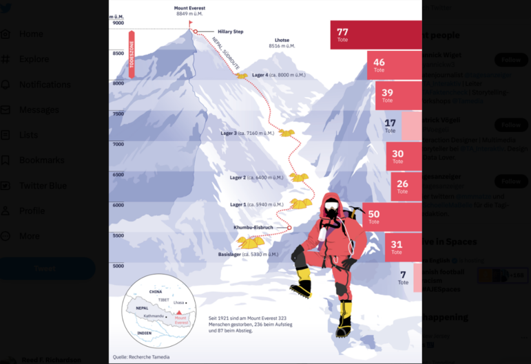
The Swiss newspaper Tages-Anzeiger examined why Mt. Everest has become increasingly deadly for those trying to summit it and tabulated fatalities (red) at different elevations along the Nepalese climbing route. Image: Screenshot, Tages-Anzeiger
This week, the Swiss newspaper Tages-Anzeiger examined why the world’s tallest mountain has become increasingly deadly for those trying to climb it — and where the fatalities occur along the climbing route. GIJN’s Top 10 in Data Journalism also explores pollution in Paris metro stations, US laws expanding gun access one year after the Uvalde mass shooting, migrant worker struggles in Singapore, and an interesting look into bias in US country radio station playlists.
Mt. Everest’s Deadly Legacy
Mount Everest, despite being the world’s tallest peak, is not the most technically challenging mountain to climb. So what makes climbing it more deadly with each passing year? For the 70th anniversary of the first ascent by Sir Edmund Hillary and Tenzing Norgay, the Swiss newspaper Tages-Anzeiger dug into decades of data to find out what has caused the most deaths — such as overcrowding, accidents, altitude, and temperature — and where the most dangerous climbing spots are along the Nepalese climbing route.
Wir haben ein paar schöne Grafiken in unserer Datengeschichte zum #MountEverest, aber diese hier von @PVoegeli sticht heraus 📸https://t.co/LKeJsviqgu (Abo) @tagesanzeiger @TA_Interaktiv pic.twitter.com/0ezUq5pWcm
— Yannick Wiget (@yannickw3) May 24, 2023
US Gun Law Changes Since Uvalde Mass Shooting
It’s been one year since the mass shooting in Uvalde, Texas, in which a gunman killed 19 children and two adults in a public elementary school. Axios gathered data from state legislations in every US state, and found that since then, lawmakers have passed more firearms bills that expand access — 56% — than bills that restrict firearm access. For the one-year mark, CNN also created a timeline of how events unfolded during the Uvalde tragedy.
One year since the Uvalde massacre, more than 1,700 gun-related bills have been introduced in state legislatures, and 93 of them were signed into law.
Of those, 56% expanded access to guns or benefited the gun industry. via @RussContreras @erindavisnews https://t.co/PM8axDyWqU
— Katie Peralta Soloff (@katieperalta) May 24, 2023
Paris Metro Air Pollution
Are Paris’s metro platforms more polluted than the outside air? Collaborating with the Vert de Rage (“green with rage”) documentary series screened on the France 5 channel, researchers measured and analyzed fine particles in the air — which are most likely to infiltrate our lungs, blood, and organs — on every line of the metro and RER commuter train platforms in the inner suburbs. Paris residents (and the curious) can use the map and a search engine to check each station’s air quality. (For your lungs’ sake, you might want to avoid La Défense station.)
Paris : les quais de votre station de métro sont-ils très « sur-pollués » par rapport à l’air extérieur ?
Découvrez les mesures inédites, ligne par ligne, collectées et analysées par l’émission « Vert de Rage » et l'excellent @BriceLeBorgne https://t.co/I0yFAFOJRG
— Maxime Loisel (@maxloisel) May 22, 2023
Prisons’ COVID-19 Response
Inmates in US federal prison and prison medical centers —“sitting ducks” for COVID-19 spread — should have been vaccinated early in the process, when the country was prioritizing those in high-risk settings. An investigation by health and medicine site STAT looked at new data on the federal prisons’ pandemic response, revealing deeper problems than expected, including delayed vaccination, inadequate testing despite ample suppliy, and failure to meet minimum health and safety recommendations.
Prison inmates were sitting ducks in the pandemic. So you might think prisons would have prioritized vaccinating them. An investigation by @NicholasFlorko suggests at least some did not. https://t.co/Z6jzVCh61e
— Helen Branswell 🇺🇦 (@HelenBranswell) May 23, 2023
Migrant Labor Conditions in Singapore
Migrant workers make up an essential part of Singapore’s workforce, but their labor conditions differ widely depending on the type of work permit they hold. Singapore-based data-driven storytelling studio Kontinentalist took a look at the data and visualized the composition of the migrant workers’ employment types, salaries, and injuries or fatal incidents. It found that majority of the migrant deaths recorded were related to the workplace, with the leading cause of death being falls from height.
Last week, we published a story that shed light on migrant workers’ rights and safety. These workers find themselves at the mercy of an unequal system, where the pursuit of profit often leads to precarious working conditions. https://t.co/sCAtvkirct
— Kontinentalist (@kontinentalist_) May 25, 2023
Understanding Book Challenges
Over the past few years, librarians and educators in the US have been faced with a steady stream of conservative attempts to ban books and to pull them from school shelves. Among the most common reasons cited by challengers for objecting to these books: they contain sexual or LGBTQ content. The Washington Post analyzed the data on book challenges filed in the 2021-22 school year in 153 school districts and found that a majority (60%) of the more than 1,000 complaints were filed by a mere 11 people.
I don't know whether to applaud or cry about this Post investigation showing that the majority of book challenges were filed by just 11 people. This is the media world we live in now.https://t.co/zrTVBKS7F3
— Alexander Russo (@alexanderrusso) May 23, 2023
Which Australian City Should You Live In?
The weather and climate in Australia varies greatly across the country; with hot and humid summers in the north, and cooler and milder summers in parts of the south. Using hourly data for each capital city over the past 23 years, The Guardian Australia created a tool that takes into consideration a reader’s weather preferences — temperature, humidity, hours of sunshine, rain, clear skies — before offering up a suggestion of where the reader should live in order to best experience their preferred climate.
This is delightful, but it also said I should live in Canberra. So clearly its also accurate.https://t.co/37w8P1BZR7
— Kate McNamara (@kaydo) May 23, 2023
Analyzing the Impact of Baseball’s New Rules
Starting this season in April, Major League Baseball in the US implemented a pitch clock — forcing pitchers to start throwing a pitch to the batter much sooner, to create a quicker pace of play. This and other new rules have already had a big impact on the sport — and the huge volume of statistics that go with it. This package from The New York Times’ The Upshot analyzes how the new rules have not only shortened game times but changed its play, with more stolen bases, different hitting behavior, and more.
Here's the Upshot piece from @BenBlatt and @fparises. Go for the charts, stay for the story, then look at the charts again. https://t.co/a6ASYHqF8Q
— Benjamin Hoffman (@BenHoffmanNYT) May 24, 2023
Opting for Bus Over Plane
Would you opt for an hour’s travel by plane or a six-hour journey by bus? Turns out Brazilians are increasingly choosing the latter between the cities Rio de Janeiro and São Paulo due to a steep increase in airfares along that route. Brazilian news portal g1 discovered this trend by comparing passenger data from last year to the pre-pandemic period.
Levantamento feito pelo meu parceiro @__victorfarias e eu com dados da Anac mostrou que o valor das passagens aéreas bateu recorde em 2022. Com o preço da ponte aérea nas alturas, passageiros estão migrando do avião para o ônibus no trecho Rio-SPhttps://t.co/iN4zvzubCr
— Marina Pinhoni (@marinapinhoni) May 19, 2023
Shelling of Mykolaiv
Since the beginning of Russia’s invasion of Ukraine in February of last year, the Mykolaiv region has been subject to constant military shelling. GIJN member organization Nikolaev Center for Investigative Reporting mapped the data of the more than 17,000 civilian objects that were damaged, the type of weapon used, and the location and number of civilians killed during the attacks.
Миколаївщина регулярно потрапляє під ворожий вогонь з початку повномасштабного вторгнення. Журналісти Центру дослідили, де найбільше страждали в регіоні від ударів. Ці відкриті дані ми нанесли на інтерактивні мапи, щоб показати масштаби злочинів армії РФ.https://t.co/FJ0nBHFGEZ
— Nikcenter – центр журналістських розслідувань (@InvestigatorNik) May 23, 2023
Additional Item: Bias in US Country Music Radio
Chances are if you turn on country music radio in the US, you will hear several consecutive songs by male artists — and it could be over nine hours until you hear back-to-back songs by women artists. Data storytelling site The Pudding dug into 2022 data from 29 US country stations to analyze songs on country music radio by gender, race, and sexual orientation. On average, women artists were played consecutively just 0.5% of the time, compared to men at 65.1%. And no women of color or LGBTQ+ women were played back-to-back at all. Read data journalist Jan Diehm’s tweet thread sharing behind-the-scenes info — while listening to The Pudding’s playlist of back-to-back songs by women artists.
Very honoured to have a lyric from Queenie, Queenie used as the title of the new study on gender inequality in Country Music radio released today by @data_jada and @jadiehm Knowledge is power 🙌🏼https://t.co/4SAnpM1C7b
— Tami Neilson (@tamineilson) May 23, 2023
GIJN’s Data Journalism Top 10 list is curated weekly. Send your suggestions to us.
 Alexa van Sickle is an associate editor at GIJN. She was previously a senior editor for the foreign correspondence magazine Roads and Kingdoms. She has also been an editor at the International Institute for Strategic Studies and a publisher at an international law non-profit in London. She lives in Vienna, Austria.
 Eunice Au is GIJN’s global team manager based in Budapest, Hungary. Previously, she was a Malaysia correspondent for Singapore’s The Straits Times, and a journalist at Malaysia’s New Straits Times. She has also written for The Sun, Malaysian Today, and Madam Chair.
