What’s the global data journalism community tweeting about this week? Our NodeXL #ddj mapping from July 8 to 14 finds BBC News analyzing Afghan election results and graphing milestones of the 25-year-old Amazon.com empire, Federica Fragapane visualizing the female menstruation cycle for Scientific American, and Bloomberg taking a closer look at China’s domination of the South China Sea. We also have a fun piece by Alberto Cairo on nonsensical diagrams.
Visualizing an Election with No Political Parties
The BBC World Service Visual Journalism team was tasked to cover the 2018 Afghan parliamentary elections last October, the first one held in eight years. Visualizing the results came with a unique set of challenges due to the country’s particular political system. Josh Rayson explains the team’s visualization process in detail.
This @joshrayman article beautifully sums up why the BBC World Service languages visual journalism hubs exist. To visualise uncertainty, dig facts out of muddled data and… explain the world https://t.co/cBg4o9NKPD Do read – it's super interesting.
— Ana Lucía González (@anlugonz) June 28, 2019
Let’s Talk Menstruation
Scientific American tackles the topic of female menstruation and dissects how age-old taboos have led to limited research on how women’s cycles work, with serious consequences for their health. It includes a beautiful visualization of the menstrual cycle by Federica Fragapane.
Loving @fedfragapane’s elegant and info-rich menstrual cycle graphic for @v_solesmith’s May @sciam article on periods https://t.co/VOac8S7JWD pic.twitter.com/z9USReOq35
— Jen Christiansen (@ChristiansenJen) April 19, 2019
The Amazon Empire
BBC visualized Amazon.com empire’s success in several charts and looks at company milestones over its extraordinary 25-year run.
Wow!! Check out the infographics for Amazon. Some surprising – some not so muchhttps://t.co/E48FWzE8Mx#Amazon #Infographic pic.twitter.com/DSpG8T2TNQ
— Tathagata Kandar (@TathagataK) July 10, 2019
Dominating the South China Sea
Bloomberg takes a detailed look at China’s “silent war” to dominate the South China Sea and claim contested waters for its own. It maps encounters by fishermen with Chinese vessels and sites of reported clashes, visualizes the Chinese fleet expansion, and more.
Fishermen are on the front lines of Aisa's most complex territorial disputes.
Great story and fabulous presentation by my colleagues Quynh, @dreocalonzo, @PJHeijmans, @hannahdormido and @ad_leunghttps://t.co/pfeTwwqLbH via @bbgvisualdata
— Siegfrid Alegado (@SiegfridAlegado) July 11, 2019
Nonsensical Diagrams
Need a good laugh? Dataviz guru Alberto Cairo gathered some nonsensical diagrams in a blog post, with some choice picks from the PhD dissertation of Sebastian Gorka, President Trump’s expert on “radical Islamist terrorism.”
Check out @AlbertoCairo's hysterical post on nonsensical diagrams. https://t.co/qUziRAmrAT pic.twitter.com/46ukZ5cidR
— Nolan Haims (@NolanHaims) July 15, 2019
Data Gaps in Canada’s Sexual Crimes
The Globe and Mail, through the use of Freedom of Information requests, analyzed how Canada’s 22 largest public transit systems track and handle sexual misconduct. It found that the record-keeping, which included incidents on buses, trains and subways, had troubling data gaps and omissions.
Personally, I've dealt with sex harassment on transit in the form of indecent act/exposing at least three times that I can remember — the first time I was maaaaybe 17? https://t.co/gPRe4TmCb6
— Ann Hui (@annhui) July 9, 2019
E-Scooters in Berlin
Thousands of e-scooters are available for rent in Berlin by four main providers. rbb|24 analyzed the data to determine how this has influenced traffic in the region. Find the data on Github. (In German.)
Der @rbb24 hat eine Datenauswertung zu den E-Rollern in Berlin veröffentlicht. Inkl. der Daten: https://t.co/N4bdMVsszt Die Daten stammen wohl von App-Scraper von @radforschung https://t.co/fk5tGeut9o #ddj
— Lorenz Matzat (@lorz) July 11, 2019
UAE Open Data
The UAE Government runs an official open data portal, where you can find government data on food security, the economy, the environment, government, and more. (For advice on covering the UAE, don’t miss GIJN’s guide on human trafficking in the Gulf states.)
Interested in getting UAE government #open_data? Find it here.https://t.co/wnF8aveCnEhttps://t.co/jC7it6TvXihttps://t.co/o3jDCoOUtz@FCSAUAE#UAE_portal
— حكومة الامارات الذكية (@UAEmGov) February 11, 2019
Emergency Shelter in France
Rue89 Strasbourg mapped the existing emergency housing for the homeless, asylum seekers, and refugees in Strasbourg, France, and highlighted the problems of adequately allocating these emergency shelters for the intended recipients.
A Strasbourg, combien de places d'hébergement, pour qui, où ? Je fais un état des lieux pour @Rue89Strasbourg.
L'hébergement d'urgence à Strasbourg, chronique d'un système sous haute tension https://t.co/pY56TOI4jE via @rue89strasbourg— Lola Scandella (@LolaScandella) July 9, 2019
Use of Pesticides in France
Mediapart dove into unpublished data by the French Agency for Biodiversity and mapped the use of pesticides in Brittany, France. It also highlighted issues with the use of cooperative models in the agriculture sector. (In French.)
1/ Hop, on lit l'excellent travail des étudiants de l'IUT de Lannion, de leurs profs et de @dodonatien https://t.co/yFmF8XJg7l
— Louise Fessard (@LouiseFessard) July 4, 2019
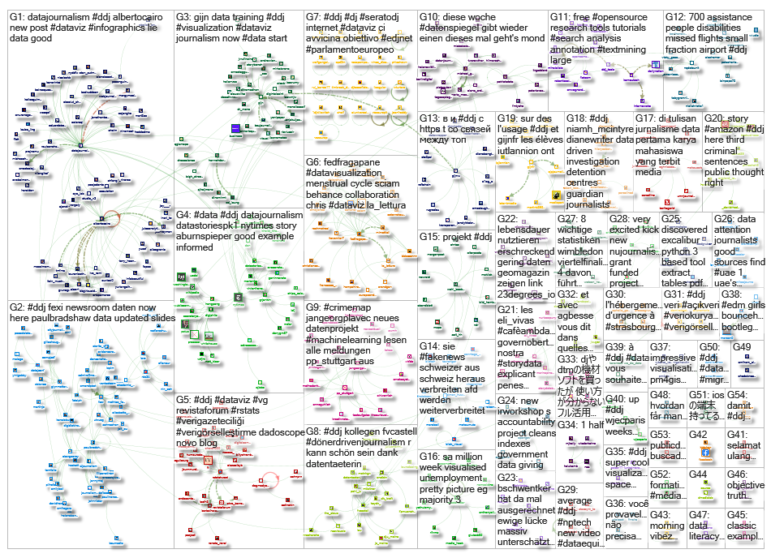
Thanks, once again, to Marc Smith of Connected Action for gathering the links and graphing them. The Top Ten #ddj list is curated weekly.
 Eunice Au is GIJN’s program coordinator. Previously, she was a Malaysia correspondent for Singapore’s The Straits Times, and a journalist at the New Straits Times. She has also written for The Sun, Malaysian Today and Madam Chair.
For a look at Marc Smith’s mapping on #ddj on Twitter, check out this map.