What’s the global data journalism community tweeting about this week? Our NodeXL #ddj mapping from April 29 to May 5 finds @zeitonline mapping German migration post-reunification, @FILWD pointing out the gaps in current data visualization teaching syllabi, @AlJazeera launching its data journalism introductory guide, and @WSJ highlighting the stark divide between national and local media in the United States.
Mapping German Migration
Zeit Online analyzed and visualized the data of approximately six million internal relocations in Germany after the country’s reunification from 1991 to 2017. It also highlighted the consequences of the exodus of about 3.6 million people, almost a quarter of the original population in East Germany, from the East to the West.
Even if you don't speak German, have a look at that #dataviz beauty by @zeitonline: https://t.co/IygAZTNjMV
It has everything:
😍 animated maps with annotation
😍 small multiples
😍 zoomed in line charts
😍 beautiful dot circlesThe best interactive story I've seen lately. pic.twitter.com/Uag03tKSj2
— Lisa Charlotte Rost (@lisacrost) May 3, 2019
Gaps in DataViz Pedagogy
Enrico Bertini, host of the Data Stories podcast, outlined several concepts that he feels are lacking in the teaching of data visualization, including ideas on data transformation, sorting and uncertainty.
I wrote blog post: "Neglected (Yet Foundational) Concepts in the Pedagogy of Data Visualization" https://t.co/sPdoRKHFNA expanding on the tweet I wrote a couple of days ago which seem to have resonated with quite a few people. Feedback welcome!
— Enrico Bertini (@FILWD) May 2, 2019
Data Journalism Intro
Al Jazeera produced a concise and practical introduction to data journalism using case studies from Arab media. It has sections on dispelling myths about data journalism, getting data, cleaning and analyzing data, as well as delivering your story.
Data Journalism – an introductory guidebook (English/Arabic)
Grab your free PDF here:https://t.co/l8liZ8KdS5 [EN]https://t.co/mU2aeO9hXL [AR]
Via @AJMInstitute #DDJ pic.twitter.com/FNLE1x8vf7
— Mohammed Haddad (@haddadme) April 29, 2019
Divide Between National/Local Media
The Wall Street Journal examines the US news industry and highlights a stark divide between big national players and small local outlets. Local media have been hardest hit by tech giants siphoning ad dollars away and are in danger of vanishing.
In stories about the decline of *newspapers*, I always want to know about and whether other models fill the *news need* and here is and it is depressing. “Openings of online-only news sites haven’t made up for flood of newspaper closures.” https://t.co/5A6MwhlSmt pic.twitter.com/yq3V5AVPu3
— Millie Tran (@millie) May 5, 2019
Storytelling With Numbers
Data viz expert Alberto Cairo talks about the key to the future of data journalism and possible innovations in borrowing techniques from other fields, such as film documentaries and video games.
.@AlbertoCairo, associate professor and Knight Chair in Visual Journalism, shares his insight on #datavisualization and where this emerging branch of #journalism is headed, https://t.co/LmjctWtjt7
— UMSoC (@UMSoC) April 29, 2019
New Digital Magazine
A group of designers, programmers and researchers formed Parametric Press to showcase interactive and dynamic writing. The first issue Science + Society is out now and each article comes with its own open source code, digital object identifier and an offline archive to preserve the article.
🏄♂️ For your surfing pleasure! 🏄♀️
The first issue of the Parametric Press is here!
Check out the data-driven stories, explorable explanations, and interactive fiction that these talented authors and editors put together. Details in thread.https://t.co/c0A5MbNtkR
— Parametric Press (@ParametricPress) May 1, 2019
Populism’s Popularity
Where are populist parties well received in the European Union? Der Spiegel analyzed 28 European countries and shows where populism has won the public’s votes in the past 20 years. Data on Github. (In German.)
Populist parties in Europe by @marcelpauly:https://t.co/fp9k2Ek79e
Data mostly by The PopuList: https://t.co/TiSgQQIwac
Data & scripts: https://t.co/TB2CF8y89S
Inspiration: https://t.co/o5ncczwewE by @driven_by_data pic.twitter.com/S1hIL8bGv9— Patrick Stotz (@PatrickStotz) April 30, 2019
Analyzing Child Abuse Data
Data Stories Pakistan analyzed police records on child rape and abuse cases since 2017 and found a worrying number of 2,841 child sexual abuse cases reported.
With 3 incidents a day and one life lost a month in #Punjab, #ChildSexualAbuse cases (under age 10) don't catch mainstream media attention. Do we remember any case other than little Zainab's in #Kasur? #Pakistan #datajournalism #ddj https://t.co/xzeVsSgWvV
— Data Stories (@datastoriespk1) April 30, 2019
GoogleSheets4
Googlesheets4, by Jenny Bryan, provides an R interface to Google Sheets via the Sheets API v4. It is a reboot of the existing googlesheets package.
Just discovered @JennyBryan's amazing googlesheets4. Has never been easier to read spreadsheet data (with authentication) 😍📝 https://t.co/vOHehmI0n3
So few lines of code 🤓 #rstats #ddj pic.twitter.com/VqWV7qKFvX— Angelo Zehr (@angelozehr) May 1, 2019
People to Follow
Looking for inspiration on Twitter? The Wire’s Aditya Jain suggests you to follow a list of people doing cool data viz and visual journalism stuff.
aight : @Da_Pacific @yanoak @AditiHBhandari @GurmanBhatia @NaemaAhmed @Sheikh_Saaliq @shadabnazmi @amiham_singh @vinodabcd @damarberlari @durand101 @rociodesigns @MelissaGee305 @online_lorraine @BCKwon @RonMorrison_ @duc_qn @Sara_Wise @unamandita @ericwilliamlin @sh_devulapalli
— Aditya Jain (@whaleandpetunia) May 4, 2019
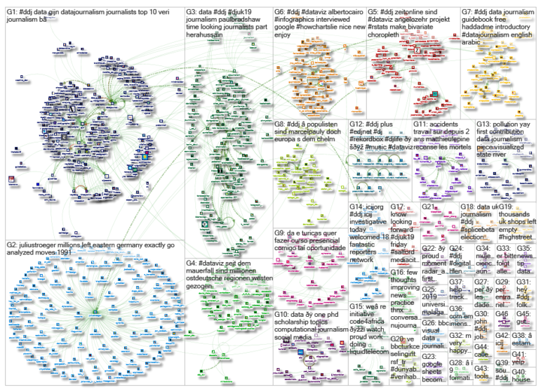
Thanks, once again, to Marc Smith of Connected Action for gathering the links and graphing them. The Top Ten #ddj list is curated weekly.
 Eunice Au is GIJN’s program coordinator. Previously, she was a Malaysia correspondent for Singapore’s The Straits Times, and a journalist at the New Straits Times. She has also written for The Sun, Malaysian Today and Madam Chair.
For a look at Marc Smith’s mapping on #ddj on Twitter, check out this map.