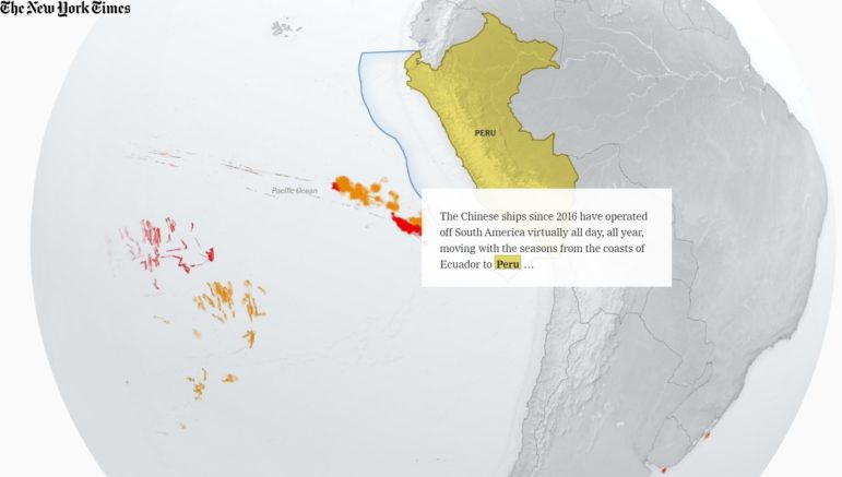
Using ship transponder data, The New York Times mapped China’s massive fishing fleet across the world. Image: Screenshot.
China’s global fishing operation is prompting concerns about overfishing and destruction of marine life and ecosystems. Using ship transponder data, The New York Times mapped the activity of the massive Chinese fishing fleet across the world. Our weekly NodeXL and human curation of the most popular data journalism stories on Twitter also highlights queer cinema history in Southeast Asia, patterns in US food franchises, Iran’s protests for women’s rights, and social housing issues in Canada.
China’s Global Fishing Reach
China has developed a massive, deep-water fishing fleet over the past two decades, and increasingly, it is fishing thousands of miles away from China, in oceans worldwide. One of the factors allowing Chinese ships to fish longer at sea without returning to port is the use of refrigerated cargo ships that act as carrier vessels servicing smaller ships, which assist in transferring fuel and supplies and collecting catches of fish. The New York Times tracked and visualized the movement of China’s fishing fleet, which is so large that it has raised concerns about the harm being done to the environment, marine species and ecosystems, as well as local economies.
The sheer size and global reach of China's fishing fleet is well known but this @nytimes piece might just be the best visualisation I've seen yet.
And lord only knows what conditions are like on the deep sea vessels that almost never return home https://t.co/Sv5sFhBTBP
— Jerome Taylor (@JeromeTaylor) September 29, 2022
Queer Cinema in Southeast Asia
From Thailand’s kathoey to Indonesia’s waria, and from Malaysia’s mak nyah to Philippines’ bakla, queer and non-binary identities have long been a part of Southeast Asian culture. Singapore-based data storytelling studio Kontinentalist crowdsourced a database of Southeast Asian queer films since the 1970s and created a timeline of these films to explore the public perception and dialogue surrounding these identities in the region over time.
This story wouldn’t have been possible without the help of readers who contributed to our crowdsourced database. Explore the full database in the story! (4/4) pic.twitter.com/kuKnbxPbgw
— Kontinentalist (@kontinentalist_) September 30, 2022
Patterns of US Food Franchises
Clio Andris and Xiaofan Liang, two researchers at the Georgia Institute of Technology, mapped independent and chain restaurants across the United States. Certain patterns started to emerge from the dataset: Kentucky, West Virginia, and Alabama had the most chain restaurants, and states with a higher percentage of Trump voters tended to have a higher share of chain restaurants. The Washington Post dove into the data and tested other variables in an attempt to figure out the basis for the correlation between Trump supporters and food franchises.
“The legacy of the highway seems to perpetuate chain restaurants,” Clio Andris of @Friendly_Cities tells @andrewvandam. Cool analysis of this country's “political foodscape.” https://t.co/yHZxax0Jjj
— Aleszu Bajak aleszu@mastodon.social (@aleszubajak) October 4, 2022
Iran Protests
Mahsa Amini, a 22-year-old Iranian woman, was arrested last month for not wearing a hijab in accordance with Iran’s official morality standards. Her subsequent death, in police custody under suspicious circumstances, sparked large protests across the country. These demonstrations have since morphed into a broader call for respecting women’s rights. Political leaders and celebrities around the world have been cutting their hair in solidarity with Iranian women. Data visualization designer Federica Fragapane is shining a light on this struggle using a simple visualization of a hair braid, with each line symbolizing a person killed while protesting.
At least 133 people have died since the beginning of protests in Iran. The strength and the courage of the people, the women, who are fighting for their rights are hard to describe. My admiration and – as a woman – my gratitude to them are infinite.#MahsaAmini #IranProtests pic.twitter.com/IwKm6rU3Yp
— Federica Fragapane (@fedfragapane) October 4, 2022
Social Housing Issues in Winnipeg
According to the Canadian Observatory on Homelessness, at least 235,000 people experience homelessness in Canada every year. The Walrus and the Investigative Journalism Foundation dug into the challenges of the unhoused and revealed flaws in the social housing system of Winnipeg, Canada, through tracking the experience of one homeless man.
"it feels like sort of a shell game when you try to hold people accountable that don’t want to be held accountable.” Thanks @jsrutgers for this deep dive into the many layers of Winnipeg's housing crisis https://t.co/F6rGY7HUhD
— Yutaka Dirks (@YutakaDirks) October 5, 2022
Spain’s Corporate Tax Bill
Despite earning a lot more profit in 2021, companies are paying far less corporate tax in Spain last year compared to 2017. Spain’s online news site elDiario dives into why this has occurred, explaining such factors as how tax reforms have contributed to eroding tax bases and reducing the tax bill.
🧀En 2021, a pesar de tener más ganancias que en 2007, las empresas españolas pagaron mucho menos en el impuesto de sociedades que entonces.
Estos son los agujeros fiscales que han reducido la tributación de las grandes empresas. Con @DiegoLarrouy 👇https://t.co/mQrphbtmmw pic.twitter.com/F5n3w4R17s
— Raúl Sánchez 📈 (@raulsanchezglez) September 28, 2022
Record Number of Amazon Fires
Before Brazil’s polls were held on October 2 this year, fires in the Amazon rainforest reached new records. Swiss-based, German-language daily Neue Zürcher Zeitung reported on data from the Brazilian space research agency Inpe: in just the first three days of last month, there were as many flares in the Amazon as in the whole of September 2021. Journalists mapped the concentration of these fires across Brazil, Bolivia, and Peru, and examined possible reasons for the increase in fires.
As the election in #Brazil approaches, farmers burn the Amazon in anticipation of stricter forest protection laws. Under Bolsonaro, deforestation has risen, while budgets for environmental agencies have been cut to an all-time low. New visual story 👉https://t.co/U1jvWpLGP6 #ddj pic.twitter.com/SqrfnyoZwO
— Adina Renner (@adinarenner) September 28, 2022
Poor Trucking Safety
The Wall Street Journal analyzed US government inspection records of trucking companies. It reported that more than 1,300 truckers contracted by Amazon between February 2020 and early August 2022 received low safety scores that typically warranted concern. The Journal’s analysis also found that truckers contracted by the online retail giant were allegedly much more likely to get a poor unsafe driving score compared to their peers in other trucking firms. Amazon responded to The Journal saying its network of carriers is safe.
Amazon routinely hired dangerous trucking companies, with deadly consequences, via @WSJ
Its regular contractors were more than twice as likely to receive unsafe driving scores compared with similar outfits. Amazon says its network is safehttps://t.co/hiDitQ6Yj2
— Liz Young (@bylizyoung) September 22, 2022
Hurricane Ian’s Destruction
Hurricane Ian, a Category 4 storm (out of a scale of five), battered western Cuba and the southeast US last month, with powerful winds and storm surges leaving widespread destruction. The New York Times used before and after photos to show the amount of damage, and journalists also mapped the extent of where surge flooding may have exceeded six feet.
The data journalists at the NYTimes were ready for Ian.
Look at this incredible map. 24 hours after landfall. 10 hours after sunrise.https://t.co/w4haFYZOS5
— (((Charles Fishman))) (@cfishman) September 29, 2022
Better Use of Text in Dataviz
Datviz designers: Are the words in your visualizations usually an afterthought? Time to make a change. Datawrapper’s Lisa Charlotte Muth wrote an extensive guide to designing text in your graphics for better readability, including considerations for font sizes, styles, phrasing, and colors.
Some great advice here (and some excellent reminders of best practice for us all!)
What to consider when using text in data visualizations https://t.co/NIBp4VpYmz#dataviz #DataVisualization #chartdesign pic.twitter.com/r1hD294YEA
— Caroline Beavon (@carolinebeavon) September 29, 2022
Bonus: Beautiful 3D Mapping
Julian Hoffmann, urban data analyst at Grosvenor Group, compiled two lists of stunning 3D maps and globes produced by creators and mapmakers that one should follow on Twitter. Here’s part one, and part two.
Do you love 3D maps, worlds & visualisations? Here are 24 world creators, mapmakers, or visuals I've come across recently. Brilliant and creative minds using many different tools! PART 1 #dataviz #GISchat #3dmaps #map #gis #3d 1/🧵 pic.twitter.com/WcqfrVSB32
— Julian Hoffmann (@Julian_H0ffmann) September 26, 2022
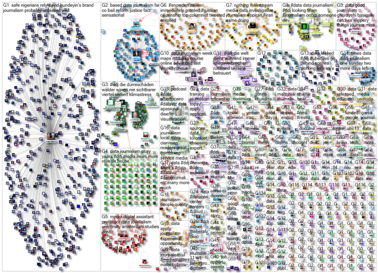
Thanks again to Marc Smith and Harald Meier of Connected Action for gathering the links and graphing them. The Top Ten #ddj list is curated weekly.
 Eunice Au is GIJN’s global team manager. Previously, she was a Malaysia correspondent for Singapore’s The Straits Times, and a journalist at Malaysia’s New Straits Times. She has also written for The Sun, Malaysian Today, and Madam Chair.

