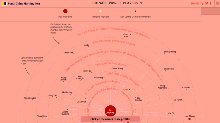
South China Morning Post mapped the connections between Chinese Communist Party members and the most influential leaders. Image: Screenshot.
The workings of the Chinese Communist Party are shrouded in secrecy, and its quinquennial national congress is closely watched by analysts for signs of political and policy shifts that can reverberate throughout the world. The South China Morning Post published a detailed guide on the power players in the party ahead of the congress later this year. Our weekly NodeXL and human curation of the most popular data journalism stories on Twitter also highlights an investigation into military justice in the United States, an analysis of Russia’s election voter turnout using artificial intelligence, a draw-it-yourself interactive of India and Pakistan’s borders, and charts celebrating Serena Williams’ astounding tennis career.
China’s Power Players
Ahead of China’s 20th Communist Party congress later this year, the South China Morning Post published a detailed digital guide breaking down everything readers need to know about one of the country’s most significant political events. SCMP journalists examined the 25 members of the Politburo (the highest policymaking body of the party), the central committee members (giving an assessment of these people’s likely futures within the party), and profiled the rising stars to watch. The guide also offered a look at the party’s history, and visualized the connections between party members and the most influential leaders.
Another A-tier graphic from @SCMPNews looking at who's who in China's Politburohttps://t.co/9j9rc8oq2V
— Jerome Taylor (@JeromeTaylor) August 11, 2022
Arbitrary Military Justice?
ProPublica and The Texas Tribune examined the military justice system in the United States. Using the Freedom of Information Act, the newsrooms obtained data on nearly 8,400 military court hearings in the past decade. Their analysis revealed that soldiers accused of sexual assault are less than half as likely to be placed in pre-trial detention compared to those accused of offenses like drug use and distribution, disobeying a superior, or burglary.
Soldiers accused of sexual assault are less than half as likely to be placed in pretrial confinement than those accused of offenses like disobeying an officer. Terrific reporting by @viannadavila @LChurchill @renLarson_ for @ProPublica @TexasTribune https://t.co/G8LiAObiyP
— Lynn Dombek (@LynnDombek) August 9, 2022
Investigating Voter Turnout with AI
Russian President Vladimir Putin’s United Russia party swept the polls in the country’s parliamentary elections last year. Exiled independent news site Meduza obtained more than one million hours of video footage from webcams installed on the premises of thousands of polling stations during that election. Using artificial intelligence and a group of independent monitors to examine the video archive, the outlet reported that voter turnout recorded in the footage was much lower than the official figures that were released. According to Meduza’s analysis, the discrepancy in numbers suggests that roughly a third of the ballots cast in the examined precincts were likely fake. If this same trend held across the country, it would translate to more than 17 million phantom votes.
Clever journalism by @meduza_en: Apply machine learning to > 1 mln hours of video footage to estimate actual turnout in Russia's 2021 Duma elections. Their estimate (would love to see replication): ~ 1/3 of ballots counted in precincts examined were fake.https://t.co/3Twu2zqFU1
— Scott Gehlbach (@sgehlbach) August 12, 2022
Analyzing Brazilian News Bias
Those who tune in to the Brazilian Jovem Pan channel are regularly fed a news diet that leans heavily toward President Jair Bolsonaro. Media outlet Revista Piauí commissioned Novelo Data, a data consultancy, to analyze more than 1,000 episodes of Pingos nos Is, the channel’s most-watched program. Their investigation offered a glimpse into how the program’s messaging leads to political radicalization. Its findings show critical comments against the country’s courts have intensified in the last five years, mentions of sensitive issues such as the massive Lava Jato corruption scandal disappeared, while topics deemed favorable to the Bolsonaro government skyrocketed.
A investigação em dados da @NoveloData que mostra a mudança de discurso do Pingos nos Is conforme a conveniência do governo Bolsonaro. Não deixem de assistir ao vídeo. E a matéria principal já está aberta para não assinantes no site da @revistapiaui https://t.co/e3l80HXgfd
— Ana Clara Costa (@anaclaracosta) August 14, 2022
Europe’s Broken Plastic Promises
European food and drink corporations have been making many plastic commitments over the past two decades, including pledges to reduce virgin plastic use and incorporate more recycled plastic in product packaging. But have these companies delivered on their promises? Deutsche Welle and the European Data Journalism Network identified 37 plastic commitments that should already have been fulfilled by European firms, and found that two-thirds of those promises have failed or been quietly dropped.
European food companies break plastics promises.
Two-thirds of pledges to go greener on plastic fail or are dropped.
How European food & drink companies break their own commitments, & how legislation might hold them accountable.
A @dwnews investigation:https://t.co/BT93rwefXu
— Lotte Leicht (@LotteLeicht1) August 9, 2022
Baby Name Second Thoughts
Choosing a newborn’s name can be one of the hardest decisions parents can make. There were nearly 30,000 baby name changes recorded by the Social Security Administration in the United States in the past five years. In a column last week, the Washington Post’s Andrew Van Dam dove into the data to find out which names were changed most often during that period, and which monikers were the most commonly adopted by name changers. The top two “regretted” baby names, most likely changed due to spelling errors, were “Issac” and “Chole.” And the top two most adopted names? Unsurprisingly, “Isaac” and “Chloe.” Also worth a look: elDiario’s look at the diversity and popularity of names in Spain over the past 25 years.
.@andrewvandam's Data Dive answers questions you DIDN'T EVEN KNOW YOU HAD https://t.co/naPw3I1Sy8
— Emily Guskin (@EmGusk) August 12, 2022
Charting Serena Williams’ Trailblazing Career
After competing in professional tennis for two decades, powerhouse Serena Williams signaled in an interview that she may soon step away from the sport. The New York Times visualized Williams’ celebrated career in several charts, giving readers an overview of her dominance in the world rankings, her achievements in singles tournaments, and her Grand Slam wins and defeats.
Serena Williams is amazing. 🐐https://t.co/v68pvjbY2E pic.twitter.com/u8P7xAEvgu
— Rob Seferian Maguire (@RobMaguire) August 10, 2022
Shortage of UK Dentists
The provision of state-funded dental care is supposed to be a boon for lower-income individuals in the United Kingdom. However, an investigation by the BBC found a serious shortage of state-subsidized services, resulting in waiting lists of up to a year or more for some patients. The BBC contacted almost 7,000 dental practices with a National Health Service contract in Scotland, Wales, England, and Northern Ireland to find out if they were taking on new patients under the state’s health service. They discovered that nine in 10 dental practices were not accepting new adult patients.
Nine in 10 weren’t taking on adults for health service treatment, while eight in 10 weren’t accepting kids
— Harriet Agerholm (@HarrietAgerholm) August 8, 2022
DIY India – Pakistan Partition
The action-adventure television series Ms. Marvel recently brought the 1947 India-Pakistan Partition to the attention of global audiences. It gave an insight into one of the world’s largest forced migrations when the Indian subcontinent was divided into two separate nations: Hindu-majority India and mostly Muslim Pakistan. Al Jazeera took a look at how the boundaries were drawn by the British and invited readers to try drawing the borders themselves in a draw-it-yourself interactive.
We've got a fabulous interactive map for you and an animation that shows you how the borders were drawn by the British. https://t.co/vMj8CZPxoF#Partition1947 #Pakistan #India @ajlabs @AJEnglish
— Alia Chughtai (@AliaChughtai) August 12, 2022
Global Emotions Index
The World Happiness Report and Global Emotions Report, published by Gallup, an American analytics and advisory company, measures people’s life satisfaction ratings, day-to-day emotional states, and captures the trends of feelings in each country. Freelance data journalist Karthik Muth visualized the research findings and created an interactive quiz for readers to explore the emotions felt by their fellow citizens.
Do you feel what others around you feel?
Try this #quiz and find out:https://t.co/YBMaWeM2C1#ddj #dataviz #scrollytelling pic.twitter.com/8jlelQkoHV— Karthik Muthuswamy (@karthik_muth) August 13, 2022
Bonus Item: All About R
Got the feels for the R programming language? You’re not alone. Data geeks are sharing their R “love stories” on Twitter in response to data analyst Tanya Shapiro’s request. Want to get notified when your code has completed running? Rachel Germain, assistant professor at The University of British Columbia, has a hack for you. Need to up your R game? Knight Center is offering an advanced online course in data journalism with R from Sept. 5 to Oct. 2. The course costs US$95.
I was an Excel data analyst managing a massive reporting system for a growing company. As time went on, excel crashed more and more often. I found R and turned a 40 hour a week job into a 10 minute a week automated process. This was about 2014.
— Robert Kahne (@rkahne) August 13, 2022
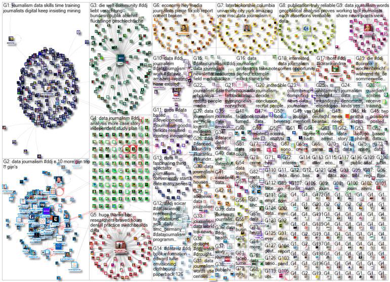
Thanks again to Marc Smith and Harald Meier of Connected Action for gathering the links and graphing them. The Top Ten #ddj list is curated weekly.
 Eunice Au is GIJN’s program manager. Previously, she was a Malaysia correspondent for Singapore’s The Straits Times, and a journalist at Malaysia’s New Straits Times. She has also written for The Sun, Malaysian Today, and Madam Chair.
