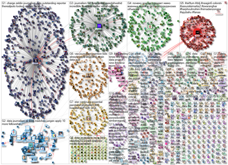
Cars today have become as sophisticated as our mobile phones, equipped with hundreds of sensors, built-in internet connections, and mechanisms for collecting millions of data points about our driving habits. The Markup looked at whose hands that data falls into, and what they do with it. Our weekly NodeXL and human curation of the most popular data journalism stories on Twitter also features The Economist’s piece on deteriorating quality of education in poorer countries, El País’ look at how higher temperatures affect our lives, Atlatszo’s visualization of Formula One’s 73-year history, and Factchecker’s analysis of India’s extrajudicial killings data.
Vehicle Data Privacy
Do you know what data is being transmitted from your car, and where that information ends up? The Markup examined the poorly regulated vehicle data industry and identified 37 companies seeking to monetize vehicle data. Among the players in the industry are vehicle data hubs, insurance companies, telecom operators, navigation firms, and in-vehicle infotainment companies. Find the data for this story on Github.
NEW: New cars today are like smartphones. So who are the companies that are collecting and monetizing your car's data? We identified 37 companies who play different roles in the connected vehicle data marketplace. w/ @alfredwkng https://t.co/BR4zh0F4dt 🚙📊 🧵 1/8
— Jon Keegan 🇺🇦 (@jonkeegan) July 27, 2022
Falling Literacy Rate Among Women
The Economist highlighted findings from a paper by researchers at the Center for Global Development on the long-running decline of education quality in the developing world. The issue? More and more girls are enrolling in schools, but the literacy rate of female students after completing at least five years of schooling is declining. This suggests that the quality of education is deteriorating over time.
.@TheEconomist has a short piece on our paper on long-run trends in education quality.
1. Not surprising: % of women going to school is rising, almost everywhere.
2. More surprising: % who are literate after 5 years of school is flat or falling.https://t.co/sJoZBva9y9 pic.twitter.com/5KTwIBka1G
— Justin Sandefur (@JustinSandefur) July 25, 2022
How Rising Temperatures Affect Us
As the world gets hotter and hotter due to climate change, journalists at Spanish daily El País took a look at how rising temperatures affect our daily life by reviewing and visualizing data from several research studies. According to the studies they referenced, as temperatures increase, aggressive behavior follows suit. Among the findings: At higher temperatures, people tend to post more insults on Twitter, honk more in traffic jams, and do worse on math tests.
1/ 🔥 ¿Cómo nos afecta el calor en el día a día? Hemos repasado datos e investigaciones… y resulta que insultamos más, pensamos peor, sube la violencia, sufren los cultivos y se frena la economía.
Con @infoiguacel y @danielegrasso: https://t.co/mb94XvkiL5
— Kiko Llaneras (@kikollan) July 30, 2022
Visualizing Formula One’s History
In conjunction with the Hungarian Grand Prix held last week, the data team at Hungarian investigative center Atlatszo, a GIJN member organization, published an interactive visualization encompassing the 73-year history of Formula One. It included data on racing locations worldwide, top performing teams, racers with the most victories, fastest pit stops and wheel changes, lives lost, and an animation of 77 tracks used in the international racing sport over the decades.
The 37th Hungarian Grand Prix @HungaroringF1 will start in two hours. Check out our new #dataviz on the history of #F1 #Formula1 on this link: https://t.co/9EjTgxkdmy pic.twitter.com/9KAVWXu5ff
— atlo.team (@AtloTeam) July 31, 2022
Is New York City Safe?
An increase in the number of homicides in New York City during the COVID-19 pandemic sparked fears and concerns among residents about the safety of the city. Bloomberg examined the statistics to see whether this perception matched reality. It found that the city is actually much safer now compared to the 1980s and early 1990s, when the murder rate was five times higher. Journalists also found that recent media coverage about crime in the Big Apple is disproportionately high compared to the actual incidences of crime. Journalist Raeedah Wahid sums up this piece in a tweet thread.
I think this article does a good job putting recent increases in NYC crime into perspective. I’d love to read more that talks to folks who work in newsrooms about their coverage choices. https://t.co/uonGV7VuBm
— Carissa Byrne Hessick (@CBHessick) August 2, 2022
Tracking Healthcare Wait Times
The pandemic has exacerbated wait times for public healthcare in Scotland. Data journalists at DC Thomson put together nine articles tracking wait times for different health services in the country, including accident and emergency services, in vitro fertilization, cancer treatment, and mental healthcare. The charts, published in The Courier and The Press and Journal, show that patients are forced to wait well beyond national targets for vital care. Data journalist Lesley-Anne Kelly shares more about the series in an opinion piece, and in a tweet thread.
You can now track NHS waiting times in your area thanks to a landmark project from @DC_Thomson's data team.
Our talented journalists have put together nine trackers covering everything from A&E to cancer treatment waiting times: https://t.co/mVsLnYxb2Z
Read on for more🧵
— The Courier (@thecourieruk) July 25, 2022
A Look at States Hostile to Abortion Access
The US is grappling with the fallout of its Supreme Court’s decision in June this year to overturn the 1973 Roe v. Wade ruling, ending a five decade-long constitutional right to abortion. According to an analysis by The Upshot, states that have banned abortion, or are likely to ban the procedure, typically perform worse in ensuring the health and wellbeing of children and mothers. These states do not offer paid family leave, and children and women of reproductive age are more likely to lack health insurance.
In today's Upshot, @clairecm @emilymbadger @sangerkatz and @EveSuane analyzed some health outcomes and policy choices of all 50 states, grouped by the likely legal status of abortion there:https://t.co/bkpLp2cYSG pic.twitter.com/DYMh9zH6NP
— Kevin Quealy (@KevinQ) July 28, 2022
Increasing Costs of Tertiary Education
Parents in Indonesia will find it increasingly difficult to pay for their children’s higher education, as predicted by Indonesia’s national newspaper Kompas. Its journalists came to this conclusion after analyzing wage data for high school and university students who graduated between 1995 and 2022, as well as tuition fees from 30 public and private universities between 2013 and 2022. Based on the newspaper’s analysis, the cost of university and college education is expected to increase by 6.03% per year, while the salaries of parents who graduate from high school or university will increase at 3.8% and 2.7% per year respectively, thus trailing behind the rising cost of tuition fees.
Tim jurnalisme data @hariankompas menganalisis data-data upah lulusan SMA dan universitas selama 1995-2022 dg data biaya studi dari 30 PTN dan PTS selama 10 thn terakhir. Hasilnya, orangtua Indonesia di masa depan makin sulit membiayai kuliah anaknya.https://t.co/MxNm5DaTUb pic.twitter.com/8UkUHFA1Rf
— BiLLY KHAERUDIN (@BiLLYKHAERUDIN) July 28, 2022
Encounter Killings in India
‘Encounter killings’ is a term used in India to describe extrajudicial killings by the police or armed forces — committed supposedly for reasons of self-defense. These killings are controversial as the motivations behind them are often dubious. India’s FactChecker analyzed data collected by the country’s National Human Rights Commission and found that the number of pending cases of encounter killings have jumped nearly fivefold over the past six years.
In past 6 years, #pending cases of #encounter killings have increased nearly fivefold #India has seen 813 cases of encounter #killings between 2016-17 and 2021-22, with almost a 70% rise in last one year.
Read @FactCheckIndia's analysis of #NHRC data: https://t.co/jh5djUhTtE pic.twitter.com/jYyJMpx1wA
— FactChecker.in (@FactCheckIndia) July 26, 2022
The “Definitive” List of What’s Midwest
While looking for accommodation in Nebraska, columnist Andrew Van Dam at The Washington Post noted that many of the listings on Airbnb mentioned “Midwestern charm,” “Midwestern welcome” or something similar. Intrigued, he then analyzed more than half a million Airbnb listings to figure out ‘Where is the Midwest?’ and ‘What is considered Midwestern?’ According to his analysis, Iowa Airbnb listings had the largest share of people describing their location as Midwestern, while the walleye fish was the most commonly mentioned Midwestern cultural artifact. Also worth a look: The Post’s streamgraph on what’s fueling inflation in the first half of this year.
My absolute favorite genre of reporting is east coast newspapers trying to figure out what the Midwest is. (This one is actually pretty good.)https://t.co/4L8yKxVCFS
— kate needham (@katenedwed) August 2, 2022
Bonus: Maps!
A few data-driven maps are making the rounds on Twitter: this map by Benjamin Tran Dinh shows you how far you can travel from each station in Europe in less than five hours. A globe by Topi Tjukanov shows the birthplaces of noteworthy people around the world. And, finally, this map by John Wiseman shows the level of GPS interference worldwide, with historical data going back to February 14 of this year.
Finally, the only daily, global, free map of GPS interference has officially launched: https://t.co/4ezvY3PEQN Watch jamming around conflict zones develop over time. Wonder who's jamming GPS all around Moscow. Like all the best maps, it raises more questions than it answers! pic.twitter.com/tHFN8detJw
— John Wiseman (@lemonodor) July 29, 2022
Thanks again to Marc Smith and Harald Meier of Connected Action for gathering the links and graphing them. The Top Ten #ddj list is curated weekly.
 Eunice Au is GIJN’s program manager. Previously, she was a Malaysia correspondent for Singapore’s The Straits Times, and a journalist at the New Straits Times. She has also written for The Sun, Malaysian Today, and Madam Chair.


