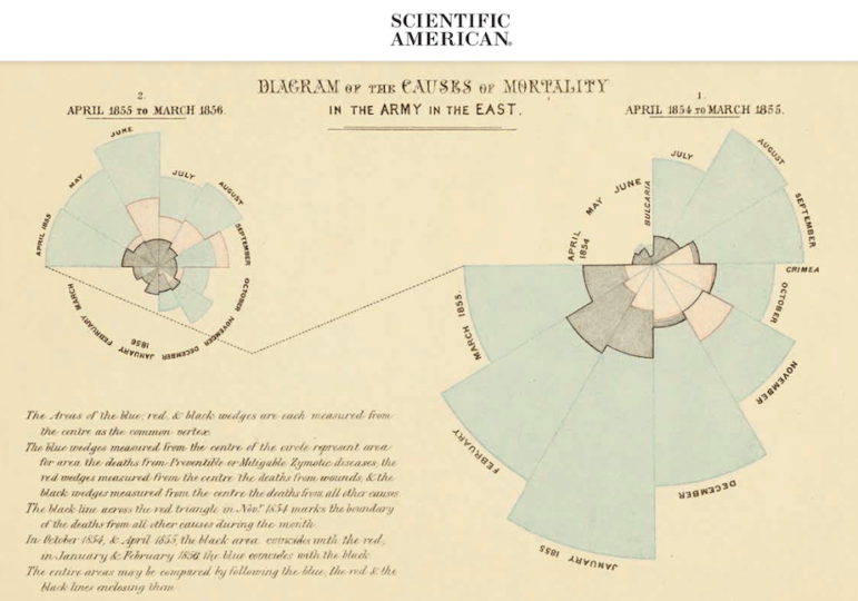
Scientific American looked at Florence Nightingale’s overlooked role in pioneering infographics and data visualization. Image: Screenshot
Children’s fashion is riddled with gender stereotypes from cut to color, and from patterns to slogans, according to an analysis by German newspaper Süddeutsche Zeitung. It found that popular children’s clothing tended to be more revealing for girls, but comfortable and functional for boys. Our weekly NodeXL and human curation of the most popular data journalism stories on Twitter also highlights an analysis of the big earners in the health care industry, Bloomberg’s tracking of post-pandemic recovery through sandwich sales, a deep dive into Spain’s immigration control industry, and a look at Florence Nightingale’s groundbreaking contribution to graphic storytelling.
Gender-Stereotyped Fashion
German newspaper Süddeutsche Zeitung examined the extent of gender stereotypes in children’s fashion by analyzing more than 20,000 items of clothing from three large online retailers: H&M, Zalando, and About You. By looking at the cut, color, patterns, and slogans of these items, the team discovered that kids’ fashion cemented widespread gender clichés. Among their findings: Girls’ shorts are shorter and more revealing, while boys’ shorts are longer and designed for movement and comfort. Girls’ shirts have more sequins, decorative bows, flowers and dots, while boys’ shirts tend to feature stripes and camouflage. The word “love” appeared more than 200 times on the examined girls’ clothing, but only about 70 times on boys’ clothing. Reporters dug into the figures and why “this is a problem – for girls and boys.”
Neue @SZ-Datenanalyse: 🩳 Hotpants für Mädchen, Shorts für Jungen? Das Angebot bei 👕 Kinderkleidung ist von Stereotypen bestimmt. Warum das ein Problem ist – und zwar für Mädchen und Jungen (SZ+) #ddj #dataviz mit @bbbrille, @nasablowski und @vorsamer https://t.co/sx71K0TrkC
— Marie-Louise Timcke (@datentaeterin) July 22, 2022
Healthcare’s Big Earners
The leaders of healthcare companies in the United States have been raking in big bucks during the pandemic. Health-oriented news site STAT reported that approximately 300 chief executives collectively took home more than US$4.5 billion in 2021, a sum large enough to cover the annual health insurance of roughly 580,000 Americans. The journalists drew this conclusion by analyzing executive compensation found in the annual proxy filings of nearly 300 healthcare companies, which they had manually entered into an open source tool developed by the Associated Press. STAT’s analysis included the CEOs’ salaries, bonuses, perks, and the actual realized gains of the executives’ stock awards and options.
Want to know what the CEOs of companies like Pfizer, GoodRx, Teladoc, HCA, or One Medical made last year — and how it roughly compares to what their employees made?
Click through this fascinating, ambitious project from a whole team of STAT reporters: https://t.co/sN1lnSsamn
— Erin Mershon (@eemershon) July 18, 2022
Sandwiches as Economic Signal
For over a year, Bloomberg has been tracking the return of workers to offices in London, New York City, Paris, and Hong Kong, as the pandemic receded. Their unique unit of measurement: sandwich sales in busy districts by international franchise Pret A Manger Ltd, popularly referred to as Pret. Bloomberg’s Pret Index shows that the sales of Pret’s sandwiches in London’s financial and theater districts are yet to recover fully but are already close to 90% of pre-pandemic numbers. In contrast, transactions in downtown and midtown New York haven’t bounced back, with sales hovering between 35% and 45% of pre-COVID levels. Read the index methodology here.
The Pret Index is the economic recovery story we didn't know we needed; such a fun piece of data journalism. https://t.co/POG0Z4x2iq @bbgvisualdata
— Adam Welch (@AdamDWelch) July 22, 2022
Immigration Control as Big Business
El Confidencial and Fundacíon PorCausa examined Spain’s immigration control industry in detail. Journalists analyzed close to 3,000 government contracts related to immigration from 2014 to April of this year, and worth a total of nearly US$1 billion. Featuring graphics, maps, and multimedia elements, their investigation details the “big winners” of the lucrative and opaque industry as well as the aspects of immigration that these businesses manage.
Impresionante trabajo de @JoseAntonio_BG y @porCausaorg sobre la industria del control migratorio:https://t.co/sN6DN7hScM
— Ana Álvarez (@AnaVgo) July 18, 2022
Florence Nightingale’s Groundbreaking Graphics
Florence Nightingale, a well-known figure in nursing history, was also a pioneer in information graphics. RJ Andrews, professional data storyteller and author of “Info We Trust,” wrote for Scientific American about how the groundbreaking use of graphic storytelling by Nightingale and her team helped convince authorities to improve sanitary conditions of the British army and to reform civilian public health systems. The piece includes several of Nightingale’s data diagrams.
Florence Nightingale is famous as a nurse, but she was also a pioneer of data graphics. Amazing story by @infowetrust: https://t.co/pzUuoBs1pf
— Clara Moskowitz (@ClaraMoskowitz) July 22, 2022
France: Record-Breaking Heat Wave
Parts of Europe have been sweltering as summer heat waves take hold. On July 18, France recorded its hottest daily high temperature since August 5, 2003. French newspaper Le Monde took a look at the historical temperatures recorded by 127 weather stations across the country. Using step charts, the paper visualized the record-breaking temperatures at each station from 1920 to today.
Probably the best way to represent the record breaking temperatures in france in #dataviz
By @LeMonde_EN https://t.co/s2TYP0XlXP— Xtophe 🇺🇳 🇯🇵(🇺🇦)! (@Xtophe_Bontemps) July 24, 2022
Vaccine Inequality
According to a report in the Guardian, global vaccine inequality means that the world has failed to reach the World Health Organization’s target of having 70% of the world’s population vaccinated against the coronavirus by the middle of 2022. While three in four people in rich countries are vaccinated against COVID-19, only one in seven have been vaccinated in low-income countries. According to the analysis, the situation is particularly dire in Africa, where seven African nations are among 10 countries worldwide that have the lowest rates of COVID vaccinations.
Covid vaccine figures lay bare global inequality as global target missed https://t.co/yLZolLG1Kw pic.twitter.com/C3lvY0rnCY
— Guardian Visuals (@GuardianVisuals) July 21, 2022
Destruction in Ukraine
Russian independent news site IStories took a look at the destruction that has taken place in the five months since Moscow launched its invasion of Ukraine. Basing their investigation on various Ukrainian data sources, journalists report that the Russian army attacked civilian targets — residential buildings, hospitals, schools, and train stations — almost 60 times more often than military ones. IStories was branded as an “undesirable organization” by the Kremlin and now operates outside the country’s borders.
За пять месяцев войны без дома (в буквальном смысле) остались минимум 3,5 млн украинцев.
Сколько людей проживало в разрушенных к 1 июня 116 тысячах домах — это 8 % населения страны. https://t.co/ZW9l61MvO7 pic.twitter.com/89eH2B5CiC— Новости без плашки (@antiplashka) July 25, 2022
Detainees in Egypt
Egypt is one of the world’s “biggest prisons for journalists,” according to Reporters Without Borders (RSF). The country’s authorities also have a practice of keeping alleged dissidents in indefinite pretrial detention by renewing their imprisonment in perfunctory hearings every time they max out the legal jail time limit. The New York Times analyzed handwritten court logs, kept by volunteer defense lawyers, which revealed about 4,500 people trapped in the circular nightmare of pretrial detention between September 2020 and February 2021. Read the investigative methodology here.
This reporting from @VivianHYee and colleagues is some of the best I've seen on Egypt's political prisoner crisis, sharing prisoners' stories and utilizing unique research methods to show why it's so hard to capture the crisis with numbers and estimates: https://t.co/9w2fihVjU6
— Allison L McManus (@AllisonLMcManus) July 16, 2022
Archiving Data Journalism
Data visualizations are getting more complex and dynamic by the day. But there is a gap in the systematic preservation of these interactive outputs and the underlying datasets. Professor Bahareh Heravi, a data and computational journalism researcher, writes for Datajournalism.com about the risks of losing these dynamic data visualizations and the challenges of preserving them. She also offered some suggestions, which include taking screengrabs and piecing them together in an animated GIF, or capturing a video cast of the data visualization in use.
#datajournalism pieces published with interactive design are reshaping digital storytelling. Some will be remembered as part of history. But how do you archive online #ddj? Prof. @Bahareh360 looks at this issue and its solutions in our latest article: https://t.co/3e66CxwLFK pic.twitter.com/JnGxliSXsK
— DataJournalism.com (@datajournalism) July 18, 2022
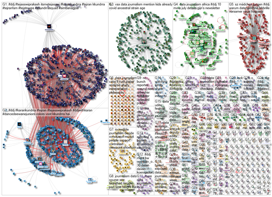
Thanks again to Marc Smith and Harald Meier of Connected Action for gathering the links and graphing them. The Top Ten #ddj list is curated weekly.
 Eunice Au is GIJN’s program manager. Previously, she was a Malaysia correspondent for Singapore’s The Straits Times, and a journalist at the New Straits Times. She has also written for The Sun, Malaysian Today, and Madam Chair.
