The New York Times mapped the distances to the nearest abortion clinic after the US Supreme Court reversed the Roe v. Wade decision. Image: ScreenshotA highlight from the world of data journalism this week looked at how a new US Supreme Court ruling is impacting travel times for women seeking abortions in clinics or hospitals around that country. Our weekly NodeXL and human curation of the most popular data journalism stories on Twitter also examines visualizations showing China’s intensifying surveillance of its population, the impact of heat waves on fragile populations in Germany, the state of the Russian army, and gender differences among speeches in Zurich’s parliament.
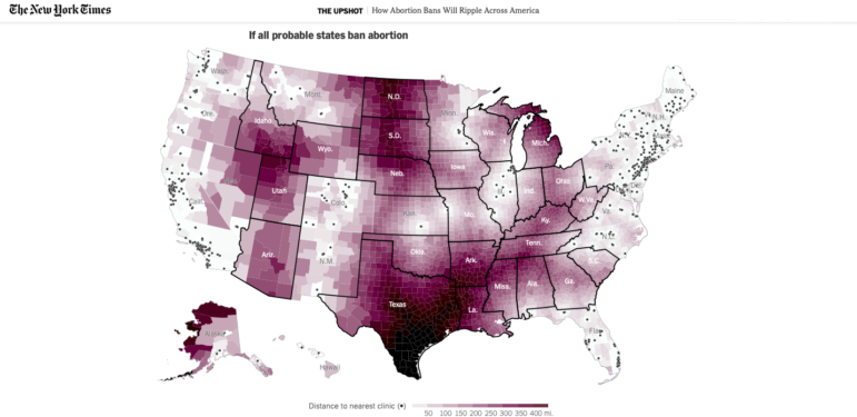
How Abortion Bans Will Ripple across America
Since the landmark Roe v. Wade precedent was overturned, abortion is no longer a federal right in the US, and nine states immediately banned the medical practice based on pre-existing “trigger” laws. These interactive maps developed by The New York Times show the impact of these bans on possible travel times for women in different regions who seek an abortion. The newspaper mapped the distance and time according to different scenarios: before the precedent was overturned; after it was overturned; if 13 states in total banned abortion; and a final scenario, in which Florida, Virginia, and Kansas would also ban abortion, which would result in 24 million women being more than 200 miles (322 kilometers) from a facility.
What happens to abortion access next depends not only on your state, but also on your neighbors. This interactive visualization tool let’s you explore various scenarios. Thanks to @sangerkatz @clairecm @qdbui @UpshotNYT for another prescient visualization. https://t.co/9akuMaKYvX
— Caitlin Knowles Myers (@Caitlin_K_Myers) June 24, 2022
US Supreme Court’s History of Overturned Rulings
Quartz also updated a chart made in December, visualizing all the decisions overturned since 1800 by the US Supreme Court. According to this analysis, the court has overturned only 233 of its previous decisions in 232 years of history. For more recent context, between 1946 and 2020, the court rendered 9,095 decisions, but overturned just 161, or less than 2%. Besides this month’s Dobbs case that reversed the Roe v. Wade precedent, other major decisions that overturned past rulings include Adler v. Board in 1967 (which allowed schools to fire teachers who belonged to “subversive organizations”) and Lawrence v. Texas in 2003 (so-called sodomy laws that effectively criminalized sex between two men).
The Roe v Wade decision is particularly surprising because, historically, very, very, very, very few decisions are overturned.
In the history of the US Supreme Court, it has happened in fewer than 2% of rulings.
We graphed every one from 1888 to 2021: https://t.co/vSvOn3SJY7 pic.twitter.com/5oqrlHNqZz
— Amanda Shendruk (@AShendruk) June 24, 2022
Showing Gender Inequity with Sound
The Swiss daily Neue Zürcher Zeitung analyzed speeches by the Zurich Parliament’s councilors, and compared those by men and women. According to their analysis — despite the greater representation of women in parliament — men still speak more often, even though women are more active than their male colleagues, and, on average, make more parliamentary proposals. To study these interactions, NZZ automated the analysis of 1,100 official meeting reports and 10,600 interactions over the past 20 years, made available by the Cantonal Council in PDF format. To capture this gender inequity, the newspaper produced a sound data visualization reflecting in music the differences in intervention between men and women in parliament.
Did a #sonification about #gender inequality in our local council. Not only are there more men on the council, men also speak more often per capita than women. Here is a session as an acoustic data visualization. 👇
What you hear (🧵) #sonofication #data #datajournalism pic.twitter.com/s87KCZG1cZ— Simon Huwiler (@simon_huwiler) June 20, 2022
China’s Surveillance State Is Growing
For over a year, The New York Times analyzed 100,000 Chinese government bidding documents collected and shared by ChinaFile, a digital magazine published by the Asia Society. They reveal how China is collecting vast amounts of personal data from its population, and is willing to intensify this strategy in the future. This visual investigation details the tools used by that government to surveil its population — cameras, phone trackers, facial recognition — and which types of data are collected, like its citizens’ iris patterns and male DNA. In one document about the latter, it reveals a police description of the intensity of this surveillance: “Do not miss a single family in each village, do not miss a single male in each family.”
China is building a new modern marvel. It's not a dam or a high speed rail, it's the most sophisticated domestic surveillance system in the world.
The scale of data collection is staggering. No biometric frontier is neglected. This is how it works: https://t.co/JsjaNDrPW3
— Paul Mozur 孟建國 (@paulmozur) June 21, 2022
Sorry State of Russia’s Army
This data story from the independent Russian investigative site IStories analyzes the state of the Russian army four months into its invasion of Ukraine. According to this analysis — which combines open source data, official Russian, Ukrainian, American, and British assessments, and data from the Oryx project — one of the world’s most powerful militaries prior to the start of the invasion has been significantly degraded, and could require years to regain its previous potential. In several visualizations, IStories provides extensive estimates on the losses of equipment such as tanks, armored vehicles, drones, and guns.
Россия уже потеряла:
• до 4% всего личного состава действующей армии,
• до 42% боеспособных танков,
• до 19% бронетехники,
• до 30% беспилотников,
• 2/3 запасов ракет.https://t.co/IF5FrOEi9E#ddj pic.twitter.com/LUJ1TmI9VL— Важные истории (@istories_media) June 20, 2022
No-Bid Contracts in Latin America
The Network of Journalists of Latin America for Transparency and Anticorruption (Red Palta) investigated how public resources are invested in mental health medications in Central and South America. Thanks to freedom of information requests and public databases, the collaborative group accessed and analyzed sales contracts signed between 2017 and 2021 in five countries: Argentina, Chile, Guatemala, Peru, and Uruguay. According to the information obtained, the majority of psychotropic drugs are acquired in processes that only have single bidders, or where subsidiaries of the same group participate. The research also illustrates the limited mental health budgets allocated by these governments.
Con la @RedPalta decidimos investigar cómo se invierten los recursos públicos en la compra de medicamentos para la #SaludMental.
Estos son los hallazgos que revelamos hoy con @Ojo_Publico, @LNdata, @robotlabot, @_ojoconmipisto, @PODERlatam y @ladiaria 🧵https://t.co/sbDBKrwXB6— 👁️🗨️Elizabeth Salazar (@ElizabSalazar) June 22, 2022
Heat Waves in Germany
A project by Germany’s Zeit Online analyzed data from the nation’s weather service for the past 50 years to show how heat spikes are particularly dangerous for elderly or sick people, and cause the deaths of thousands of people every year. The analysis shows how a crucial national and international topic can be brought to light with local data, while also telling the stories of the human lives behind the data. The report also reveals how unprepared German authorities seem to be for the local consequences of global warming.
Deutschland wird heißer und Hitze tötet. In heißen Sommern sterben mehr, als im ganzen Jahr im Verkehr. Doch das Problem wird ignoriert. Die Mehrzahl der Landkreise hat keine #Hitzeschutzpläne, zeigt unsere Recherche. Obwohl sie zuständig sind #Klimakrise https://t.co/cBtMWOH2aQ pic.twitter.com/BYnptVmzPZ
— Kai Biermann (@kaibiermann) June 22, 2022
Counting Italy’s Monumental Trees
The Italian site Il Post took an interest in the country’s monumental trees, classified as those that are a “rare example of majesty and longevity, presenting a particular naturalistic value due to the rarity of the species, or constituting a precise reference to events or relevant memories from a historical point of view.” Since 2017, the Ministry of Agricultural and Forestry Policies has made an inventory of those trees and, according to the last census in 2021, there are now 3,662 of them throughout the country. Il Post geolocated these trees and, according to its visualization, the regions with the highest number of trees are the island of Sardinia (410), followed by Friuli-Venezia Giulia in the northeast (334), and Abruzzo east of Rome (298).
Dove sono gli alberi monumentali in Italia? Ce ne sono 3.662, sparsi un po' ovunque, e i più facili da salvaguardare sono quelli di cui ci siamo dimenticati. Qui un po' di info e la mappa con i dati pubblicati dal @Mipaaf_ https://t.co/mSr60VQp7y #opendata #ddj #dataviz @ilpost pic.twitter.com/0I1wdYWaMj
— Isaia Invernizzi (@EasyInve) June 20, 2022
Describing Sounds
Try to describe sounds and you’ll soon notice that we don’t have many words to describe them. The Sound Atlas project, created by Dutch organizations aifoon and SMAK — with help from blind and visually impaired people — wants to do something about this. The site aims to stimulate internet users to imagine sounds and find words for them on the basis of a public survey, and allows these results to be monitored in real time.
[NIEUW] Voor de Geluidenatlas van @aifoon maakte ik een visualisatie van hoe mensen woorden met geluiden associëren https://t.co/rcstJ7dGFf pic.twitter.com/8qDWtApeJv
— Maarten Lambrechts (@maartenzam) June 20, 2022
Identifying Map Projections
If you see a map and need to replicate it — but don’t know how it was created — Clara Dealberto, data designer at WeDoData, recommends this tool, which allows users to know the projection of any map. She explains how to use it in the following thread (in French).
🔍🗺✨ Vous avez une carte, vous devez la refaire, mais vous ignorez la projection utilisée ?
BOUGEZ PAS C'EST PLUS UN PROBLÈME !
Merci à Tomáš Bayer d'avoir créé cet outil, merci @briceterdjman pour la découverte 💖https://t.co/Sjx4ItH70H
Par ici pour le DealberTuto™ ⬇️ pic.twitter.com/DgELkvONDR
— Clara Dealberto (@claradealberto) June 20, 2022
Thanks again to Marc Smith and Harald Meier of Connected Action for gathering the links and graphing them. The Top Ten #ddj list is curated weekly.
 Marthe Rubio is GIJN’s French editor. After working for five years in Spain and Argentina, she is now based in France. She worked for two years on the data team of Argentina’s La Nacion. She has also published in Slate and Libération and worked as a correspondent in Buenos Aires for French newspapers Le Figaro and Mediapart.