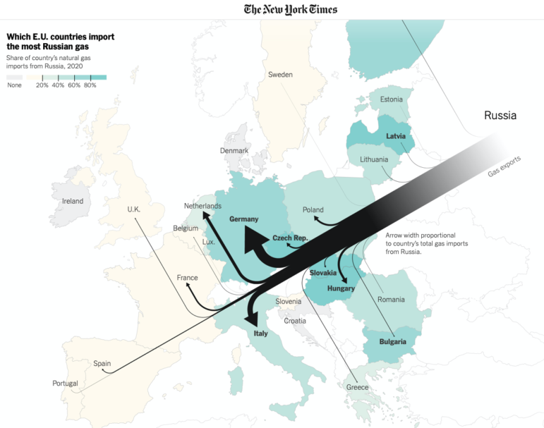
The New York Times created a graphic to track Russian natural gas exports to Europe. Image: Screenshot
The world’s attention is on the unfolding Russian invasion of Ukraine. Data teams in newsrooms across the globe are mapping the military movements, the dependence of countries on Russian exports, and Russia’s ability to withstand economic sanctions. Our weekly NodeXL curation of the most popular data journalism stories on Twitter also features a global collaborative investigation led by Süddeutsche Zeitung and OCCRP into a Swiss bank leak, results from DataJournalism.com’s 2021 State of Data Journalism survey, and a New York Times report on the quadruple jump revolution in women’s figure skating.
Global Dependence on Russia’s Exports
The world watched in shock as Russia launched a full-fledged invasion of Ukraine early yesterday. Data journalists have been gripped by the escalating situation for weeks, churning out a large number of graphs, maps, and explainers on the building conflict. The New York Times earlier reported that Europe’s dependency on Russian natural gas could limit countries’ diplomatic responses to Russia’s actions. The team visualized the largest importers of Russian gas using a flow diagram, and is regularly updating its map tracker of Russia’s invasion. Reuters has a piece on the same topic, mapping the main gas waypoints between Russia and the rest of Europe. Al Jazeera focused on wheat exports, as Russia is the world’s largest wheat exporter. For its part, The Wall Street Journal looked at how Russia could buffer itself against economic sanctions imposed in response to the invasion.
NYT has done a reverse Minard and I'm into it https://t.co/XHo8kiZ8UX
— Soph (@SophieWarnes) February 18, 2022
#SuisseSecrets
A huge investigation led by German paper Süddeutsche Zeitung (SZ) and the Organized Crime and Corruption Reporting Project (OCCRP), with 163 journalists from 48 media outlets in 39 countries, reveals how a top Swiss bank helped dictators, corrupt politicians, spies, and criminals hide illicit fortunes. The Guardian mapped the countries with the largest number of high-risk clients in the leaked bank data, including Venezuela, Egypt, Ukraine, and Thailand. Browse some of the most problematic account holders in OCCRP’s interactive, and listen to the story via SZ’s 4-episode podcast here (in German).
Credit Suisse leak reveals the secret owners of 18,000 bank accounts, worth a total of £80bn.https://t.co/d5b47jMLkr
We mapped where the beneficiaries of those accounts are from.#SuisseSecrets pic.twitter.com/RfdEW8BSm5
— Niels de Hoog (@nielsdhg) February 20, 2022
The State of Data Journalism
During the past year, DataJournalism.com surveyed over 1,500 people involved in data journalism worldwide. The survey revealed 11 surprising findings, including that a quarter of the respondents took up data journalism as a result of the pandemic, that most of them are self-taught, and that Python is their most popular programming tool. Check out all the results here. See some of the key findings visualized using Flourish.
Which of the following do you consider real challenges to producing more #datajournalism? We found that access to quality data is seen as the main barrier to data journalists (56%), followed by time pressure (49%) and lack of final resources (47%): https://t.co/6zpMLgRc07 #ddj pic.twitter.com/RraMw8umUP
— DataJournalism.com (@datajournalism) February 21, 2022
Black Neighborhoods Impacted by Investors
The Washington Post analyzed data from real estate firm Redfin and found that investors had bought nearly one in seven homes in top metropolitan areas in the United States last year. These investors were particularly aggressive in targeting neighborhoods with a majority of Black residents, which could drive up housing prices and price out current tenants as a result. The Post report follows a cross-border investigative collaboration by Arena for Journalism in Europe last year, which found a similar trend happening on that continent. Explore the data for 40 US cities in WaPo’s interactive.
New maps from @kevinschaul: Investors bought up a record number of homes in top metro areas last year, with Black neighborhoods disproportionately affected https://t.co/oPgdWz4uwV pic.twitter.com/b8R2GiNQmf
— John Muyskens (@JohnMuyskens) February 16, 2022
The Quad Jump Revolution
Men have been landing quadruple jumps (four full revolutions in the air) in figure skating for years. The New York Times reported that, now, women are starting to incorporate it into their routines at international competitions, as quads are worth more points than other jumps even when they aren’t executed well. Only 12 women have landed the quad cleanly in competition so far, and Russian athletes are leading the charge due to their youth and intensive training regime. NYT charted quads that led to medals since 2005 for both genders, plus the female skaters who have landed the quad in international competition.
these illustrations from @yparshina are so delightfully lovely https://t.co/yK7O0TV9v3 pic.twitter.com/6Wbl4Rxg5U
— ಠ_ಠ (@DeniseDSLu) February 17, 2022
Unequal Vaccine Distribution
Le Monde examined the distribution, resale, and donations of COVID-19 vaccines across the European Union during the first year of the continent’s vaccination campaigns. Its analysis found an unequal distribution: the richer northern and western countries favored mRNA vaccines (Pfizer and Moderna) while the poorer southern and eastern countries prioritized the cheaper viral vector vaccines (AstraZeneca and Janssen). It also discovered that a few of the poorest countries in the EU resold large quantities of mRNA vaccines that they had previously received.
Covid : L’ARN messager a été privilégié à l’ouest et au nord, les pays de l’Est ont commandé plus d’AstraZeneca @LiseBarneoud https://t.co/wCOhZNoG1B @lemondefr pic.twitter.com/wH0lmcGxJ8
— Le Monde en cartes (@LM_enCartes) February 17, 2022
Explaining “Containergeddon”
During the COVID-19 pandemic, particularly in the first year, the world faced a “supply chain crisis” as countries locked down and isolated infected workers, causing vast economic disruptions and shipping delays worldwide. The South China Morning Post created an infographic to explain why goods were taking much longer to reach consumers due to the shortage of crew, as well as lack of containers and capacity at major ports.
🙂 I was an honor to get to work with graphic team at SCMP and learn about infographic design in newsroom. yeh ! I used my 3d skills to make this artworks at SCMP and it was very fun. https://t.co/OedT8fVCZr #Dataviz
— Molpasorn S. (@MOLP_SW) February 16, 2022
Text-Based DataViz
Information designer Tiziana Alocci threw out a question on Twitter: “What are the best examples of text-based data visualization?” And the data journalism community delivered a flood of inspiring replies. Among the suggestions, it seemed that The Pudding’s visualization portfolio emerged a clear favorite. See its 2018 piece on how Ali Wong structures her stand up comedy, the Gyllenhaal spelling experiment, and their interactive visualization of every line in Hamilton. Check out all the examples here.
This one by @NadiehBremer https://t.co/bySogVBkTs
— Yan (@yanoak) February 15, 2022
Visualize Data with Fewer Colors
Using too many colors in a visualization can cause confusion among readers. What to do? Berlin-based designer Lisa Charlotte Muth wrote a blog post recommending 10 ways to minimize the use of colors in charts with many categories, including emphasizing one category at a time, direct labeling of same-colored lines, or simply, don’t use different colors.
🎉 New blog post! How can you get from the 15 colors in your visualization to a less overwhelming (and more accessible!) five? Or one?
I wrote down a few ideas: https://t.co/rpZVhaMzYk— Lisa Charlotte Muth (@lisacmuth) February 16, 2022
Mapping Castilian-Leonese Election Results
Spain’s El Pais broke down the results of the February 2022 Castilian-Leonese snap regional election street-by-street. It found that the popularity of the far-right Vox party was broad and cut across the lower-, middle-, and upper-middle-income neighborhoods. The party, which had only garnered 5.5% of votes in a May 2019 election, now boasts 17.9% of the total.
¿Qué barrios votan a Vox? Hemos explorado sus resultados y fueron MUY transversales. Primero: le votan en pueblos y ciudades. Segundo: aunque Vox despunta en las calles más ricas, tiene igual éxito en vecindarios de renta baja, media y media-alta.
Más 👉 https://t.co/8mElRfY7fP pic.twitter.com/aAApKkt05v— Kiko Llaneras (@kikollan) February 20, 2022
Bonus 11th item: Data Comic
xkcd’s webcomic is always a favorite among those who work with data, math, and statistics, so we couldn’t resist sneaking this one in.
Me (evil voice): “that is precisely what I want MUAHAHAHAHA”https://t.co/7okBUapAdg pic.twitter.com/R2LmbSE6zN
— Jorge Galindo (@JorgeGalindo) February 18, 2022
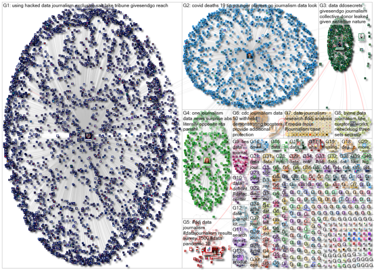
Thanks again to Marc Smith and Harald Meier of Connected Action for gathering the links and graphing them. The Top Ten #ddj list is curated weekly.
 Eunice Au is GIJN’s program manager. Previously, she was a Malaysia correspondent for Singapore’s The Straits Times, and a journalist at the New Straits Times. She has also written for The Sun, Malaysian Today, and Madam Chair.

