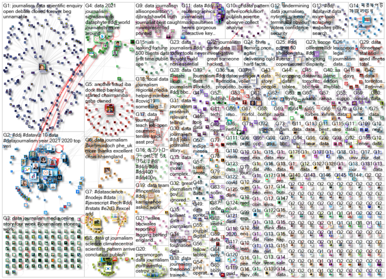
Scenes of supporters of outgoing President Donald Trump storming the US Capitol building dominated news headlines and filled social media feeds last week. Our NodeXL #ddj mapping from January 4 to 10 found Reuters producing a play-by-play summary of what happened, and FiveThirtyEight examining the stark difference in reaction by the authorities to the Capitol mob compared to Black Lives Matter protesters. Also in this edition, we feature National Geographic’s cartography archive, Data Crítica’s investigation into under-counting of Indigenous COVID-19 infections, and The Markup’s analysis of the impact of Facebook’s political ads.
From the Archives: National Geographic Maps
In case you missed this announcement from 2018 which resurfaced on Twitter recently, National Geographic has digitized its archive of more than 6,000 maps from its 130-year history. The entire cartography collection includes every map published in the magazine since its first issue in October 1888 and is accessible only to subscribers.
Every map ever published in the National Geographic magazine since the first issue in October 1888 has been compiled into a digital archive—take a look https://t.co/blT0EmiEDQ
— National Geographic (@NatGeo) January 5, 2021
How the Capitol Riots Unfolded
Hundreds of supporters of now twice-impeached US President Donald Trump stormed the Capitol building in Washington, DC, last Wednesday. Reuters neatly and chronologically summarized what occurred during the riots starting from Trump’s speech around midday, in which he urged his supporters to march on the Capitol, to the mob breaching the building, and finally to when order was restored.
Play-by-play:
How a pro-Trump mob stormed the U.S. Capitol as lawmakers debated the final certification of the presidential election @ReutersGraphics https://t.co/9AkXR5jpbP 1/8 pic.twitter.com/gVfyF0YcpV— Reuters (@Reuters) January 7, 2021
US Protests from Left to Right
When pro-Trump supporters mobbed the Capitol building, one thing was notably absent: the kind of confrontations between police and protesters that occurred during the Black Lives Matter protests last summer. FiveThirtyEight spoke to the nonprofit Armed Conflict Location & Event Data Project, which documents detailed information about protests. It found that US authorities are more than twice as likely to break up a left-wing protest than a right-wing protest.
Left-wing protests (like #BLM) see a different response from authorities than right-wing protests.
This is what I discussed with @FiveThirtyEight regarding yesterday’s events in #DC. https://t.co/FABGTRmnEe
— Roudabeh Kishi (@roudabehkishi) January 7, 2021
Comparing COVID-19 and Flu
Since the start of the COVID-19 outbreak, people have compared the pandemic to the what happens during a typical flu season. Using historical data on flu admissions in intensive care units of UK hospitals, John Burn-Murdoch, a senior data visualization journalist at the Financial Times, examines how the two viruses impact occupancy of intensive care beds.
NEW: a common response to reports of hospitals struggling this winter is "it’s no different to a bad flu season!"
I’ve tracked down historical data on flu ICU admissions, including winter 2017-18, a record high.
Here’s how England’s Covid winter compares to a bad flu season 📹 pic.twitter.com/tsExrDZM31
— John Burn-Murdoch (@jburnmurdoch) January 7, 2021
Miscounting Indigenous COVID-19 Infections
For months, Mexico has been under-reporting thousands of suspected cases of COVID-19 in Indigenous communities in its official data, according to this investigation by Data Crítica, published by GIJN member Quinto Elemento Lab. Among the accounting failures: More than 3,000 people who were infected by the coronavirus were marked as “Indigenous language speakers” in the records but were classified as “non-Indigenous” elsewhere.
Durante meses, en México se excluyeron más de 9 mil casos sospechosos de covid-19 entre indígenas. Este subregistro por parte del gobierno federal se suma a una larga cadena de invisibilización.
Una investigación de @Datacritica producida por @quintoelab https://t.co/vcCzW3ThRD— Patricia Curiel (@PatCuriel) December 30, 2020
Facebook and Elections
Last November, Facebook clamped down on political advertising in an attempt to reduce the spread of misinformation in the US presidential election. However, it did allow sponsored posts about politics in the state of Georgia ahead of the recent Senate election. Nonprofit investigative newsroom The Markup found that the social media platform’s decision to switch on political ads again resulted in partisan content elbowing out information from news sites from users’ Facebook feeds. Check out their findings and investigative methodology.
.@corintxt crunched the numbers and found that after Facebook flipped the switch for political ads, partisan content elbowed out reputable news outlets in our panelists’ news feeds. https://t.co/Z0kibSBeQZ /2
— Surya Mattu (@suryamattu) January 5, 2021
COVID-19 Vaccinations in the UK
In a race to combat a faster-spreading variant of the coronavirus, the UK has launched a massive vaccination program with a target to distribute vaccines to more than 30 million people “by the autumn.” The BBC breaks down the details on how this vaccine roll-out will take place, including information on who will get the vaccine first, which vaccines will be distributed, and the differences between the various approved vaccines. Also, check out the BBC piece from last year paying tribute to COVID-19 victims by visualizing the losses as flower petals.
How will the UK jab millions of people?@dominicbailey_ and I looked at the latest logistical details of the biggest vaccination programme the country has ever seen https://t.co/tXpS8ogTtH pic.twitter.com/MN22LmAVVT
— Lucy Rodgers (@upyorkshire) January 8, 2021
Measuring Happiness on Twitter
Peter Dodds and Chris Danforth, applied mathematics professors who run the Computational Story Lab at the University of Vermont, set out to measure people’s happiness in near-real time. The first version of the tool they created for the task, the Hedonometer, draws on Twitter data as a source and assigns a “happiness score” to a group of words collected from a sampling of roughly 500 million tweets daily. Some trends have emerged in their analysis through the years: Saturday is the week’s happiest day on Twitter, while Tuesday is the saddest. Read more on how their tool works here.
Just how bad was pandemic 2020? These professors found answers on @Twitter, by @travismandrews https://t.co/pz9rAqLowT via @washingtonpost #COVID19 #SoMe #Goodbye2020
— André Picard (@picardonhealth) December 31, 2020
Germany’s Travel Boundaries
In Germany, the government has proposed that in counties with a seven-day incidence of over 200 new COVID-19 infections per 100,000, residents should not be allowed to travel beyond a 15-kilometer (nine mile) radius from their homes. German daily Berliner Morgenpost created an interactive tool for the public to input their place of residence to see how far they could venture from their household, if the proposal comes into effect where they live. Der Spiegel has a similar tool.
#Berlin nähert sich wieder der 200-Grenze bei der Wocheninzidenz. Wenn sie erreicht ist, wird die Mobilität in der Stadt auf einen 15-km-Radius um die Stadtgrenze eingeschränkt.. #15km #Corona https://t.co/SXx2xaKavl pic.twitter.com/Myv7wtTO5n
— BM Infografik (@BMgrafik) January 12, 2021
Ethics of Using Black Market Data
A blockbuster investigation by Bellingcat and The Insider Russia, in cooperation with Der Spiegel and CNN, implicated Russia’s Federal Security Service (FSB) in the attempted assassination of Russian opposition politician Alexey Navalny. The exposé was made possible through the purchase of flight manifests and cellphone metadata bought on the Russian data black market, which placed the FSB agents in proximity to Navalny at key moments. The Washington Post writes that this payment for material set off ethical alarm bells in the industry. Dive into the methodology here.
As it has partnered with mainstream news organizations to get its findings to the public — including CNN and Der Spiegel — Bellingcat’s occasional use of what is essentially a black market for data raises questions for American newsrooms. https://t.co/z8CiLr8nAW
— Nieman Reports (@NiemanReports) January 11, 2021
Thanks again to Marc Smith and Harald Meier of Connected Action for gathering the links and graphing them. The Top Ten #ddj list is curated weekly.
 Eunice Au is GIJN’s program manager. Previously, she was a Malaysia correspondent for Singapore’s The Straits Times, and a journalist at the New Straits Times. She has also written for The Sun, Malaysian Today, and Madam Chair.
For a look at NodeXL’s mapping on #ddj and data journalism on Twitter, check out this map.