The death of African American George Floyd in police custody has resulted in a major uproar against structural racism in the United States. Our NodeXL #ddj mapping from June 1 to 7 finds The New York Times examining police use of force in Minneapolis, the city in which Floyd died after being asphyxiated by a police officer. The Washington Post also dug into data of every fatal shooting in the US by police officers since 2015. Meanwhile in coronavirus-related data journalism, The Guardian highlighted questionable medical research data, the Financial Times investigated flawed figures from Spain’s government, and Belgium’s Le Soir found many domain names linked to the coronavirus crisis have already been reserved.
Police Use of Force Against Black People
Videos showing the death of George Floyd in police custody in Minneapolis in the US have horrified people around the world, sparking many Black Lives Matter protests against structural racism and police brutality towards the African-American community. The New York Times examined police use of force data in Minneapolis since 2015 and found that cops got violent with blacks at a rate at least seven times that of white people over the past five years. The NYT’s visual investigations team also reconstructed the events leading up to Floyd’s death using security footage, witness videos, and official documents.
This is an extraordinary piece of data journalism. https://t.co/ShB3eqtTpV
— Christopher Groskopf (@onyxfish) June 3, 2020
Police Shootings Database
The Washington Post has been compiling a database of every fatal shooting in the US by a police officer in the line of duty since January 1, 2015. The team dug into the data to look at the frequency and location of shootings, and the races of the victims involved. Despite promised reforms, the data show nothing has changed. More reporting on this here.
The Washington Post police shooting database is now in its 6th year. All 6 years of data — every person shot and killed by an on-duty police officer since January 1, 2015 — is available here: https://t.co/rlHWocqQUt
— Wesley (@WesleyLowery) May 26, 2020
Data Points for Protests
Interactive developer and journalist Erik Hinton tweeted his concerns about the media’s current coverage of protests. He questioned newsrooms’ focus on mapping violent incidents as data points and ponders if there is a better way to chart the bigger picture. You can read his tweet thread here.
I think a lot about how an inability to adequately cover protests is built into journalistic institutions and norms, into what constitutes a data point. You can fact-check and plot a broken window, but editors haven't figured out how to chart the bigger picture of revolt.
— Erik Hinton (@erikhinton) June 2, 2020
Questions over COVID-19 Research Site
As the world seeks treatments for COVID-19, several medical studies have been referencing data from QuartzClinical, a vast medical database from a little-known company called Surgisphere. The company claims that it monitors global healthcare in real time using artificial intelligence to collect data from 1,200 international hospitals. But as researchers began to scrutinize the database more closely, they discovered serious flaws. The Lancet and The New England Journal of Medicine, both major science journals, retracted studies based on QuartzClinical data because the data could not be verified. The Guardian reports on this here, and here is a summary of what they found.
You can also read her feature looking at how a single study published in a leading medical journals led to trials of a possible coronavirus treatment being halted around the world. Weeks later the study was retracted and it all began to unravel https://t.co/bBvwFHNRNr
— Laura Murphy-Oates (@lauramoates) June 9, 2020
Giving Voice to the Voiceless
As the coronavirus spreads across the globe, not enough attention is going to its impact on the world’s vulnerable populations, writes journalist Sherry Ricchiardi for Datajournalism.com. She gathered suggestions from several data journalists on how newsrooms can ensure their coverage includes the voiceless and marginalized communities.
.@datajournalism's latest story by Sherry Ricchiardi (@sricchia) explores how reporters are bringing a voice to the voiceless with their #coronavirus coverage using #datajournalism. A useful read with interviews from @aeleraqi @mendozamartha #storytelling https://t.co/rYUUBOFklY
— Tara Kelly (@tarakelly) June 4, 2020
Flawed COVID-19 Figures in Spain
Spain’s figures for coronavirus-related deaths have been more volatile than those of any other rich country, due to revisions in the way the government counts the deaths. The Financial Times digs into the cause of the erratic numbers. Data journalist John-Burn Murdoch explains the story in this tweet thread.
As Spain encourages visitors… are they hiding the true figures? https://t.co/1BTJNqqTJq
— Coral Rose Official (@coralroseradio) June 7, 2020
Coronavirus Domain Names Reserved
The Belgian daily newspaper Le Soir found that an avalanche of Belgian domain names linked to the coronavirus crisis have been reserved since January this year. This includes at least 1,909 site addresses which feature the keywords “corona,” “Covid,” “virus” and “masks.”
Frénésie de réservations de noms domaines ".be" liés à la crise depuis le début de l'année avec les termes coronavirus, covid, masque, mask, et virus. Grâce à la coopération de @DNSBelgium (une première!), nous avons pu tous les passer en revue. https://t.co/08PgM9RidL pic.twitter.com/1zxzgf8B9Y
— Alain Jennotte (@plicplic) June 7, 2020
Orphans in Russia
In conjunction with International Children’s Day on June 1, Russian investigative media site I-Stories looked at the plight of orphans in Russia. The team examined how the introduction of the Dima Yakovlev Law, which forbade Americans adopting Russian children, affected orphans in the country. Separately: I-Stories also has a tutorial on how to use OpenRefine to quickly clean data and make automatic queries to databases.
В День защиты детей рассказываем, как от санкционной политики России страдают дети.
7 лет назад чиновники подписали «закон подлецов», запретив американцам усыновлять российских сирот.https://t.co/X9uD5luRst #ddj
Опубликовано с @novaya_gazeta и @takiedelaru pic.twitter.com/013qjSg9NG— Важные истории (@istories_media) June 1, 2020
Psychopathic Charts
Alberto Cairo, Knight Chair in Visual Journalism at the University of Miami, rounds up a bunch of “psychopathic” charts that cherry-pick data and are grossly misleading.
New post: Psychopathic charts, lines that should be bars, and picking cherries https://t.co/Gw2qD1X90s #dataviz #infographics #ddj pic.twitter.com/M9P0fjfi2t
— Alberto Cairo (@AlbertoCairo) June 6, 2020
Examining Minard’s Portfolio
French civil engineer Charles-Joseph Minard, who lived from 1781 to 1870, is known among the dataviz community as a great information designer and an important figure in the development of data visualization. He is particularly noted for his representation of numerical data on geographic maps, especially his flow maps. Paul Kahn, a Northeastern University lecturer in experience design, examines Minard’s extensive portfolio.
An interesting review of Minard's work, including a thought experiment – what if he had never created the Napoleon's march diagram?
Touching Minard https://t.co/V24WCBSv9t pic.twitter.com/T99wsgPK70
— Bill Shander (@billshander) June 3, 2020
Thanks again to Marc Smith of Connected Action for gathering the links and graphing them. The Top Ten #ddj list is curated weekly.
 Eunice Au is GIJN’s program coordinator. Previously, she was a Malaysia correspondent for Singapore’s The Straits Times, and a journalist at the New Straits Times. She has also written for The Sun, Malaysian Today, and Madam Chair.
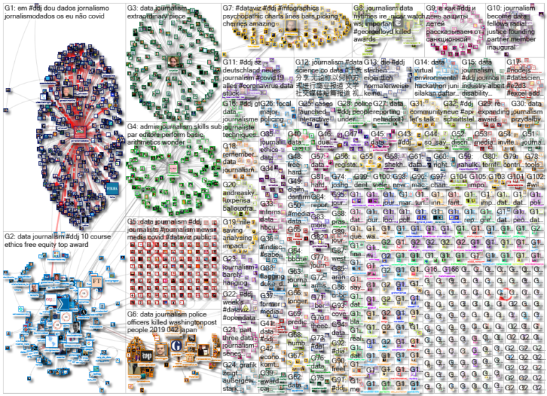
For a look at NodeXL’s mapping on #ddj and data journalism on Twitter, check out this map.

Very informative and critical thinking about data journalism.Good initiative work for journalists and journalism department Students.