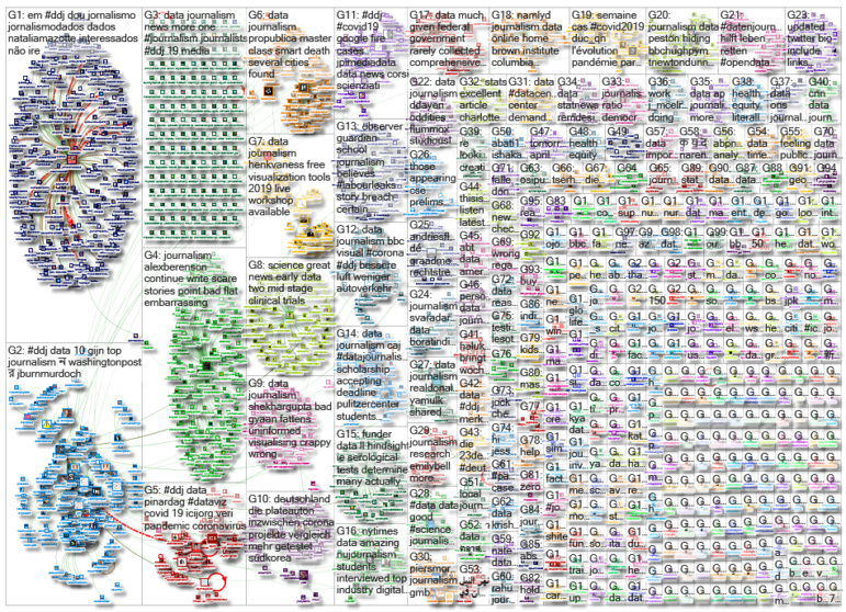
Misinformation has grown ubiquitous during the COVID-19 pandemic, so much so that World Health Organization Director-General Tedros Adhanom Ghebreyesus proclaimed: “We’re not just fighting an epidemic; we’re fighting an infodemic.” Microsoft co-founder Bill Gates has emerged as a favorite target of disinformation actors, according to an article in The New York Times, that we discovered through our NodeXL #ddj mapping from April 13 to 19. We also found The Economist and ProPublica examining the true impact of the pandemic by looking into “excess mortalities” such as home deaths, the Associated Press releasing and updating a coronavirus public dataset for the United States, and the International Consortium of Investigative Journalists talking about the limitations of current COVID-19 data.
Coronavirus Conspiracies Circling Bill Gates
Microsoft co-founder Bill Gates is the target of an explosion of conspiracy theories surrounding the coronavirus outbreak. This piece by The New York Times looking into the attacks against Gates unleashed by anti-vaccinators, conspiracy theorists, and right-wing pundits is peppered with data on the misinformation involved.
we also found more than 1,035 Facebook communities, 28 Instagram accounts, and tens of thousands of other posts, tweets and videos have pushed conspiracy theories related to Mr. Gates and the coronavirus pic.twitter.com/gF31Hg5pJd
— Davey Alba (@daveyalba) April 17, 2020
Tracking COVID-19 Excess Mortality
Many official daily figures of COVID-19 deaths exclude anyone who didn’t die in hospital, who did not test positive, or those who were killed by other conditions that could have been treated successfully if hospitals were not overwhelmed. This means official death tolls are likely under-counting the true number of fatalities the pandemic has caused. The Economist is trying to better measure the full damage caused by looking at “excess mortality” worldwide. Data journalist James Tozer explains the story in a tweet thread.
The COVID-19 outbreak is possibly much more severe than the confirmed figures suggest.
Jakarta reports 84 confirmed deaths due to COVID-19. But data on burials in Indonesia’s capital suggest an excess of at least 1,600 deaths.
From The Economist here https://t.co/HOfEkKJ3pb pic.twitter.com/YdSygP28WK
— Max Roser (@MaxCRoser) April 20, 2020
Spike in Home Deaths: COVID-19 Under-Counting
ProPublica has its own take on under-counting of COVID-19 related deaths by diving into data that shows a spike in people dying at home in several cities. In New York alone, authorities are recording more than 200 home deaths per day — a nearly sixfold increase from recent years.
In Detroit, authorities are responding to nearly 4x the number of 911 calls for dead bodies. Residents near Boston are dying much more often than usual.
A look at the growing undercount problem of covid-19 across the U.S. (w/ @lisalsong & @jeffykao):https://t.co/Da5AY3nl7r
— Jack Gillum (@jackgillum) April 14, 2020
Behind the Scenes of a Viral COVID-19 Tracker
Data visualizations have been helping people around the world make sense of the pandemic, and The Financial Times’ COVID-19 cases trajectory tracker has been particularly useful. Data journalist John Burn-Murdoch shared with Nightingale’s Jason Forrest the behind-the-scenes process of creating the popular chart.
Those hugely influential COVID-19 charts by the FT’s @jburnmurdoch started life as ggplot2 charts in R #rstats https://t.co/DwlXsWH6DT
— David Smith (@revodavid) April 15, 2020
Open Data on Coronavirus
The Associated Press joins other organizations in releasing a COVID-19 dataset. It has made public US county-level data and is updating it hourly. The dataset is available to any organization that signs up for a free account on data.world. The platform also organized a webinar earlier, which you can watch here on-demand, to demonstrate how to use the data for research and analysis. In France, the French government has also provided a COVID-19 dashboard.
AP now sharing #opendata on #coronavirus https://t.co/jSJCecq4b6 – joining the LA Times https://t.co/QszDxOCRHI and the NYT https://t.co/0mX5hLEowt – anyone know of any others?
— Paul Bradshaw (@paulbradshaw) April 14, 2020
Spread of Coronavirus in Brazil
Using Flourish data visualization studio, UOL Noticias prepared a timeline of the spread of the coronavirus in Brazil. The maps shows how COVID-19 cases started to appear in the larger cities and spread through the interior of the states.
Após 2 semanas de análise de dados e plotagem de gráficos no @f_l_o_u_r_i_s_h, sai hoje meu primeiro trabalho com uma visualização de dados que eu mesma fiz, no @UOLNoticias
Uma linha do tempo do coronavírus no Brasil.
Siga o fio para (+)https://t.co/uSO9CLnwtd— Judite (@juditecypreste) April 16, 2020
Data Limitations in Investigating the Pandemic
Agustin Armendariz, senior data reporter at the International Consortium of Investigative Journalists, writes about the flaws in widely-used COVID-19 numbers worldwide. He describes the impact of the pandemic on data journalism and the caveats journalists insert in their reports to ensure transparency on the limitations of data used.
The most widely-used numbers to describe the impact of the #COVID19 pandemic — reported cases and deaths — are flawed. @ICIJorg data journalist @agustin_ICIJ tells you what it means and why it matters. https://t.co/LVgMKxOAHG
— Scilla Alecci (@shirafu) April 14, 2020
Coronavirus Testing in Germany
One of the main problems faced by governments around the world is the lack of COVID-19 tests and difficulties in testing. Der Tagesspiegel analyzed the availability of such test kits in Germany, and the percentage of those tested that are positive. For more data journalism from Der Tagesspiegel, check this repository of all their interactives.
Deutschland hat inzwischen mehr auf Corona getestet als Südkorea. Die #Coronavirus-Tests in Deutschland im Vergleich zu anderen Ländern. Und was sagt die Testquote eigentlich aus? @jonasfbb hat es recherchiert. #ddj https://t.co/JFS2hiAsX1 pic.twitter.com/BgvtVGXiGZ
— Hendrik Lehmann (@plateauton) April 16, 2020
The “Making-Of” Interviews
In Storybench’s interview section, students at the Northeastern University’s School of Journalism are looking “under the hood” of the latest digital stories. Their in-depth features provide insights into how top industry practitioners create data visualizations, and produce strong investigative journalism.
My amazing @NUjournalism students interviewed top industry digital storytellers & published @storybench https://t.co/jhVsZZc56r w @nytimes @washingtonpost @voxdotcom & more thnx @NickStoico @aleszubajak @Northeastern – great inside insights on data, design, persistence #ddj
— John Wihbey (@wihbey) April 15, 2020
So You Want to Be a Data Journalist?
In case you missed the massive open online data journalism course organized by the Knight Center Journalism in the Americas last year, the materials are now available online. Among the instructors featured: Alberto Cairo, Simon Rogers, Debra Anderson, Duncan Clark, Jan Diehm, Minhaz Kazi, Dale Markowitz, Marco Túlio Pires, and Katherine Riley.
Want to learn to be a #datajournalist? @AlbertoCairo and I worked on this #MOOC with the great team at @utknightcenter, supported by the @GoogleNewsInit.
This thread will show some of the videos – you can read more here: https://t.co/3Vc0Xhe4GD
Welcome: https://t.co/4hi44Afm2A
— Simon Rogers (@smfrogers) April 12, 2020
Thanks again to Marc Smith of Connected Action for gathering the links and graphing them. The Top Ten #ddj list is curated weekly.
 Eunice Au is GIJN’s program coordinator. Previously, she was a Malaysia correspondent for Singapore’s The Straits Times, and a journalist at the New Straits Times. She has also written for The Sun, Malaysian Today, and Madam Chair.
For a look at NodeXL’s mapping on #ddj and data journalism on Twitter, check out this map.