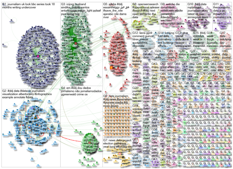
What’s the global data journalism community tweeting about this week? Our NodeXL #ddj mapping from January 20 to 26 finds the Johns Hopkins Center for Systems Science and Engineering mapping the Wuhan coronavirus outbreak, Al Jazeera analyzing the impact that Ethiopia’s mega-dam project will have on the Nile river and its surroundings, Der Tagesspiegel outlining the changes in America over the course of Donald Trump’s presidency, and Alberto Cairo highlighting the importance of annotating data visualizations.
Wuhan Coronavirus
The World Health Organization was informed of an outbreak of “pneumonia of unknown cause” detected in the city of Wuhan in China’s Hubei province on December 31, 2019. The Johns Hopkins Center for Systems Science and Engineering is tracking the spread of that outbreak, now known as the 2019-novel coronavirus (2019-nCoV) or the Wuhan coronavirus, in real-time. It mapped the cases and locations in this online dashboard. Read more about the project here.
This is cool and informative map of #WuFlu https://t.co/d6yLnyfWnY pic.twitter.com/zzAMkcsdij
— Oilinki, Thailand (@oilinki) January 26, 2020
Saving the Nile
A mega-dam has triggered a major dispute between Egypt and Ethiopia over access to water resources from the Nile, the oldest and longest river on the planet. Al Jazeera analyzed five scenarios currently being negotiated between Egypt, Sudan, and Ethiopia, and provide a look at the potential consequences to the region.
Scientists believe the Nile in its current form is considered to be the oldest and longest river on the planet.
The dam is expected to severely impact the biodiversity of more than 100 islands in the Nile and the people who rely on them https://t.co/AobiymQ9ZQ pic.twitter.com/TslQwoIvke
— Al Jazeera English (@AJEnglish) January 23, 2020
Trump Analyzed in 15 Graphs
US President Donald Trump has been in office for three years. Der Tagesspiegel digs into what has changed in America during his presidency and analyzes his chances for re-election in November this year.
Mehr Jobs, eine wachsende Wirtschaft – hält #Trump, was er versprochen hat? Zum dreijährigen Amtsjubiläum des US-Präsidenten haben wir seine Amtszeit in 15 Grafiken analysiert. @Tagesspiegel @benebrandhofer @Michael_Gegg @plateauton @_davidmeidinger
🇺🇸➡️https://t.co/vQARo0grdM pic.twitter.com/2w9ZJfRgDG— Helena Wittlich (@HelenaWittlich) January 20, 2020
How to Annotate a Visualization
Alberto Cairo, Knight Chair in Visual Journalism, blogs about the importance of annotations in visualizations by highlighting a good example from the Financial Times. He says: “Explanatory visualizations shouldn’t consist of visualizing data alone, but also of adding words to put the data in context, highlight the most relevant facts, or dispel possible misinterpretations.”
New post: An example of how to annotate a visualization, by @ftdata: https://t.co/W61kWt3yVI #dataviz #infographics #ddj #dataJournalism pic.twitter.com/U7PX4xkuCq
— Alberto Cairo (@AlbertoCairo) January 23, 2020
Analyzing Public Protests in Hungary
Over the past year, there has been an increase in reports of protests in Hungary, including rallies for workers’ rights and education. Atlatszo’s data team analyzed the number and type of demonstrations in the country, as well as crowd size, between November 2015 and October 2019.
Demonstrations and public rallies in Hungary in the last four years #ddj #dataviz https://t.co/79e4Nr3OeT
— atlo.team (@AtloTeam) January 21, 2020
American Media Diet Affects Views on Ukraine
According to an analysis of data from Pew Research Center’s Election News Pathways project, the news diets of Democrats and Republicans are tied to their perceptions of President Trump’s behavior and motives in withholding military aid to Ukraine. The data is available here. More analysis on the country’s media polarization here.
65% of Republicans and their leaners who got their news only from media outlets with right-leaning audiences say President Trump withheld aid to Ukraine as part of an effort to fight corruption, not help his reelection https://t.co/uOfCMdNPeA pic.twitter.com/AmV1mCcmqM
— Pew Research Fact Tank (@FactTank) January 27, 2020
Advocacy with Data on Your Side
Eva Belmonte, director of Spanish nonprofit newsroom Civio, offers her views on the line separating journalism from advocacy. She says: “Activism cannot be what starts or moves the wheels of an investigation. It cannot set the agenda. You can be an activist after publishing, but not during an investigation and you may not treat activists differently from other sources, despite the temptation.”
Our latest Long Read is out: @civio's founder @evabelmonte explores how #datajournalism is blurring the lines between activism and journalism
➡ https://t.co/cTETlSfxbL pic.twitter.com/wAEENEWBQY— DataJournalism.com (@datajournalism) January 20, 2020
Unreliable Buses
Inspired by this SWR3 story on the punctuality of public transport in Frankfurt, data journalist Haluka Maier-Borst took a look at Flixbuses that depart from Berlin. He found that 60% of them arrive at their destinations late, performing worse than trains.
It all started with colleagues @SWRdata publishing this cool story. I thought, why not make a quick Berlin spin off. This was the one of the very first drafts of the viz. (2/x) pic.twitter.com/bWhSTQ6afy
— Haluka Maier-Borst (@HalukaMB) January 21, 2020
Missed Scholarship Opportunities in El Salvador
More than 50 countries offered scholarships to El Salvador in the last five years, but only half of those scholarships were awarded. The loss of the other half was due to various reasons, including candidates’ lack of fluency in a second or third language. Elsalvador.com analyzed the issue.
#Noticias Más de 50 países ofrecieron becas a El Salvador en los últimos cinco años. La mitad de estas becas se perdió por diversas razones 👇https://t.co/LaC5xkT03t
— elsalvador.com (@elsalvadorcom) January 22, 2020
Data Workshop for 5 Southeast Asian Countries
CrowdTangle is hosting a three-day data bootcamp designed to help newsrooms integrate data analytics in their editorial operations. The program is open to newsrooms based in Indonesia, Malaysia, Philippines, Singapore, and Thailand.
At @crowdtangle, I'm often asked: “How do you get journalists and editors to embrace data as part of their workflow?” To help with this, we’re hosting a bootcamp to help Southeast Asia newsrooms integrate data analytics in their operations https://t.co/3K2MI6Esyr
— Janie Octia (@JanieOctia) January 10, 2020
Thanks again to Marc Smith of Connected Action for gathering the links and graphing them. The Top Ten #ddj list is curated weekly.
 Eunice Au is GIJN’s program coordinator. Previously, she was a Malaysia correspondent for Singapore’s The Straits Times, and a journalist at the New Straits Times. She has also written for The Sun, Malaysian Today, and Madam Chair.
For a look at NodeXL’s mapping on #ddj and data journalism on Twitter, check out this map.