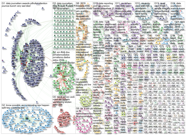
What’s the global data journalism community tweeting about this week? Our NodeXL #ddj mapping from December 30, 2019 to January 5, 2020 finds The New York Times examining Australia’s brutal fire season, the launch of The Sigma Awards to honor outstanding data journalism, Der Tagesspiegel analyzing the major changes across the globe in the past decade, and inspiring best-of data visualization lists by Nathan Yau, Pew Research Center, ZEIT ONLINE, the Los Angeles Times and the Financial Times.
Australia’s Deadly Wildfires
Devastating wildfires have swept across millions of acres of land in Australia since October 2019, destroying homes, displacing thousands of residents, and killing at least 25 people. The New York Times mapped the hotspots and highlights several contributing factors that make Australia’s 2019 fire season exceptionally brutal.
This graphs from the NYT are quite something https://t.co/ZJ0ki4vIaA pic.twitter.com/HaJ7Oxjgrk
— Osman Faruqi (@oz_f) January 3, 2020
Launch of The Sigma Awards
The Sigma Awards, which recognizes outstanding data journalism, has just been launched in the wake of the Data Journalism Awards’ death. There will be nine prizes for six categories. Data teams from around the world can submit their work until February 3. Read more about the launch of the awards here.
🏆If you're looking to start the New Year with good intentions, we’ve got some exciting news for you! We have recently teamed up with @GoogleNewsInit to launch the @sigmaawards for outstanding #datajournalism around the globe! Apply today: https://t.co/LE02JLCVz2 pic.twitter.com/SAIwk4r7WS
— DataJournalism.com (@datajournalism) January 6, 2020
Flowingdata’s Favorite Data Viz in 2019
Statistician Nathan Yau’s ten favorite data visualization picks in 2019 showcase an array of amazingly creative projects. From presenting gerrymandering via a font type to personifying data through a comic and chart combination, it is a list that will inspire you to think out of the box for your graphics.
Here are my favorite data visualization projects for 2019 https://t.co/B4qW21kE6E
— Nathan Yau (@flowingdata) December 19, 2019
A Decade of Change
The world has changed fundamentally in the past decade, with major developments in communication, climate, energy, transport, warfare, and power. Using graphics and satellite images, Der Tagesspiegel produced a detailed and insightful look at what has changed over the past 10 years and by how much. (In German.)
Verkehr, Klima, Vernetzung: In den letzten zehn Jahren hat sich die Welt fundamental verändert. Wir zeigen in Grafiken und Satellitenbildern, was sich besonders verändert hat: https://t.co/nndA6u3iEF #ddj #dataviz @Tagesspiegel @HelenaWittlich @_davidmeidinger @benebrandhofer pic.twitter.com/fqsAMG52hN
— Hendrik Lehmann (@plateauton) December 30, 2019
The Economist’s Graphs in One PDF
The Economist collated 61 of its print graphics articles into one PDF. To download it, you’ll need to sign up for a free account or subscribe to the magazine.
New post: All The Economist Graphic Detail visualizations in one convenient PDF https://t.co/Aoo6y17h3X #dataviz #infographics #ddj h/t @AlexSelbyB pic.twitter.com/ebZ8QEX1vp
— Alberto Cairo (@AlbertoCairo) December 26, 2019
Pew Research Center’s Favorite Data Viz
What makes for a successful graphic? Pew Research Center says good visualizations must have a clear takeaway, engage readers and display layers of information beyond the immediate point that first catches the eye. They highlight five of their favorite graphics in 2019, with notes on their design process.
Our favorite Pew Research Center data visualizations of 2019. So proud of our digital team which took us to new heights. What makes for a compelling graphic? This piece explains https://t.co/wRDN69pDc3
— Dan Morrison (@DMediaguy) December 31, 2019
Zeit Online’s Best Data Viz in 2019
What the German parliament debated, where the rent burden was highest, and how many people left East Germany: These are just some of the topics covered by Zeit Online’s best data visualizations in 2019. (In German.)
Cooler und interaktiver Rückblick auf 2019: Die Kollegen von @zeitonline haben das Jahr in Karten, Grafiken und Illustrationen zusammengefasst https://t.co/g5YALREGz9
— Ludwig Obermeier🇪🇺 (@ludwigobermeier) December 27, 2019
LA Times’ 50 Best Data and Graphics Journalism
From visual stories to interactive games, the Los Angeles Times’ data and graphics department produced an interesting body of work last year. Check out 50 examples of how the team merged the sciences of statistics and computer programming with the arts of reporting, writing, and editing.
The @latimes' newly merged @datagraphics team is like Shaq at 17: big, growing fast and a little bit scary.
Here's their best work in 2019. Buckle up for 2020.https://t.co/6La3jXpasK
— Ben Welsh (@palewire) December 30, 2019
Germany’s Rail Network
Are there any differences between the rail networks in East and West Germany? Is it true that rail development in the East has fallen behind the West? To find out, Der Spiegel examined train timetable data and spoke to experts. (In German.)
Das Ur-Problem: Die Politik erwartet bis heute, der Bahnverkehr müsse profitabel oder wenigstens kostendeckend sein, sieht Autobahnen und Bundesstraßen hingegen als Infrastruktur, die natürlich subventioniert werden muss. https://t.co/Zm7hpEFZFK
— Mario Sixtus 馬六 🇪🇺🇭🇰 (@sixtus) December 31, 2019
Financial Times’ Best Charts in 2019
The Financial Times’ picked 10 of its best visual journalism stories last year, covering a range of topics from extreme weather patterns to signs of a growing surveillance society.
The power of a good chart or map lies in its ability to inform the debates and decisions that lie ahead. Here are 10 graphics published by the Financial Times in 2019 where the real story is often about what happens next https://t.co/1wZQ8MvS1Z
— Financial Times (@FinancialTimes) December 30, 2019
Thanks again to Marc Smith of Connected Action for gathering the links and graphing them. The Top Ten #ddj list is curated weekly.
 Eunice Au is GIJN’s program coordinator. Previously, she was a Malaysia correspondent for Singapore’s The Straits Times, and a journalist at the New Straits Times. She has also written for The Sun, Malaysian Today, and Madam Chair.
For a look at NodeXL’s mapping on #ddj and data journalism on Twitter, check out this map.