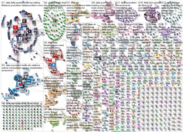
What’s the global data journalism community tweeting about this week? Our NodeXL #ddj mapping from November 4 to 10 finds The New York Times analyzing more than 11,000 of Trump’s tweets, The Financial Times measuring air quality in London’s Underground, Der Tagesspiegel creating an interactive of the Berlin Wall, and Nieman Lab discussing data voids exploited by media manipulators.
Analyzing Trump’s 11,000 Tweets
Donald Trump has tweeted more than 11,000 times over 33 months since he took office as president of the United States. In those tweets, he often praised himself — more than 2,000 times — and attacked his perceived enemies. The New York Times reviewed all his tweets and interviewed current and former administration officials to piece together this analysis of how Trump uses Twitter to exert power.
A recommended read. This isn’t only a story about Trump, but an illustrative analysis on how the rules of the game were transformed when political power met the power of the platforms. Great data-driven story by @shearm et al. https://t.co/l2SDjqLBTx #medialiteracy #journalism
— Jarno M. Koponen (@ilparone) November 6, 2019
London Tube: Dirtiest Place in the City
Are you one of the 4.8 million passengers who commute via the London Underground daily? Bad news. The Financial Times investigated air quality in the train carriages and found that the air is polluted with high levels of particulate matter, which could be up to 18 times worse than the city’s roadside air.
the authors kindly include a csv download for the underlying data in their methods section.
📰 https://t.co/PDqdM1TWKx pic.twitter.com/pUkJ7qZVgu
— @micahstubbs (@micahstubbs) November 8, 2019
Inundated Cities in 2050
New research by Climate Central estimates that rising seas could inundate large swaths of land and affect some 150 million people by 2050, three times more than previously thought. An article by The New York Times based on this research attracted a lot of attention and arguments on Twitter from those who are alarmed at the climate crisis and others who question the accuracy of the data.
One scary sentence: "Some 150 million people are now living on land that will be below the high-tide line by midcentury." https://t.co/OR0ZrmarDE #ClimateChange
— David Beard (@dabeard) October 30, 2019
Interactive Time Travel: 360 Degrees Berlin Wall
To commemorate the 30th anniversary of a unified Berlin, Der Tagesspiegel collaborated with startup Zaubar to help current-day Berliners understand what it was like before the Berlin Wall fell. They developed several styles of storytelling, including an interactive map and a city tour app in augmented reality, which allows you to see historical photos from the divided city in exactly the places in Berlin where they were taken.
Wie groß war die Mauer? Wo stand sie? Fragen, die immer wieder kommen. Dafür haben wir zusammen mit @zaubarApp eine App entwickelt: Tagesspiegel 89/19 Die Mauer als 3D-Objekt im hier und jetzt. Dazu historische Fotos an Orten von heute. Mehr hier: https://t.co/FdxLg5zgvC
— Christian Tretbar (@ctretbar) November 8, 2019
Yay or Nay: Using AI for Data Journalism
With digitized information growing at such a quick rate on almost any topic out there, data journalists are turning to artificial intelligence (AI) technology to help sort and analyze massive datasets. Datafloq examines the benefits and drawbacks of using AI for data journalism, and advises journalists to maintain a healthy skepticism about the technology.
#AI in #Data #Journalism: Pros and Cons – by @kaylaematthews https://t.co/pG2ybQtx7i pic.twitter.com/obSUpuZujG
— Datafloq (@Datafloq) November 12, 2019
Exploiting Data Voids to Spread Misinformation
Michael Golebiewski of Microsoft coined the term “data void” in May 2018 to describe search engine queries that turn up little to no results, especially when the query is rather obscure, or not searched often. These voids are ripe for exploitation by media manipulators who might rush to fill in the gaps with false information. Nieman Lab’s Joshua Benton writes about the dangers of these data voids.
The deep problem of "data voids" — obscure or made-up terms that can be abused to spread misinformation and conspiracy theories. This is also a huge problem for health and science (short thread). By @jbenton https://t.co/4GAY3BLJ0f via @NiemanLab
— Laura Helmuth (@laurahelmuth) November 5, 2019
Farewell to Global Editors Network
The announcement of Global Editors Network’s closure last week came as a surprise to many in the data journalism community. According to the farewell statement by GEN’s CEO Bertrand Pecquerie, the association is ceasing its activities after nine years due to lack of sustainable finances. Among GEN’s achievements: launching the Data Journalism Awards back in 2012.
GEN announced today that it will cease its activities due to lack of sustainable finances. Thank you to all the GEN supporters & friends who made our work possible! We hope the fruits of our work will continue to serve journalism. Keep up the fight! https://t.co/11opIcG9R1 pic.twitter.com/Fcw2xYW6Lt
— Global Editors Network (@GENinnovate) November 7, 2019
Datashare: ICIJ’s Document Analysis Software
Have you checked out the free, open-source software built by the International Consortium of Investigative Journalists? Datashare helps you to index, search, star, tag, filter, and analyze your documents. It works on Mac, Windows, and Linux. ICIJ’s product designer Soline Ledésert wrote a new guide to help you utilize it.
Our brilliant tech team has made #ICIJDatashare, a cutting edge tool for journalists (or anyone else) who need to analyze a set of documents, available open source. So you can use the same technology we do… 🕵️♂️🕵️♂️ https://t.co/0toEi59T20
— Sasha Chavkin (@sashachavkin) November 5, 2019
Student DataViz: Win a Trip to C+J Conference
The Computation + Journalism Symposium 2020 is open to submissions of excellent data visualizations from college-level, student-run news sites or from students. Students with winning entries will get free flight and accommodations at the conference. Submission deadline: December 13, 2019.
Does your student newsroom do data visualization? Submit your best to win a trip to @Northeastern for our Computation + Journalism Symposium on March 20, 2020
Judging by @AlbertoCairo @maggiemulvihill and @MattCData https://t.co/KPVidgQBRU pic.twitter.com/DWWHM4bPDs
— Aleszu Bajak (@aleszubajak) October 14, 2019
Collaborative Data Journalism
Data journalism is one of the most impactful forms of reporting, and it works even better with collaboration. The Center for Cooperative Media takes a look at ProPublica, Reveal, and the Associated Press, organizations that are building infrastructure to support collaborative data journalism with impact.
See what open-source, collaborative tools @propublica @AP and @Reveal have developed to manage multi-newsroom, investigative efforts like Project Hate and the Panama Papers. https://t.co/JjIhBBU2sC by @willfisch15 pic.twitter.com/lcxQW5pwHn
— Sourcefabric (@Sourcefabric) November 5, 2019
Thanks to Marc Smith and Harald Meier of Connected Action for gathering the links and graphing them. The Top Ten #ddj list is curated weekly.
 Eunice Au is GIJN’s program coordinator. Previously, she was a Malaysia correspondent for Singapore’s The Straits Times, and a journalist at the New Straits Times. She has also written for The Sun, Malaysian Today, and Madam Chair.
For a look at NodeXL’s mapping on #ddj and data journalism on Twitter, check out this map.