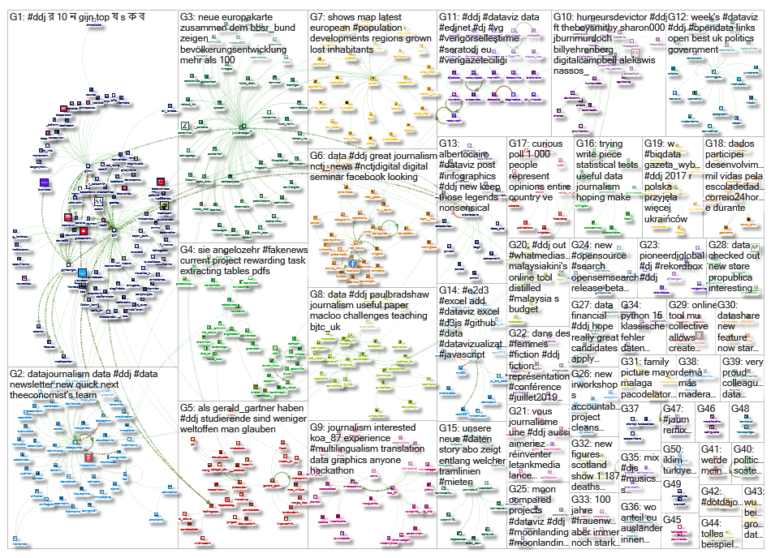
What’s the global data journalism community tweeting about this week? Our NodeXL #ddj mapping from July 15 to 21 finds Information Is Beautiful’s sharing its gallery of must-read data visualization books, Datajournalism.com highlighting pitfalls in creating charts, the FT analyzing the age of Wimbledon players, and WDR scrutinizing Germany’s opera repertoire.
Old World Opera
WDR scrutinized the opera schedules of 13 municipal theaters in North Rhine Westphalia, Germany, last year. While there was a total of more than 1,000 shows performed, WDR found that living composers barely had a chance to be included in the repertoire.
Opera in Northrhine-Westphalia: Many presentations, but mostly by dead and almost exclusively by male composers https://t.co/w3dLcIDaCB
— Christoph Hörentrup (@choere) July 14, 2019
Dataviz Books Everyone Should Read
Looking to improve your knowledge on data visualization? Information is Beautiful, in association with the Data Visualization Society, put together a neat gallery of books to read with links to purchase them.
From creative interactives to practical chart techniques – @infobeautiful has an exhaustive (and elegantly presented) guide to the #dataviz books everyone should read: https://t.co/GqZnaeHZnq pic.twitter.com/impGBJRFy2
— Fire Plus Algebra (@FireAlgebra) July 15, 2019
Bad Charts
This edition of the Conversations with Data newsletter looks at the common pitfalls in creating data visualizations. Learn from the visual faux pas other data journalists have made so you can avoid the same mistakes.
Do you like charts and maps? Well, watch out for the following charts/maps pitfalls:
https://t.co/9Mm7393wcQ@datajournalism #ddj @Highcharts— mustapha mekhatria (@MusMekh) July 22, 2019
Veterans Dominate Wimbledon
The failure of men’s tennis younger players to break the hegemony of the Big Three — Djokovic, Federer, and Nadal — at Wimbledon this year meant that the average age of men in Wimbledon’s last 16 surpassed 30 years old for the first time.
Veteran tennis stars continue to dominate Wimbledon https://t.co/RXtuKG9qON pic.twitter.com/gQYYzlmPww
— Financial Times (@FinancialTimes) July 11, 2019
Which EU Country Is Family Friendly?
VoxEurop takes a look at UNICEF’s report on family-friendly policies in European Union member states. Explore the ranking of each country in several interactive graphs according to four key indicators, including paid leave and childcare. Spoiler alert: Sweden does well, as expected, but the top spot is grabbed by… Portugal. This piece is also available in French, German, and Italian.
Who is more family-friendly?
A report from @UNICEF highlights the varying performance of EU Member States along with four policy proxies: https://t.co/YS8jc2HBB3 #family #EU #ddj pic.twitter.com/gohrlmpXzz
— VoxEurop (@VoxEurop) July 2, 2019
Importance of Legends
Think twice before getting rid of legends in data visualizations, as viewers might get frustrated if they cannot find explanations or references for the graphics. Data viz expert Alberto Cairo argues that legends aren’t optional add-ons but an integral part of visualizations.
I agree with @AlbertoCairo on this one
keep those legends
(also please add footnotes)https://t.co/3w0rIp4WZX— Leonard Kiefer (@lenkiefer) July 17, 2019
Representing Data Through Touch
Data physicalization can be seen, touched, heard, tasted, smelled, and more. Alice Corona, co-founder of the Batjo data site, explains the potential journalistic benefits of physical data representations and how to create such artifacts.
Humans have been embedding data into the properties of physical objects for millennia, so why don't modern journalists? @alice_corona explores the newsroom benefits of data physicalisation, along with a tutorial to get you started: https://t.co/sEaKZA39S1 #ddj #datajournalism pic.twitter.com/sNsSCkYsXZ
— DataJournalism.com (@datajournalism) July 16, 2019
Disinformation Website Exposed
After months of analysis, Blick revealed who is behind Schweizer Morgenpost and breaks down its successful strategy in disseminating propaganda and disinformation.
Der @Blickch hat da sehr schön aufgedeckt, wer hinter der Fake News-Seite "Schweizer Morgenpost" steckt und wie dieser jemand arbeitet. Inklusive sehr schöne Visualisierungen. https://t.co/jc8BNhdPn3
— Stefan Schett (@derSchett) July 17, 2019
Teaching Data Journalism
Digital journalism professor Mindy McAdams attempts to answer the question: “How can we prepare emerging journalists to work with data, and what are the essential computational skills that need to be conveyed?” in her paper for the World Journalism Education Congress.
Educators wondering how to incorporate data journalism/computational skills into their curriculum should read this comprehensive @macloo paper first. https://t.co/Zf5Z1hbRJk
— Jonathan Groves (@grovesprof) July 18, 2019
Open Source Datashare
Have you tried ICIJ’s Datashare document analysis tool yet? It now offers journalists the ability to star documents to bookmark them and search within documents using Control+F or Command+F.
Sorting through thousands of leaked files is no easy task. For #BriberyDivision and #MauritiusLeaks, we used our innovative research platform #Datashare. It now comes with a star feature for bookmarking important documents. Download for free here: https://t.co/M53qMbqWPR pic.twitter.com/9DuJ3NIxa0
— ICIJ (@ICIJorg) July 24, 2019
Thanks, once again, to Marc Smith of Connected Action for gathering the links and graphing them. The Top Ten #ddj list is curated weekly.
 Eunice Au is GIJN’s program coordinator. Previously, she was a Malaysia correspondent for Singapore’s The Straits Times, and a journalist at the New Straits Times. She has also written for The Sun, Malaysian Today and Madam Chair.

