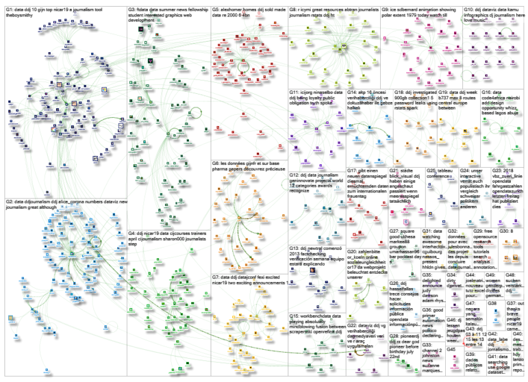
What’s the global data journalism community tweeting about this week? Our NodeXL #ddj mapping from March 11 to March 17 finds @davduf‘s award-winning exposé of Yellow Vest injuries in France, @theboysmithy making music out of the yield curve, and @alisonkilling on mapping two fictional migrants’ journeys to Europe.
Yellow Vest Injuries Exposed
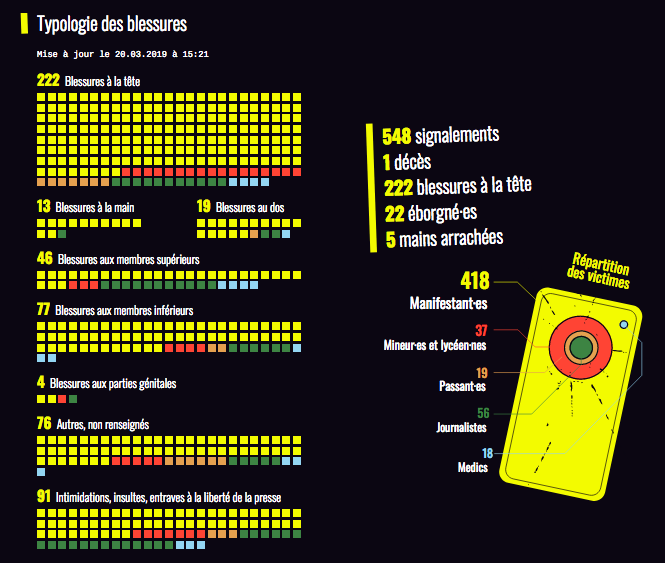
David Dufresne just won the grand prize in France’s top journalism awards for his data-driven project “Allô Place Beauvau,” on the shocking amount of police violence against protesters from the Yellow Vest movement. By crowdsourcing incidents on social media, he chronicled 548 incidents, including 222 head injuries, 22 lost eyes and 5 severed hands.
Yielding Music
The Financial Times’ data visualization editor Alan Smith had fun with sonification for his latest Chart Doctor column: He turned the iconic yield curve, which shows the yield of different US government bonds, into a piece of music. The resulting four-octave range suits an instrument like the marimba, he found.
Looking for some light relief from a heavy week of Brexit shenanigans? I can offer you the yield curve played on a marimba. My latest @FinancialTimes Chart Doctor makeover, in conjunction with the amazing @tomhannen https://t.co/MOXqBRO2QM #dataviz #sonification pic.twitter.com/K3u2yLuFoQ
— Alan Smith (@theboysmithy) March 15, 2019
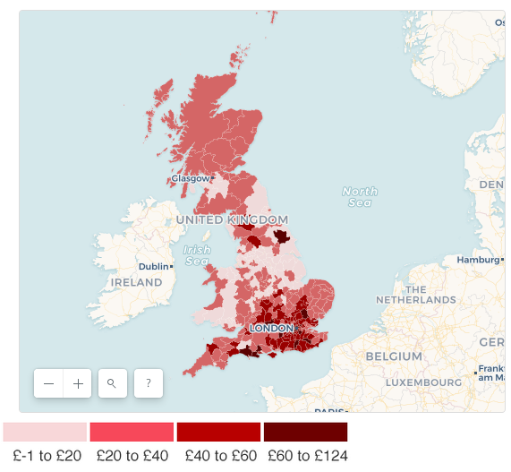
Right to Buy
The BBC created an interactive map highlighting the scale of property flipping under the “Right to Buy” program, which allows UK council tenants to buy their homes at a reduced price. Detractors of the program have renewed calls for it to be suspended in England, after it was stopped in Scotland and Wales.
Migration Trail
The MapBox blog has an interview with Alison Killing, the creator of Migration Trail, an interactive project that uses maps and data visualization to tell the story of two fictional migrants traveling to Europe. She explains that she used lots of open data on displaced people from sources like the United Nations High Commissioner for Refugees data portal, the European Commission’s statistics division, the Passport Index and the International Organisation of Migration’s Missing Migrant project.
Although these a huge amount of #data available on #migration, it can be challenging to humanise these numbers. This interview with @alisonkilling looks at the power of interactive #maps in telling these important stories: https://t.co/lUVhaFis2A #ddj #dataviz
— DataDrivenJournalism (@ddjournalism) March 12, 2019
Covering Immigration With Data
The awesome NICAR slides keep coming: This time they’re from a session on covering immigration with data, from Christine Mehta, Nausheen Husain and Ryan McNeill.
Hey #NICAR19, if you missed our session on covering migration with data, our slides are here: https://t.co/mT1AqaxYBK; tipsheet is here:https://t.co/4mgOyhdnKt. Also the “situations” page I mentioned yesterday *has an API*, it’s been added to the tipsheet.
— Nausheen Husain (@nausheenhusain) March 9, 2019
Archiving Data Projects
Ever wanted to archive your data project — with more than a screenshot? Try out this work-in-progress app up on GitHub which captures archival packages of data journalism websites. And remember to thank your librarians (in this case, NYU librarians).
If you want to know more about archiving digital journalism and @katy_boss emulation based archiving tool, I got you covered:
Github: https://t.co/8WeoZnbp5m
Documentation: https://t.co/gpxZm0P0WI
Presentation: https://t.co/MESVNRsAnf#NICAR19 #ddj
— Daniele Palumbo (@Danict89) March 7, 2019
R in Turkish
For Turkish speakers, here’s a practical book on using R for data journalism, written by Kerim Göztepe of Sakarya University. It’s free to download here.
R ve Uygulamaları Kitabı https://t.co/VLWkcb9aCe #rddj #ggplot #Rdatasets #dataviz #vg #verihaberciliği #ddj pic.twitter.com/5P3UddAoGD
— Açık Veri Gazeteciliği PlatformuTR (@DagmedyaVeri) March 12, 2019
Infographics and Dataviz
5W Infographics is offering two workshops on information graphics and data visualization featuring Juan and Samuel Velasco, who have created graphics for numerous media outlets in the United States and Spain. The two-day workshop will be offered in San Francisco on March 21-22 and in Washington, DC on April 11-12.
Announcing our next 5W Academy’s Infographics and Data Visualization workshops: San Francisco (March 21-22) and Washington DC (April 11-12). By the founders of award-winning studio 5W Infographics.
Workshop: https://t.co/wWYp7dUsmN
5W Infographics: https://t.co/7dJTYMLWC1 pic.twitter.com/Zq9pVydiGa— Juan Velasco (@juanvelasco) January 28, 2019
Data Workshops
The Center for Investigative Journalism is offering several courses in London this spring, including a one-day workshop on finding stories with data and a two-day workshop on data-driven investigations.
Improve your investigative skills this #April with #Data journalism courses for beginners and intermediates and a full day of learning how to use #FreedomOfInformatioAct more effectively. These are the last #CIJCourses before the #CIJSummer. #ddj https://t.co/56dYztrDuU pic.twitter.com/EBe3L32jjf
— CIJ (@cijournalism) March 14, 2019
Fellowships Across Europe
The European Journalism Centre and the Google News Initiative are offering paid summer fellowships in newsrooms across Europe, including many focused on data journalism.
See the full list here. The deadline to apply is April 1.
We’re still accepting applications for the #GNIFellowship. Apply before 1 April 2019 if you’d like spend your summer building your career in #journalism at one of our 40 newsrooms in Europe. 🇦🇹🇧🇪🇫🇮🇫🇷🇩🇪🇮🇪🇵🇱🇸🇪🇨🇭🇳🇱🇬🇧 #internshiphttps://t.co/gbIsQ9iGF6
— European Journalism Centre (@ejcnet) March 17, 2019
Thanks, once again, to Marc Smith of Connected Action for gathering the links and graphing them.
 Gaelle Faure is GIJN’s associate editor. Previously, she worked for France 24, where she specialized in social newsgathering and verification. She has also worked as an editor for News Deeply and reported for Time Magazine.
For a look at Marc Smith’s mapping on #ddj on Twitter, check out this map.